- Power BI forums
- Updates
- News & Announcements
- Get Help with Power BI
- Desktop
- Service
- Report Server
- Power Query
- Mobile Apps
- Developer
- DAX Commands and Tips
- Custom Visuals Development Discussion
- Health and Life Sciences
- Power BI Spanish forums
- Translated Spanish Desktop
- Power Platform Integration - Better Together!
- Power Platform Integrations (Read-only)
- Power Platform and Dynamics 365 Integrations (Read-only)
- Training and Consulting
- Instructor Led Training
- Dashboard in a Day for Women, by Women
- Galleries
- Community Connections & How-To Videos
- COVID-19 Data Stories Gallery
- Themes Gallery
- Data Stories Gallery
- R Script Showcase
- Webinars and Video Gallery
- Quick Measures Gallery
- 2021 MSBizAppsSummit Gallery
- 2020 MSBizAppsSummit Gallery
- 2019 MSBizAppsSummit Gallery
- Events
- Ideas
- Custom Visuals Ideas
- Issues
- Issues
- Events
- Upcoming Events
- Community Blog
- Power BI Community Blog
- Custom Visuals Community Blog
- Community Support
- Community Accounts & Registration
- Using the Community
- Community Feedback
Register now to learn Fabric in free live sessions led by the best Microsoft experts. From Apr 16 to May 9, in English and Spanish.
- Power BI forums
- Forums
- Get Help with Power BI
- Desktop
- Visualization for contract start/end dates and cos...
- Subscribe to RSS Feed
- Mark Topic as New
- Mark Topic as Read
- Float this Topic for Current User
- Bookmark
- Subscribe
- Printer Friendly Page
- Mark as New
- Bookmark
- Subscribe
- Mute
- Subscribe to RSS Feed
- Permalink
- Report Inappropriate Content
Visualization for contract start/end dates and cost
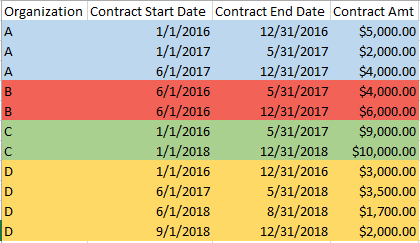
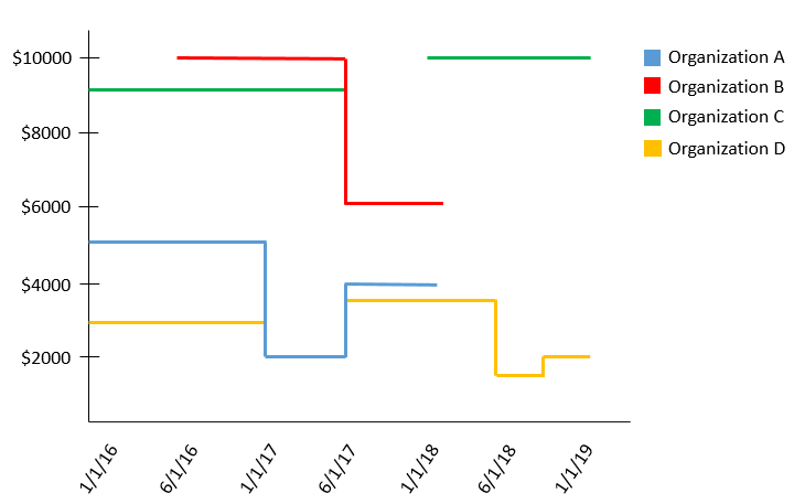
I have several entries, each with the fields: organization name, contract start date, contract end date, and contract amount. I am trying to create a visual that will display organization contracts and their amount over time using start dates and end dates as the axis bounds, contract amount as the value, and the organization name as the legend.
Is there a method to display data in this fashion within BI? I have attached a couple of manually-created example images that better explain what I'm trying to do. Please note how "Organization B" has aggregated contract values over the same timeframe and Organizations "C" and "D" have certain timespans with no effective contracts.
Any pointers would be appreciated! Thanks.
Solved! Go to Solution.
- Mark as New
- Bookmark
- Subscribe
- Mute
- Subscribe to RSS Feed
- Permalink
- Report Inappropriate Content
Hi @kiranbrao,
You can create a calendar table:
Calendar = CALENDAR(MIN('Table1'[Contract start date]),MAX('Table1'[Contract end date]))
Then create a measure in fact table:
Amount = CALCULATE(SUM('Table1'[Contract amount]),FILTER('Table1','Table1'[Contract start date]<=MAX('Calendar'[Date]) && 'Table1'[Contract end date]>=MAX('Calendar'[Date])))
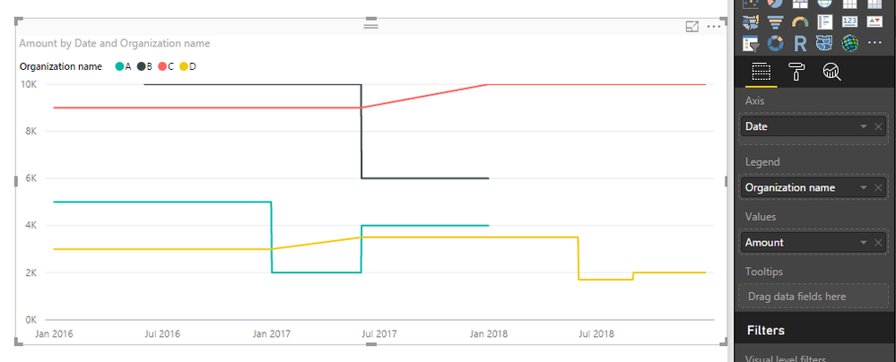
Please check attached .pbix file.
Best Regards,
Qiuyun Yu
If this post helps, then please consider Accept it as the solution to help the other members find it more quickly.
- Mark as New
- Bookmark
- Subscribe
- Mute
- Subscribe to RSS Feed
- Permalink
- Report Inappropriate Content
i tried to make it a cumulative line, but unfortunately i messed it up.
Running Actuals = CALCULATE(SUM(Table1[Contract amount],FILTER(ALL(Table1[Contract start date],'Calendar'[Date].[Date]<=MAX('Calendar'[Date].[Date])))))
Is there any measure for this, but cumulative?
- Mark as New
- Bookmark
- Subscribe
- Mute
- Subscribe to RSS Feed
- Permalink
- Report Inappropriate Content
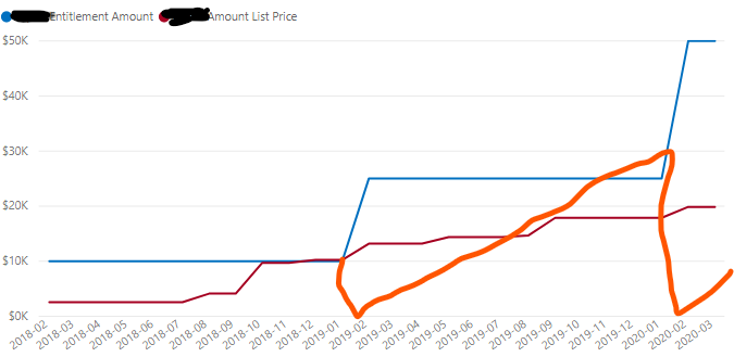
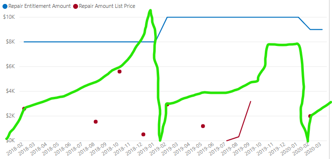
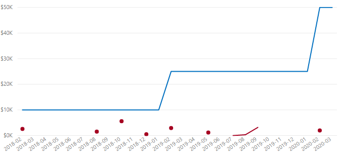
@v-qiuyu-msft This is really helpful. Thank you! I plotted my contract values over time, but now is there a way to plot actual transactions as the run up to the total contract value, and then start over at the new contract? My formulas are giving me the blue and red line, but I want the blue and orange line.
BLUE Line:
CALCULATE(
I also tried this, but this really didn't work:
- Mark as New
- Bookmark
- Subscribe
- Mute
- Subscribe to RSS Feed
- Permalink
- Report Inappropriate Content
Hi,
Share some data and show the expected result in a simple table format.
Regards,
Ashish Mathur
http://www.ashishmathur.com
https://www.linkedin.com/in/excelenthusiasts/
- Mark as New
- Bookmark
- Subscribe
- Mute
- Subscribe to RSS Feed
- Permalink
- Report Inappropriate Content
@Ashish_MathurPlease note I manually created the cumulative usage in Excel above, but this is what I'd like Power BI to do and then draw in a graph, which each new contract starting at 0. See how I have the entitlement amount working correctly, with the help of this post, but now how do I get the actuals to accumulate towards the cap? Thanks for your help!
- Mark as New
- Bookmark
- Subscribe
- Mute
- Subscribe to RSS Feed
- Permalink
- Report Inappropriate Content
@Ashish_MathurHere's an example of the usage data:
| Order Submit Date | List_Price | Cumulative Usage | Notes |
| 2/21/2018 | $2,592 | $2,592 | Usage begins at 0 on 2/1/18 |
| 8/23/2018 | $1,542 | $4,134 | |
| 10/12/2018 | $1,709 | $5,843 | |
| 10/17/2018 | $3,893 | $9,736 | |
| 12/4/2018 | $513 | $10,249 | |
| 2/25/2019 | $2,940 | $2,940 | Usage begins at 0 again on 2/1/19 |
| 5/14/2019 | $1,186 | $4,126 | |
| 7/18/2019 | $0 | $4,126 | |
| 8/23/2019 | $323 | $4,449 | |
| 9/2/2019 | $545 | $4,994 | |
| 9/24/2019 | $2,636 | $7,630 | |
| 2/7/2020 | $1,737 | $1,737 | Usage begins again at 0 on 2/1/20 |
| 2/19/2020 | $128 | $1,865 | |
| 2/20/2020 | $128 | $1,993 |
- Mark as New
- Bookmark
- Subscribe
- Mute
- Subscribe to RSS Feed
- Permalink
- Report Inappropriate Content
@Ashish_MathurI've tried three times now and powerbi community is not cooperating.
Please see image I posted previously. Here is an example of contract cap data.
| BPID | Customer Name (BPID) | contr_num | SAP Contract Start | SAP Contract End | Contract Cap |
| 100769396399 | ABC COMPANY (100769396399) | 8003656409 | 2/1/2018 | 1/31/2019 | $8,000 |
| 100769396399 | ABC COMPANY (100769396399) | 8004081579 | 2/1/2019 | 1/31/2020 | $10,000 |
| 100769396399 | ABC COMPANY (100769396399) | 8004575589 | 2/1/2020 | 1/31/2021 | $9,000 |
- Mark as New
- Bookmark
- Subscribe
- Mute
- Subscribe to RSS Feed
- Permalink
- Report Inappropriate Content
Hi,
The visual that you want to create is immaterial. First and foremost, we have to calculated the correct figures in a simple Table format. So share your input Tables and show the exact expected result in a simple Table format.
Regards,
Ashish Mathur
http://www.ashishmathur.com
https://www.linkedin.com/in/excelenthusiasts/
- Mark as New
- Bookmark
- Subscribe
- Mute
- Subscribe to RSS Feed
- Permalink
- Report Inappropriate Content
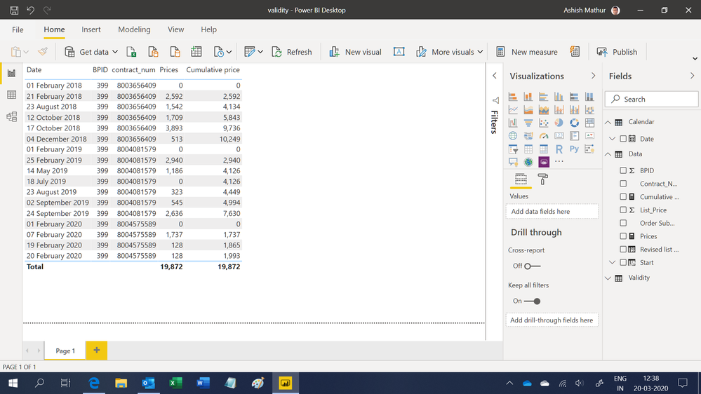
@Ashish_MathurI'm trying to provide as you ask, and if this isn't it, I don't know what else to do. I'm trying to figure out how to sum the List price cumulatively for the list price transactions that occur between the start and end date range for each contract. In other words, the list prices accumulate from the start to the end of each contract. When the contract is over, the accumulation starts over again at 0. Any help in how to do this is greatly appreciated. Thank you.
| CONTRACT INPUTS | |||||
| BPID | Customer Name (BPID) | contract_num | SAP Contract Start | SAP Contract End | Contract Cap |
| 399 | ABC COMPANY (399) | 8003656409 | 2/1/2018 | 1/31/2019 | $ 8,000.00 |
| 399 | ABC COMPANY (399) | 8004081579 | 2/1/2019 | 1/31/2020 | $ 10,000.00 |
| 399 | ABC COMPANY (399) | 8004575589 | 2/1/2020 | 1/31/2021 | $ 9,000.00 |
| DATA INPUTS | DATA INPUTS | DESIRED RESULT | |
| Order Submit Date | List_Price | Cumulative Usage | Notes |
| 2/1/2018 | 0 | Usage begins at 0 on 2/1/18, which is start of the contract above | |
| 2/21/2018 | $2,592 | $2,592 | |
| 8/23/2018 | $1,542 | $4,134 | |
| 10/12/2018 | $1,709 | $5,843 | |
| 10/17/2018 | $3,893 | $9,736 | |
| 12/4/2018 | $513 | $10,249 | |
| 2/1/2019 | $0 | Usage begins at 0 again on 2/1/19, with a new contract | |
| 2/25/2019 | $2,940 | $2,940 | |
| 5/14/2019 | $1,186 | $4,126 | |
| 7/18/2019 | $0 | $4,126 | |
| 8/23/2019 | $323 | $4,449 | |
| 9/2/2019 | $545 | $4,994 | |
| 9/24/2019 | $2,636 | $7,630 | |
| 2/1/2020 | $0 | Usage begins again at 0 on 2/1/20 | |
| 2/7/2020 | $1,737 | $1,737 | |
| 2/19/2020 | $128 | $1,865 | |
| 2/20/2020 | $128 | $1,993 | |
- Mark as New
- Bookmark
- Subscribe
- Mute
- Subscribe to RSS Feed
- Permalink
- Report Inappropriate Content
Hi,
In the second table, assuming the first 2 columns are user inputs, there should be 2 columns there as aadditional user inputs - BPID and contract_num. Why are they absent?
Regards,
Ashish Mathur
http://www.ashishmathur.com
https://www.linkedin.com/in/excelenthusiasts/
- Mark as New
- Bookmark
- Subscribe
- Mute
- Subscribe to RSS Feed
- Permalink
- Report Inappropriate Content
Hi @Ashish_Mathur,
Good point. I'm sorry, I neglected those in the table I provided. It would look like this:
| DATA INPUTS | DATA INPUTS | DATA INPUTS | DATA INPUTS | DESIRED RESULT | |
| Order Submit Date | BPID | Contract_Num | List_Price | Cumulative Usage | Notes |
| 2/1/2018 | 0 | Usage begins at 0 on 2/1/18, which is start of the contract above | |||
| 2/21/2018 | 7693963 | 800365640 | $2,592 | $2,592 | |
| 8/23/2018 | 7693963 | 800365640 | $1,542 | $4,134 | |
| 10/12/2018 | 7693963 | 800365640 | $1,709 | $5,843 | |
| 10/17/2018 | 7693963 | 800365640 | $3,893 | $9,736 | |
| 12/4/2018 | 7693963 | 800365640 | $513 | $10,249 | |
| 2/1/2019 | $0 | Usage begins at 0 again on 2/1/19, with a new contract | |||
| 2/25/2019 | 7693963 | 800408157 | $2,940 | $2,940 | |
| 5/14/2019 | 7693963 | 800408157 | $1,186 | $4,126 | |
| 7/18/2019 | 7693963 | 800408157 | $0 | $4,126 | |
| 8/23/2019 | 7693963 | 800408157 | $323 | $4,449 | |
| 9/2/2019 | 7693963 | 800408157 | $545 | $4,994 | |
| 9/24/2019 | 7693963 | 800408157 | $2,636 | $7,630 | |
| 2/1/2020 | $0 | Usage begins again at 0 on 2/1/20 | |||
| 2/7/2020 | 7693963 | 800457558 | $1,737 | $1,737 | |
| 2/19/2020 | 7693963 | 800457558 | $128 | $1,865 | |
| 2/20/2020 | 7693963 | 800457558 | $128 | $1,993 | |
Thanks for the help.
- Mark as New
- Bookmark
- Subscribe
- Mute
- Subscribe to RSS Feed
- Permalink
- Report Inappropriate Content
Hi,
You may download my solution PBI file from here.
Hope this helps.
Regards,
Ashish Mathur
http://www.ashishmathur.com
https://www.linkedin.com/in/excelenthusiasts/
- Mark as New
- Bookmark
- Subscribe
- Mute
- Subscribe to RSS Feed
- Permalink
- Report Inappropriate Content
Is there anyway to group these by month?
Helpful resources

Microsoft Fabric Learn Together
Covering the world! 9:00-10:30 AM Sydney, 4:00-5:30 PM CET (Paris/Berlin), 7:00-8:30 PM Mexico City

Power BI Monthly Update - April 2024
Check out the April 2024 Power BI update to learn about new features.

| User | Count |
|---|---|
| 112 | |
| 99 | |
| 73 | |
| 72 | |
| 49 |
| User | Count |
|---|---|
| 145 | |
| 109 | |
| 109 | |
| 90 | |
| 64 |
