- Power BI forums
- Updates
- News & Announcements
- Get Help with Power BI
- Desktop
- Service
- Report Server
- Power Query
- Mobile Apps
- Developer
- DAX Commands and Tips
- Custom Visuals Development Discussion
- Health and Life Sciences
- Power BI Spanish forums
- Translated Spanish Desktop
- Power Platform Integration - Better Together!
- Power Platform Integrations (Read-only)
- Power Platform and Dynamics 365 Integrations (Read-only)
- Training and Consulting
- Instructor Led Training
- Dashboard in a Day for Women, by Women
- Galleries
- Community Connections & How-To Videos
- COVID-19 Data Stories Gallery
- Themes Gallery
- Data Stories Gallery
- R Script Showcase
- Webinars and Video Gallery
- Quick Measures Gallery
- 2021 MSBizAppsSummit Gallery
- 2020 MSBizAppsSummit Gallery
- 2019 MSBizAppsSummit Gallery
- Events
- Ideas
- Custom Visuals Ideas
- Issues
- Issues
- Events
- Upcoming Events
- Community Blog
- Power BI Community Blog
- Custom Visuals Community Blog
- Community Support
- Community Accounts & Registration
- Using the Community
- Community Feedback
Register now to learn Fabric in free live sessions led by the best Microsoft experts. From Apr 16 to May 9, in English and Spanish.
- Power BI forums
- Forums
- Get Help with Power BI
- Desktop
- Re: Visualization Help - Show Proportions in Pie C...
- Subscribe to RSS Feed
- Mark Topic as New
- Mark Topic as Read
- Float this Topic for Current User
- Bookmark
- Subscribe
- Printer Friendly Page
- Mark as New
- Bookmark
- Subscribe
- Mute
- Subscribe to RSS Feed
- Permalink
- Report Inappropriate Content
Visualization Help - Show Proportions in Pie Chart & Percent Value
Hello PowerBI Community!
I really need help with creating this additional visualization that I was stuck with for quite a long time.
Here is a mock-up dataset: (Column A has all 7 days)
| Column A | Column B | Column C |
| Monday | John | 200 |
| Tuesday | Steve | 400 |
| Monday | Clive | 600 |
| Tuesday | Austin | 1000 |
| Tuesday | John | 900 |
| Saturday | Clive | 1100 |
| Monday | John | 1200 |
What I did was to create a Card Visualization that shows the total count of column C as well as 2 different filter slicers that gives me a list of the 7 days in a week and a list of the individuals in the dataset.
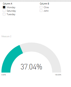
What I need to do is to create a pie/donut chart as well as a percent value (something like a card) that shows the proportion of column C's value when I click on the list in my filter slicer.
For example, if I clicked on Monday, it will give me a total of (200+600+1200/Total of Column C) = 37%.
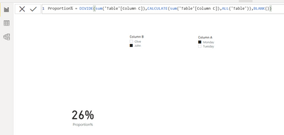
If I clicked on Monday & John, it will give me (200+1200/Total of Column C) = 26%.
The pie/donut chart will 37% of it shaded in another color.
I really appreciate any help! Thank you so much !!
Solved! Go to Solution.
- Mark as New
- Bookmark
- Subscribe
- Mute
- Subscribe to RSS Feed
- Permalink
- Report Inappropriate Content
@lwklwk98
Pie or Donut chart will not show the shaded area in another color. you can use the Guage chart effectively
Measure:
Percent =
DIVIDE(
    SUM(Table6[Column C]),
    CALCULATE(
        SUM(Table6[Column C]),
        REMOVEFILTERS(table6)
    )
)
⭕ Subscribe and learn Power BI from these videos
⚪ Website ⚪ LinkedIn ⚪ PBI User Group
- Mark as New
- Bookmark
- Subscribe
- Mute
- Subscribe to RSS Feed
- Permalink
- Report Inappropriate Content
Thank you so much! The Guage Chart is the perfect icing on the cake 🙂
- Mark as New
- Bookmark
- Subscribe
- Mute
- Subscribe to RSS Feed
- Permalink
- Report Inappropriate Content
Hi @lwklwk98 ,
You can create a measure like this to get the desired result:
Proportion% = DIVIDE(sum('Table'[Column C]),CALCULATE(sum('Table'[Column C]),ALL('Table')),BLANK())
Please accept this as a solution if your question has been answered !!
Appreciate a Kudos 😀
- Mark as New
- Bookmark
- Subscribe
- Mute
- Subscribe to RSS Feed
- Permalink
- Report Inappropriate Content
Thank you so much! I have learned something from you!
- Mark as New
- Bookmark
- Subscribe
- Mute
- Subscribe to RSS Feed
- Permalink
- Report Inappropriate Content
@lwklwk98 , Try a measure like
divide(sum(Table[Columnc]), calculate(sum(Table[Columnc]), all(Table)))
or
divide(sum(Table[Columnc]), calculate(sum(Table[Columnc]), allselected(Table)))
Microsoft Power BI Learning Resources, 2023 !!
Learn Power BI - Full Course with Dec-2022, with Window, Index, Offset, 100+ Topics !!
Did I answer your question? Mark my post as a solution! Appreciate your Kudos !! Proud to be a Super User! !!
- Mark as New
- Bookmark
- Subscribe
- Mute
- Subscribe to RSS Feed
- Permalink
- Report Inappropriate Content
Thank you so much! That is easy to understand.
Helpful resources

Microsoft Fabric Learn Together
Covering the world! 9:00-10:30 AM Sydney, 4:00-5:30 PM CET (Paris/Berlin), 7:00-8:30 PM Mexico City

Power BI Monthly Update - April 2024
Check out the April 2024 Power BI update to learn about new features.

| User | Count |
|---|---|
| 109 | |
| 99 | |
| 77 | |
| 66 | |
| 54 |
| User | Count |
|---|---|
| 144 | |
| 104 | |
| 101 | |
| 86 | |
| 64 |


