- Power BI forums
- Updates
- News & Announcements
- Get Help with Power BI
- Desktop
- Service
- Report Server
- Power Query
- Mobile Apps
- Developer
- DAX Commands and Tips
- Custom Visuals Development Discussion
- Health and Life Sciences
- Power BI Spanish forums
- Translated Spanish Desktop
- Power Platform Integration - Better Together!
- Power Platform Integrations (Read-only)
- Power Platform and Dynamics 365 Integrations (Read-only)
- Training and Consulting
- Instructor Led Training
- Dashboard in a Day for Women, by Women
- Galleries
- Community Connections & How-To Videos
- COVID-19 Data Stories Gallery
- Themes Gallery
- Data Stories Gallery
- R Script Showcase
- Webinars and Video Gallery
- Quick Measures Gallery
- 2021 MSBizAppsSummit Gallery
- 2020 MSBizAppsSummit Gallery
- 2019 MSBizAppsSummit Gallery
- Events
- Ideas
- Custom Visuals Ideas
- Issues
- Issues
- Events
- Upcoming Events
- Community Blog
- Power BI Community Blog
- Custom Visuals Community Blog
- Community Support
- Community Accounts & Registration
- Using the Community
- Community Feedback
Register now to learn Fabric in free live sessions led by the best Microsoft experts. From Apr 16 to May 9, in English and Spanish.
- Power BI forums
- Forums
- Get Help with Power BI
- Desktop
- Re: Visualise by ranking text instead of value
- Subscribe to RSS Feed
- Mark Topic as New
- Mark Topic as Read
- Float this Topic for Current User
- Bookmark
- Subscribe
- Printer Friendly Page
- Mark as New
- Bookmark
- Subscribe
- Mute
- Subscribe to RSS Feed
- Permalink
- Report Inappropriate Content
Visualise by ranking text instead of value
Hi,
This may have been solved before, but part of the problem is working out the search terms.
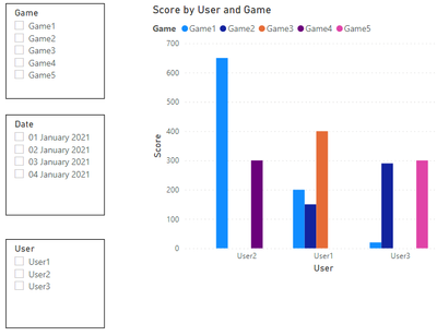
I have a simple table that shows users playing various games on different dates and the score they achieved.
| User | Date | Game | Score |
| User1 | 01/01/2021 | Game1 | 200 |
| User1 | 02/01/2021 | Game2 | 150 |
| User1 | 03/01/2021 | Game3 | 400 |
| User2 | 01/01/2021 | Game1 | 650 |
| User2 | 02/01/2021 | Game4 | 300 |
| User3 | 01/01/2021 | Game1 | 20 |
| User3 | 04/01/2021 | Game2 | 290 |
| User3 | 02/01/2021 | Game5 | 300 |
With this I can create a simple visual and slicers, like so:
I then have another table like this:
| Game | ScoreFrom | ScoreTo | Test |
| Game1 | 0 | 200 | Poor |
| Game1 | 201 | 400 | Average |
| Game1 | 401 | 600 | Good |
| Game1 | 601 | null | Amazing |
| Game2 | 0 | 300 | Poor |
| Game2 | 301 | 500 | Good |
| Game2 | 501 | null | Amazing |
| Game3 | 0 | 100 | Poor |
| Game3 | 201 | 450 | Good |
| Game3 | 451 | null | Amazing |
| Game4 | 0 | 400 | Poor |
| Game4 | 401 | 550 | Good |
| Game4 | 551 | null | Amazing |
| Game5 | 0 | 20 | Poor |
| Game5 | 21 | 400 | Good |
| Game5 | 401 | null | Amazing |
This table gives a textual ranking for each score band.
You will note that each Game has different bands.
What I want to do is show the score band on the Y axis, instead of the actual score.
User1 and User3 on Game1 did 'Poor'. Whereas User2 did 'Amazing'.
I want to be able to show User1, User2 and User3 on the visual with clustered bar chart and a column for User1 upto the word Poor, same for User2, but User3 up to Amazing. The words Poor, Average, Good and Amazing still need to be a rising scale.
Essentially the words are replacing value ranges. I realise that multuiple games could not be displayed, as they have different ranges to each other.
Is this possible?
I would upload an attachement as stated in the guide post, but I cannot seem to do this (no attachment button, dropping on file states .pbix not supported).
Sam.
- Mark as New
- Bookmark
- Subscribe
- Mute
- Subscribe to RSS Feed
- Permalink
- Report Inappropriate Content
@PBISam To the best of my knowledge Y axis columns/measures have to be numeric. There may be a custom visual where this is not the case.
@ me in replies or I'll lose your thread!!!
Instead of a Kudo, please vote for this idea
Become an expert!: Enterprise DNA
External Tools: MSHGQM
YouTube Channel!: Microsoft Hates Greg
Latest book!: The Definitive Guide to Power Query (M)
DAX is easy, CALCULATE makes DAX hard...
Helpful resources

Microsoft Fabric Learn Together
Covering the world! 9:00-10:30 AM Sydney, 4:00-5:30 PM CET (Paris/Berlin), 7:00-8:30 PM Mexico City

Power BI Monthly Update - April 2024
Check out the April 2024 Power BI update to learn about new features.

| User | Count |
|---|---|
| 107 | |
| 98 | |
| 77 | |
| 66 | |
| 53 |
| User | Count |
|---|---|
| 144 | |
| 104 | |
| 100 | |
| 86 | |
| 64 |

