- Power BI forums
- Updates
- News & Announcements
- Get Help with Power BI
- Desktop
- Service
- Report Server
- Power Query
- Mobile Apps
- Developer
- DAX Commands and Tips
- Custom Visuals Development Discussion
- Health and Life Sciences
- Power BI Spanish forums
- Translated Spanish Desktop
- Power Platform Integration - Better Together!
- Power Platform Integrations (Read-only)
- Power Platform and Dynamics 365 Integrations (Read-only)
- Training and Consulting
- Instructor Led Training
- Dashboard in a Day for Women, by Women
- Galleries
- Community Connections & How-To Videos
- COVID-19 Data Stories Gallery
- Themes Gallery
- Data Stories Gallery
- R Script Showcase
- Webinars and Video Gallery
- Quick Measures Gallery
- 2021 MSBizAppsSummit Gallery
- 2020 MSBizAppsSummit Gallery
- 2019 MSBizAppsSummit Gallery
- Events
- Ideas
- Custom Visuals Ideas
- Issues
- Issues
- Events
- Upcoming Events
- Community Blog
- Power BI Community Blog
- Custom Visuals Community Blog
- Community Support
- Community Accounts & Registration
- Using the Community
- Community Feedback
Register now to learn Fabric in free live sessions led by the best Microsoft experts. From Apr 16 to May 9, in English and Spanish.
- Power BI forums
- Forums
- Get Help with Power BI
- Desktop
- Visualisation from 2 diffrent queries
- Subscribe to RSS Feed
- Mark Topic as New
- Mark Topic as Read
- Float this Topic for Current User
- Bookmark
- Subscribe
- Printer Friendly Page
- Mark as New
- Bookmark
- Subscribe
- Mute
- Subscribe to RSS Feed
- Permalink
- Report Inappropriate Content
Visualisation from 2 diffrent queries
Hello all, I really do hope I will explain this as well as possible.
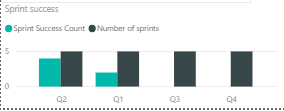
What I need is a graph that represtens the ratio of successful sprints to the number of sprints for a team of developers.
So a simple graph where two measurements are taken. But here where the problem lays I'd say. I've got the data in 2 diffrent Queries.
So the number of sprints is taken from a diffrent table that looks like this (and is taken from a summary tab)
| Team | Quarter | Number of sprints |
| Team1 | Q1 | 5 |
| Team2 | Q1 | 5 |
| Team3 | Q1 | 4 |
| Team4 | Q1 | 4 |
| Team1 | Q2 | 6 |
| Team2 | Q2 | 7 |
| Team3 | Q2 | 9 |
| Team4 | Q2 | 8 |
| Team1 | Q3 | 4 |
| Team2 | Q3 | 6 |
| Team3 | Q3 | 8 |
| Team4 | Q3 | 5 |
| Team1 | Q4 | 1 |
| Team2 | Q4 | 6 |
| Team3 | Q4 | 5 |
| Team4 | Q4 | 7 |
as where the the sprint success count FOR TEAM 1 is taken from a table that looks like this :
| Sprint # | Quarter | Sprint successful |
| 1 | Q1 | 1 |
| 2 | Q1 | 1 |
| 3 | Q1 | 0 |
| 4 | Q1 | 1 |
| 5 | Q1 | 0 |
| 6 | Q2 | 1 |
| 7 | Q2 | 1 |
| 8 | Q2 | 1 |
| 9 | Q2 | 1 |
| 10 | Q2 | 1 |
| 11 | Q2 | 1 |
| 12 | Q3 | 1 |
| 13 | Q3 | 1 |
| 14 | Q3 | 1 |
| 15 | Q3 | 1 |
| 16 | Q4 | 1 |
So if the sprint was succsessful we've got 1 if not then 0. I'm trying my best to achieve this but it's not working. It either sums up all the data for the whole year. Or by some weird reason show for each quareter exactly the same data. Does anyone have any suggestion how could this be resolved?
If anything is unclear please let me know I'll be glad to explain !
Solved! Go to Solution.
- Mark as New
- Bookmark
- Subscribe
- Mute
- Subscribe to RSS Feed
- Permalink
- Report Inappropriate Content
Hi @Anonymous ,
Based on my test, you could refer to below steps:
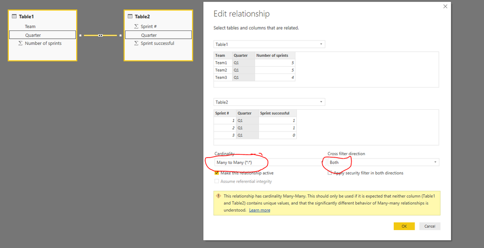
Create relationships between two quarters:
Use related fields to make your desired visual:
You could also download the pbix file to have a view.
Regards,
Daniel He
If this post helps, then please consider Accept it as the solution to help the other members find it more quickly.
- Mark as New
- Bookmark
- Subscribe
- Mute
- Subscribe to RSS Feed
- Permalink
- Report Inappropriate Content
Hi @Anonymous,
From your description, could you mean [Sprint successful] is your desired column? If so, how could you define "So if the sprint was succsessful we've got 1 if not then 0"? Could you please offer me more information or pbix file to haev a test if possible?
Regards,
Daniel He
If this post helps, then please consider Accept it as the solution to help the other members find it more quickly.
- Mark as New
- Bookmark
- Subscribe
- Mute
- Subscribe to RSS Feed
- Permalink
- Report Inappropriate Content
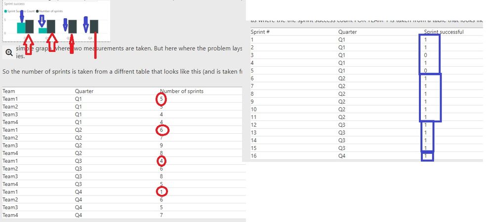
Hi, thanks for the reponse!! Let me explain because I might have been to chaotic, all the information are based in an excell file. Where the first tab is a summary tab and as you can see on the left the information is sumed up for each quarter.
1. On the left is the tab where we've got summary tab with all the teams. And I would like to show that as the black column in the visualisation.
2. On the right is the view of the team where if a sprint was successfull they'd add 1 if not then 0. And I would like THE SUM of each quarter to be shown as the blue column in the visualistaion?
Unfortunately I can't share the pbix.
- Mark as New
- Bookmark
- Subscribe
- Mute
- Subscribe to RSS Feed
- Permalink
- Report Inappropriate Content
Hi @Anonymous ,
Based on my test, you could refer to below steps:
Create relationships between two quarters:
Use related fields to make your desired visual:
You could also download the pbix file to have a view.
Regards,
Daniel He
If this post helps, then please consider Accept it as the solution to help the other members find it more quickly.
Helpful resources

Microsoft Fabric Learn Together
Covering the world! 9:00-10:30 AM Sydney, 4:00-5:30 PM CET (Paris/Berlin), 7:00-8:30 PM Mexico City

Power BI Monthly Update - April 2024
Check out the April 2024 Power BI update to learn about new features.

| User | Count |
|---|---|
| 114 | |
| 101 | |
| 78 | |
| 75 | |
| 49 |
| User | Count |
|---|---|
| 145 | |
| 108 | |
| 107 | |
| 89 | |
| 61 |


