- Power BI forums
- Updates
- News & Announcements
- Get Help with Power BI
- Desktop
- Service
- Report Server
- Power Query
- Mobile Apps
- Developer
- DAX Commands and Tips
- Custom Visuals Development Discussion
- Health and Life Sciences
- Power BI Spanish forums
- Translated Spanish Desktop
- Power Platform Integration - Better Together!
- Power Platform Integrations (Read-only)
- Power Platform and Dynamics 365 Integrations (Read-only)
- Training and Consulting
- Instructor Led Training
- Dashboard in a Day for Women, by Women
- Galleries
- Community Connections & How-To Videos
- COVID-19 Data Stories Gallery
- Themes Gallery
- Data Stories Gallery
- R Script Showcase
- Webinars and Video Gallery
- Quick Measures Gallery
- 2021 MSBizAppsSummit Gallery
- 2020 MSBizAppsSummit Gallery
- 2019 MSBizAppsSummit Gallery
- Events
- Ideas
- Custom Visuals Ideas
- Issues
- Issues
- Events
- Upcoming Events
- Community Blog
- Power BI Community Blog
- Custom Visuals Community Blog
- Community Support
- Community Accounts & Registration
- Using the Community
- Community Feedback
Register now to learn Fabric in free live sessions led by the best Microsoft experts. From Apr 16 to May 9, in English and Spanish.
- Power BI forums
- Forums
- Get Help with Power BI
- Desktop
- Re: Visual with two values, independantly filtered
- Subscribe to RSS Feed
- Mark Topic as New
- Mark Topic as Read
- Float this Topic for Current User
- Bookmark
- Subscribe
- Printer Friendly Page
- Mark as New
- Bookmark
- Subscribe
- Mute
- Subscribe to RSS Feed
- Permalink
- Report Inappropriate Content
Visual with two values, independantly filtered
Hi there,
I have a report with 1 visual, let's say a clustered column chart. That chart has 2 values.
I have 3 filter visualisations in the same report. I've duplicated these filters, so i now have 6 in total.
I want the first 3 filters to only filter Value 1 in the chart. And I want the 3 duplicated filters to only filter Value 2 in the chart.
Is something like that possible? If it's not possible with a clustered column but with a different visualisation i'd also be keen to hear more about that.
Thanks in advance
Bas
Solved! Go to Solution.
- Mark as New
- Bookmark
- Subscribe
- Mute
- Subscribe to RSS Feed
- Permalink
- Report Inappropriate Content
Hi @Anonymous
You may try to create a Month table and use it as x-axis.Create the second same data table to get the sales.Link them as below.Please refer to below attached simple file.
Regards,
If this post helps, then please consider Accept it as the solution to help the other members find it more quickly.
- Mark as New
- Bookmark
- Subscribe
- Mute
- Subscribe to RSS Feed
- Permalink
- Report Inappropriate Content
If the filters are static (means you don't want users changing this), then you could just create 2 measures with the respective filters applied inside CALCULATE function.
If the filters has to be dynamic, then you could try clearing the filter context from respective dimensions for each measure using ALL(Table[Column]), assuming you have duplicated the columns.
- Mark as New
- Bookmark
- Subscribe
- Mute
- Subscribe to RSS Feed
- Permalink
- Report Inappropriate Content
Hi @AkhilAshok ,
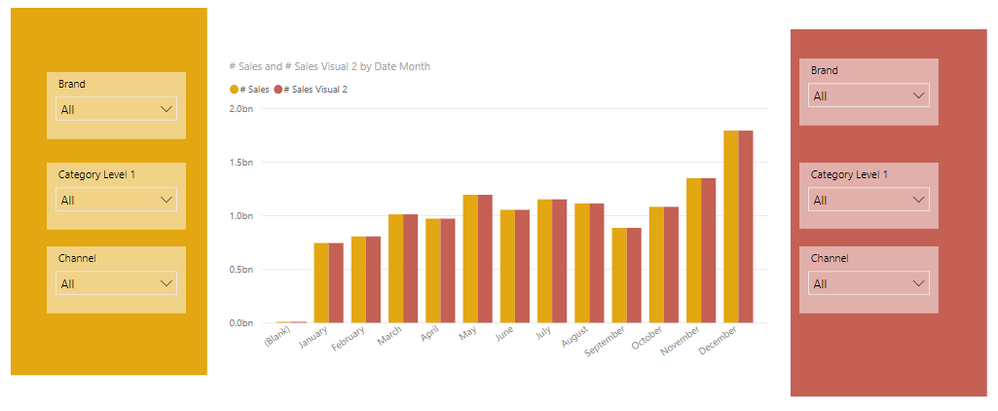
Thanks for taking the time to help out on this. I thought it might be best for me to simply add a screenshot of what I'm looking for.
On the left and right you have the three filters, and in the middle there's the chart. I want the filters on the left to only affect the orange bars, and the filters on the right to only affect the red bars.
I've tried putting two charts on top of eachother. That works pretty ok, but the downside is that when things get filtered, the X and Y axis are changing, and it gets hard to see the actual difference. I can set the X and Y to a fixed number of 2 billion, but when you start filterin the numbers will soon go to millions and less, and you can hardly see any differences in the chart then.
Thanks
- Mark as New
- Bookmark
- Subscribe
- Mute
- Subscribe to RSS Feed
- Permalink
- Report Inappropriate Content
Hi @Anonymous
You may try to create a Month table and use it as x-axis.Create the second same data table to get the sales.Link them as below.Please refer to below attached simple file.
Regards,
If this post helps, then please consider Accept it as the solution to help the other members find it more quickly.
- Mark as New
- Bookmark
- Subscribe
- Mute
- Subscribe to RSS Feed
- Permalink
- Report Inappropriate Content
Hi @v-cherch-msft ,
That's a great idea, I would never have thought of that. Thanks for finding out and attaching the file.
It's not the ideal solution as I'm working with lots of filters and millions of rows of data that need to be duplicated to an other table, but I'm going to give it a go anyway.
Thanks for your help!
Bas
Helpful resources

Microsoft Fabric Learn Together
Covering the world! 9:00-10:30 AM Sydney, 4:00-5:30 PM CET (Paris/Berlin), 7:00-8:30 PM Mexico City

Power BI Monthly Update - April 2024
Check out the April 2024 Power BI update to learn about new features.

| User | Count |
|---|---|
| 107 | |
| 98 | |
| 78 | |
| 66 | |
| 53 |
| User | Count |
|---|---|
| 144 | |
| 104 | |
| 100 | |
| 86 | |
| 64 |


