- Power BI forums
- Updates
- News & Announcements
- Get Help with Power BI
- Desktop
- Service
- Report Server
- Power Query
- Mobile Apps
- Developer
- DAX Commands and Tips
- Custom Visuals Development Discussion
- Health and Life Sciences
- Power BI Spanish forums
- Translated Spanish Desktop
- Power Platform Integration - Better Together!
- Power Platform Integrations (Read-only)
- Power Platform and Dynamics 365 Integrations (Read-only)
- Training and Consulting
- Instructor Led Training
- Dashboard in a Day for Women, by Women
- Galleries
- Community Connections & How-To Videos
- COVID-19 Data Stories Gallery
- Themes Gallery
- Data Stories Gallery
- R Script Showcase
- Webinars and Video Gallery
- Quick Measures Gallery
- 2021 MSBizAppsSummit Gallery
- 2020 MSBizAppsSummit Gallery
- 2019 MSBizAppsSummit Gallery
- Events
- Ideas
- Custom Visuals Ideas
- Issues
- Issues
- Events
- Upcoming Events
- Community Blog
- Power BI Community Blog
- Custom Visuals Community Blog
- Community Support
- Community Accounts & Registration
- Using the Community
- Community Feedback
Register now to learn Fabric in free live sessions led by the best Microsoft experts. From Apr 16 to May 9, in English and Spanish.
- Power BI forums
- Forums
- Get Help with Power BI
- Desktop
- Re: Visual to compare monthly performance of diffe...
- Subscribe to RSS Feed
- Mark Topic as New
- Mark Topic as Read
- Float this Topic for Current User
- Bookmark
- Subscribe
- Printer Friendly Page
- Mark as New
- Bookmark
- Subscribe
- Mute
- Subscribe to RSS Feed
- Permalink
- Report Inappropriate Content
Visual to compare monthly performance of different sales people
Hi, new to PowerBI, hopefully this question will make sense.
I've been asked to create a visual that allows our sales VPs to see how their team members are performing monthly, and then to contrast their performance against the rest of the team. My model contains a table that has the date the Opportunity is created with the Amount, sales rep ID. A separate table contains the sales rep ID, name, and the region that they belong to.
I'm using a Line Chart right now (not married to it) but that just shows a single line for the amount. What I would like is to have a multi select slicer appear on the page, that allows the user to select more than 1 sales rep, and when another rep is added, have it show as a separate line on the same visual.
Eventually to take it even further, what they would like is to see how a given rep performs against the rest of the team in the Region.
Hopefully that's enough to go with! Thank you all in advance.
Solved! Go to Solution.
- Mark as New
- Bookmark
- Subscribe
- Mute
- Subscribe to RSS Feed
- Permalink
- Report Inappropriate Content
@Anonymous
To remove "future months", you can ceratinly use MONTH(TODAY()). Please create a "Calendar" table! and use it in your filters, slicers, visuals....
Something along the lines of:
OppAmount = IF(Calendar[month] > MONTH(TODAY()),BLANK(),CALCULATE(SUM(Opportunity[Amount])))
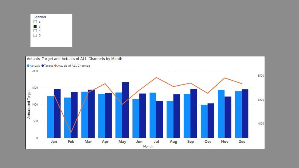
You can use a combined clustered/line chart if you wish. Here is an example where the columns refer to the values selected in the slicer (actuals and target for selected "B") and the line is the Actuals for ALL channels:
Did I answer your question? Mark my post as a solution!
In doing so, you are also helping me. Thank you!
Proud to be a Super User!
Paul on Linkedin.
- Mark as New
- Bookmark
- Subscribe
- Mute
- Subscribe to RSS Feed
- Permalink
- Report Inappropriate Content
@Anonymous , You should have region as axis and sales person as a legend . Based on your selection of sales person, no of lines can increase. You can also have a clustered bar chart.
Microsoft Power BI Learning Resources, 2023 !!
Learn Power BI - Full Course with Dec-2022, with Window, Index, Offset, 100+ Topics !!
Did I answer your question? Mark my post as a solution! Appreciate your Kudos !! Proud to be a Super User! !!
- Mark as New
- Bookmark
- Subscribe
- Mute
- Subscribe to RSS Feed
- Permalink
- Report Inappropriate Content
@Anonymous
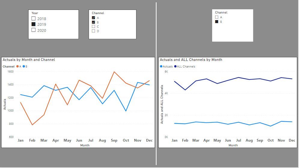
If you add the Sales Rep to your legend in the chart you will get a line for each rep you select in the slicer.
To make the slicer multi- select, do so in the format pane under selection controls for the visual.
The caveat is that if you follow ths method, you can only have one measure in the values bucket. If you need to compare one Sales ID to the rest of sales reps, you wil need to do so in a seperate visual. To calculate the values for the whole team, use ALL in the Filter expression of a CALCULATE function. In my example (visual on the right) I'm comparing actuals of Channel B to actuals of all Channels. The sum of all channels is:
Actuals of ALL Channels = CALCULATE(SUM('Fact Table'[Actuals]), ALL('Channel Dim'[Channel]))
Here is a simple example:
Did I answer your question? Mark my post as a solution!
In doing so, you are also helping me. Thank you!
Proud to be a Super User!
Paul on Linkedin.
- Mark as New
- Bookmark
- Subscribe
- Mute
- Subscribe to RSS Feed
- Permalink
- Report Inappropriate Content
Thanks! That helps a lot. Couple of follow up questions, I ended up switching to a clustered column chart instead.
To get around the month gaps where there was no activity, I created a measure instead of using the Amount field directly, used the following:
- Mark as New
- Bookmark
- Subscribe
- Mute
- Subscribe to RSS Feed
- Permalink
- Report Inappropriate Content
@Anonymous
To remove "future months", you can ceratinly use MONTH(TODAY()). Please create a "Calendar" table! and use it in your filters, slicers, visuals....
Something along the lines of:
OppAmount = IF(Calendar[month] > MONTH(TODAY()),BLANK(),CALCULATE(SUM(Opportunity[Amount])))
You can use a combined clustered/line chart if you wish. Here is an example where the columns refer to the values selected in the slicer (actuals and target for selected "B") and the line is the Actuals for ALL channels:
Did I answer your question? Mark my post as a solution!
In doing so, you are also helping me. Thank you!
Proud to be a Super User!
Paul on Linkedin.
Helpful resources

Microsoft Fabric Learn Together
Covering the world! 9:00-10:30 AM Sydney, 4:00-5:30 PM CET (Paris/Berlin), 7:00-8:30 PM Mexico City

Power BI Monthly Update - April 2024
Check out the April 2024 Power BI update to learn about new features.

| User | Count |
|---|---|
| 114 | |
| 99 | |
| 75 | |
| 73 | |
| 49 |
| User | Count |
|---|---|
| 145 | |
| 109 | |
| 109 | |
| 90 | |
| 64 |


