- Power BI forums
- Updates
- News & Announcements
- Get Help with Power BI
- Desktop
- Service
- Report Server
- Power Query
- Mobile Apps
- Developer
- DAX Commands and Tips
- Custom Visuals Development Discussion
- Health and Life Sciences
- Power BI Spanish forums
- Translated Spanish Desktop
- Power Platform Integration - Better Together!
- Power Platform Integrations (Read-only)
- Power Platform and Dynamics 365 Integrations (Read-only)
- Training and Consulting
- Instructor Led Training
- Dashboard in a Day for Women, by Women
- Galleries
- Community Connections & How-To Videos
- COVID-19 Data Stories Gallery
- Themes Gallery
- Data Stories Gallery
- R Script Showcase
- Webinars and Video Gallery
- Quick Measures Gallery
- 2021 MSBizAppsSummit Gallery
- 2020 MSBizAppsSummit Gallery
- 2019 MSBizAppsSummit Gallery
- Events
- Ideas
- Custom Visuals Ideas
- Issues
- Issues
- Events
- Upcoming Events
- Community Blog
- Power BI Community Blog
- Custom Visuals Community Blog
- Community Support
- Community Accounts & Registration
- Using the Community
- Community Feedback
Register now to learn Fabric in free live sessions led by the best Microsoft experts. From Apr 16 to May 9, in English and Spanish.
- Power BI forums
- Forums
- Get Help with Power BI
- Desktop
- Visual shows wrong data/ invents values
- Subscribe to RSS Feed
- Mark Topic as New
- Mark Topic as Read
- Float this Topic for Current User
- Bookmark
- Subscribe
- Printer Friendly Page
- Mark as New
- Bookmark
- Subscribe
- Mute
- Subscribe to RSS Feed
- Permalink
- Report Inappropriate Content
Visual shows wrong data/ invents values
Hi,
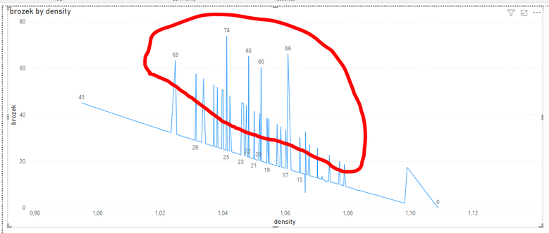
I have a small dataset that contains the bodyfat (called here "brozek" because of the used calculation method) and and the density of random people. There is definitly a linear relationship between both values. The Problem is, in a line chart visual the result looks like shown in the image below. All the red marked peaks are wrong aka values that don't exist in my dataset.
If I create a card visual with the max of brozek (y-axis) one can see that the max value is soemthing around 45 and the peaks are obvious "fake" values, invented by the visual.
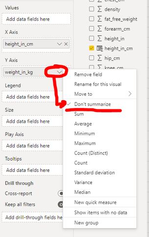
The same strange behavior can one see in the scatter chart visual. If I try to plot the relation between weight (y-axis) and height (x-axis) of a person, I get the following chart.
All the red marked points don't exist in my dataset. The only way I can overcome this is by forcing the x-axis range maximum to the maximum height.
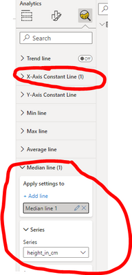
Update: Interestingly even the median lines are different. Though both are just selected under the analytics button (no own Dax formula) they plot me two different lines......
I guess, I'm using the visuals in the wrong way, but I don't get it. Maybe someone can give me a hint.
Thx HenX.
Solved! Go to Solution.
- Mark as New
- Bookmark
- Subscribe
- Mute
- Subscribe to RSS Feed
- Permalink
- Report Inappropriate Content
Hello @HenX ,
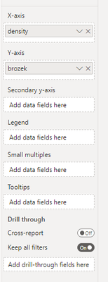
What is the summarization you're using for the brozek column? On the first chart perhaps you have multiple brozek values for density and the brozek column is summing those values for each density value?
- Mark as New
- Bookmark
- Subscribe
- Mute
- Subscribe to RSS Feed
- Permalink
- Report Inappropriate Content
The solution for the other issues is also the aggregation function. If I select "don't summarize" it works as expected.
- Mark as New
- Bookmark
- Subscribe
- Mute
- Subscribe to RSS Feed
- Permalink
- Report Inappropriate Content
Thanks @James-Harpin,
yes you were right. There were multiple brozek values for some density values and were summed up. By using Average the chart is as expected. 🙂
Helpful resources

Microsoft Fabric Learn Together
Covering the world! 9:00-10:30 AM Sydney, 4:00-5:30 PM CET (Paris/Berlin), 7:00-8:30 PM Mexico City

Power BI Monthly Update - April 2024
Check out the April 2024 Power BI update to learn about new features.

| User | Count |
|---|---|
| 118 | |
| 107 | |
| 70 | |
| 70 | |
| 43 |
| User | Count |
|---|---|
| 148 | |
| 106 | |
| 104 | |
| 89 | |
| 65 |
