- Power BI forums
- Updates
- News & Announcements
- Get Help with Power BI
- Desktop
- Service
- Report Server
- Power Query
- Mobile Apps
- Developer
- DAX Commands and Tips
- Custom Visuals Development Discussion
- Health and Life Sciences
- Power BI Spanish forums
- Translated Spanish Desktop
- Power Platform Integration - Better Together!
- Power Platform Integrations (Read-only)
- Power Platform and Dynamics 365 Integrations (Read-only)
- Training and Consulting
- Instructor Led Training
- Dashboard in a Day for Women, by Women
- Galleries
- Community Connections & How-To Videos
- COVID-19 Data Stories Gallery
- Themes Gallery
- Data Stories Gallery
- R Script Showcase
- Webinars and Video Gallery
- Quick Measures Gallery
- 2021 MSBizAppsSummit Gallery
- 2020 MSBizAppsSummit Gallery
- 2019 MSBizAppsSummit Gallery
- Events
- Ideas
- Custom Visuals Ideas
- Issues
- Issues
- Events
- Upcoming Events
- Community Blog
- Power BI Community Blog
- Custom Visuals Community Blog
- Community Support
- Community Accounts & Registration
- Using the Community
- Community Feedback
Register now to learn Fabric in free live sessions led by the best Microsoft experts. From Apr 16 to May 9, in English and Spanish.
- Power BI forums
- Forums
- Get Help with Power BI
- Desktop
- Visual help for custom grouped cluster chart
- Subscribe to RSS Feed
- Mark Topic as New
- Mark Topic as Read
- Float this Topic for Current User
- Bookmark
- Subscribe
- Printer Friendly Page
- Mark as New
- Bookmark
- Subscribe
- Mute
- Subscribe to RSS Feed
- Permalink
- Report Inappropriate Content
Visual help for custom grouped cluster chart
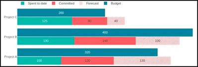
Hi all, I was wondering if anyone has come across somthing like this or can help. I have three measures one for actual , one for the remaining forecast (ie total forecast less actual) and one for budget.
I was trying to put them in a stacked bar chart (like the below) so that the actual and forecast on one bar is stacked against the budget bar (which is not stacked). What would be ideal is also showing the total of the actual and foreccast against the total budget (I have worked out how to do that part on a combo - line and stacked column chart although this chart is virtical and not horizontal which I needed to save space)
I have searched a number of sources, and could not find any clear way of just doing this, therefore any help would be really appreciated.
Solved! Go to Solution.
- Mark as New
- Bookmark
- Subscribe
- Mute
- Subscribe to RSS Feed
- Permalink
- Report Inappropriate Content
Hi @pjukone ,
I am not very sure, if I have understood your requirements very clearly. But Given the appearance of chart, you can create one in PBIVizEdit.
You can modify similar chart https://pbivizedit.com/gallery/budget-vs-actual:
Thanks,
-R
- Mark as New
- Bookmark
- Subscribe
- Mute
- Subscribe to RSS Feed
- Permalink
- Report Inappropriate Content
Hi Radhey, This is exactly what I had been looking for, this took me a long time googling this, but you found the solution staight away. A big thank you for your help with this!
- Mark as New
- Bookmark
- Subscribe
- Mute
- Subscribe to RSS Feed
- Permalink
- Report Inappropriate Content
Have you tried to unpivot the data set in power query?
This will only work if you create a single column of that status (actual/forecast/budget), then another with the value on each status. You may need to transform the data slightly before that but could be effective for your scenario.
You just select those 2 columns, plus whatever fields you still want to bring over, and unpivot from there.
Then you'd need to clean up your stacked chart visual, to use the new fields 😊
- Mark as New
- Bookmark
- Subscribe
- Mute
- Subscribe to RSS Feed
- Permalink
- Report Inappropriate Content
Hi Kmcdonald, The values are in a measure, thanks for your help, I think the above solution of the visual did the trick.
Kind regards,
P
Helpful resources

Microsoft Fabric Learn Together
Covering the world! 9:00-10:30 AM Sydney, 4:00-5:30 PM CET (Paris/Berlin), 7:00-8:30 PM Mexico City

Power BI Monthly Update - April 2024
Check out the April 2024 Power BI update to learn about new features.

| User | Count |
|---|---|
| 115 | |
| 100 | |
| 88 | |
| 68 | |
| 61 |
| User | Count |
|---|---|
| 150 | |
| 120 | |
| 100 | |
| 87 | |
| 68 |


