- Power BI forums
- Updates
- News & Announcements
- Get Help with Power BI
- Desktop
- Service
- Report Server
- Power Query
- Mobile Apps
- Developer
- DAX Commands and Tips
- Custom Visuals Development Discussion
- Health and Life Sciences
- Power BI Spanish forums
- Translated Spanish Desktop
- Power Platform Integration - Better Together!
- Power Platform Integrations (Read-only)
- Power Platform and Dynamics 365 Integrations (Read-only)
- Training and Consulting
- Instructor Led Training
- Dashboard in a Day for Women, by Women
- Galleries
- Community Connections & How-To Videos
- COVID-19 Data Stories Gallery
- Themes Gallery
- Data Stories Gallery
- R Script Showcase
- Webinars and Video Gallery
- Quick Measures Gallery
- 2021 MSBizAppsSummit Gallery
- 2020 MSBizAppsSummit Gallery
- 2019 MSBizAppsSummit Gallery
- Events
- Ideas
- Custom Visuals Ideas
- Issues
- Issues
- Events
- Upcoming Events
- Community Blog
- Power BI Community Blog
- Custom Visuals Community Blog
- Community Support
- Community Accounts & Registration
- Using the Community
- Community Feedback
Register now to learn Fabric in free live sessions led by the best Microsoft experts. From Apr 16 to May 9, in English and Spanish.
- Power BI forums
- Forums
- Get Help with Power BI
- Desktop
- Visual Help: Line chart, with legend, and a dynami...
- Subscribe to RSS Feed
- Mark Topic as New
- Mark Topic as Read
- Float this Topic for Current User
- Bookmark
- Subscribe
- Printer Friendly Page
- Mark as New
- Bookmark
- Subscribe
- Mute
- Subscribe to RSS Feed
- Permalink
- Report Inappropriate Content
Visual Help: Line chart, with legend, and a dynamic constant line
Hi All,
Im after a way, to display a Line chart, with a legend, AND have said line chart always be able to plot a single constant line (which is dynamic/data driven).
Our scenario,
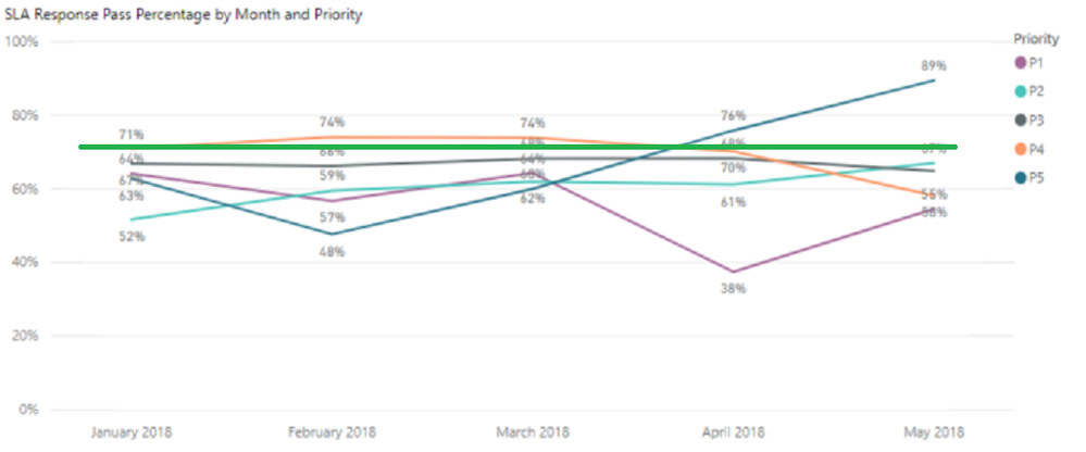
We need to display SLA % passed, by month, dissected by priority.
We also have a requirement for the SLA Target (say 90%) to be displayed as say a red line/shaded area/whatever, so we can see that the sla's by priority are clearly falling below target.
A Line and clustered column chart kind of gets me there - but the visual for it isnt what the business wants.
Making the column stacks as the sla then the target the line plot does plot what i need, but does a poor job of showing up/down slided between months, a line does this better than a column.
In this case:
- our X axis is month
- Our plotted value is SLA %
- Our legend is priority (so each priority's sla is plotted as a separate line).
The line chart (nor any chart it seems) allows me to plot multiple values AND have a legend. It seems to be one way or the other.
Does anyone know of a work around, or a marketplace visual that may help?
I've also considered doing this as KPI, but this wont behave correctly either, as i cant get the sla/priority plot split on a single graph to happen.
A sample of what im after, where the green line is a constant line coming from a datasource (measure). I added the line in myself to illustrate the sample.
Thanks,
Andrew
Solved! Go to Solution.
- Mark as New
- Bookmark
- Subscribe
- Mute
- Subscribe to RSS Feed
- Permalink
- Report Inappropriate Content
Currently, it is not possible to create a dynamic constant line based on measure, for this issue, you can vote up this idea.
As a workaround for this issue, you can use "Line and clustered column chart" instead of Line chart, drag the measure to Line values section of the chart.
Regards,
Lydia
If this post helps, then please consider Accept it as the solution to help the other members find it more quickly.
Helpful resources

Microsoft Fabric Learn Together
Covering the world! 9:00-10:30 AM Sydney, 4:00-5:30 PM CET (Paris/Berlin), 7:00-8:30 PM Mexico City

Power BI Monthly Update - April 2024
Check out the April 2024 Power BI update to learn about new features.

| User | Count |
|---|---|
| 113 | |
| 99 | |
| 80 | |
| 70 | |
| 60 |
| User | Count |
|---|---|
| 149 | |
| 114 | |
| 107 | |
| 89 | |
| 67 |

