- Power BI forums
- Updates
- News & Announcements
- Get Help with Power BI
- Desktop
- Service
- Report Server
- Power Query
- Mobile Apps
- Developer
- DAX Commands and Tips
- Custom Visuals Development Discussion
- Health and Life Sciences
- Power BI Spanish forums
- Translated Spanish Desktop
- Power Platform Integration - Better Together!
- Power Platform Integrations (Read-only)
- Power Platform and Dynamics 365 Integrations (Read-only)
- Training and Consulting
- Instructor Led Training
- Dashboard in a Day for Women, by Women
- Galleries
- Community Connections & How-To Videos
- COVID-19 Data Stories Gallery
- Themes Gallery
- Data Stories Gallery
- R Script Showcase
- Webinars and Video Gallery
- Quick Measures Gallery
- 2021 MSBizAppsSummit Gallery
- 2020 MSBizAppsSummit Gallery
- 2019 MSBizAppsSummit Gallery
- Events
- Ideas
- Custom Visuals Ideas
- Issues
- Issues
- Events
- Upcoming Events
- Community Blog
- Power BI Community Blog
- Custom Visuals Community Blog
- Community Support
- Community Accounts & Registration
- Using the Community
- Community Feedback
Register now to learn Fabric in free live sessions led by the best Microsoft experts. From Apr 16 to May 9, in English and Spanish.
- Power BI forums
- Forums
- Get Help with Power BI
- Desktop
- Re: Values in graph not filtered by the date slice...
- Subscribe to RSS Feed
- Mark Topic as New
- Mark Topic as Read
- Float this Topic for Current User
- Bookmark
- Subscribe
- Printer Friendly Page
- Mark as New
- Bookmark
- Subscribe
- Mute
- Subscribe to RSS Feed
- Permalink
- Report Inappropriate Content
Values in graph not filtered by the date slicer (or only the year)
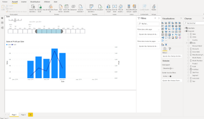
The graph is filtered by date slicer.
If I select for example january to May on the slicer, it will filter the graph :

On this visual, I just want the line (Profit) from January to December (not from January to July like in the date slicer).
I used this DAX formula for the date slicer :
Date =
VAR MinYear = YEAR ( MIN ( Reporting[Date] ) )
VAR MaxYear = YEAR ( MAX ( Reporting[Date] ) )
RETURN
ADDCOLUMNS (
FILTER (
CALENDARAUTO( ),
AND ( YEAR ( [Date] ) >= MinYear, YEAR ( [Date] ) <= MaxYear )
),
"Calendar Year", "CY " & YEAR ( [Date] ),
"Month Name", FORMAT ( [Date], "mmmm" ),
"Month Number", MONTH ( [Date] ),
"Weekday", FORMAT ( [Date], "dddd" ),
"Weekday number", WEEKDAY( [Date] ),
"Quarter", "Q" & TRUNC ( ( MONTH ( [Date] ) - 1 ) / 3 ) + 1
)
And the X axis of my graph is Month Name
is it possible to select january to may in the slicer and have the x axis from January to December and the line from January to December too?
Thank you
Solved! Go to Solution.
- Mark as New
- Bookmark
- Subscribe
- Mute
- Subscribe to RSS Feed
- Permalink
- Report Inappropriate Content
Hi @ADN75
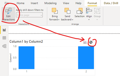
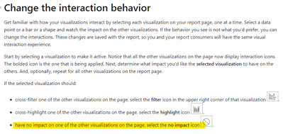
You can turn off the interaction with the two visuals .You can refer to the link below .
https://docs.microsoft.com/en-us/power-bi/create-reports/service-reports-visual-interactions
Best Regards
Community Support Team _ Ailsa Tao
If this post helps, then please consider Accept it as the solution to help the other members find it more quickly.
- Mark as New
- Bookmark
- Subscribe
- Mute
- Subscribe to RSS Feed
- Permalink
- Report Inappropriate Content
Hi @ADN75
So is the visual in the screenshot you provided the final result you want ? Can you provide me with a detailed pbix file and the final result you want ?
Best Regards
Community Support Team _ Ailsa Tao
If this post helps, then please consider Accept it as the solution to help the other members find it more quickly.
- Mark as New
- Bookmark
- Subscribe
- Mute
- Subscribe to RSS Feed
- Permalink
- Report Inappropriate Content
No, I just want to have the line in my graph not filtered by the date slicer as the x axis.
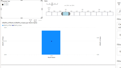
For example, if I select only April :
I want to have my graph with all the months (from Jan to Dec not like in screenshot) as the line.
How can I provide you my pbix file?
Thank you
- Mark as New
- Bookmark
- Subscribe
- Mute
- Subscribe to RSS Feed
- Permalink
- Report Inappropriate Content
@ADN75 , if you select a range and if you want data less than that range, you can restrict.
But if you need more range then, then you need an independent table
Need of an Independent Date Table:https://www.youtube.com/watch?v=44fGGmg9fHI
Microsoft Power BI Learning Resources, 2023 !!
Learn Power BI - Full Course with Dec-2022, with Window, Index, Offset, 100+ Topics !!
Did I answer your question? Mark my post as a solution! Appreciate your Kudos !! Proud to be a Super User! !!
- Mark as New
- Bookmark
- Subscribe
- Mute
- Subscribe to RSS Feed
- Permalink
- Report Inappropriate Content
Hi @amitchandak,
Thank you for your answer ! I managed to create my measure "Last 12 Month Forecast" like in your videos.
My problem now is to show the whole year :
I select a year and the months of the year I want to display (only for production).
Now I try to display all the year (from January to December) on the X axis (only filtered by the slicer on the top left) and have my new measure only filtered by this slicer. But I want my production (the bars) filtered by the slicer on the top right.
Do you know if it's possible?
Helpful resources

Microsoft Fabric Learn Together
Covering the world! 9:00-10:30 AM Sydney, 4:00-5:30 PM CET (Paris/Berlin), 7:00-8:30 PM Mexico City

Power BI Monthly Update - April 2024
Check out the April 2024 Power BI update to learn about new features.

| User | Count |
|---|---|
| 110 | |
| 96 | |
| 77 | |
| 63 | |
| 55 |
| User | Count |
|---|---|
| 143 | |
| 109 | |
| 89 | |
| 84 | |
| 66 |


