- Power BI forums
- Updates
- News & Announcements
- Get Help with Power BI
- Desktop
- Service
- Report Server
- Power Query
- Mobile Apps
- Developer
- DAX Commands and Tips
- Custom Visuals Development Discussion
- Health and Life Sciences
- Power BI Spanish forums
- Translated Spanish Desktop
- Power Platform Integration - Better Together!
- Power Platform Integrations (Read-only)
- Power Platform and Dynamics 365 Integrations (Read-only)
- Training and Consulting
- Instructor Led Training
- Dashboard in a Day for Women, by Women
- Galleries
- Community Connections & How-To Videos
- COVID-19 Data Stories Gallery
- Themes Gallery
- Data Stories Gallery
- R Script Showcase
- Webinars and Video Gallery
- Quick Measures Gallery
- 2021 MSBizAppsSummit Gallery
- 2020 MSBizAppsSummit Gallery
- 2019 MSBizAppsSummit Gallery
- Events
- Ideas
- Custom Visuals Ideas
- Issues
- Issues
- Events
- Upcoming Events
- Community Blog
- Power BI Community Blog
- Custom Visuals Community Blog
- Community Support
- Community Accounts & Registration
- Using the Community
- Community Feedback
Register now to learn Fabric in free live sessions led by the best Microsoft experts. From Apr 16 to May 9, in English and Spanish.
- Power BI forums
- Forums
- Get Help with Power BI
- Desktop
- Re: Using maximum percentage from cumulative data
- Subscribe to RSS Feed
- Mark Topic as New
- Mark Topic as Read
- Float this Topic for Current User
- Bookmark
- Subscribe
- Printer Friendly Page
- Mark as New
- Bookmark
- Subscribe
- Mute
- Subscribe to RSS Feed
- Permalink
- Report Inappropriate Content
Using maximum percentage from cumulative data
Hi all,
I'm having an issue with a graph I'm trying to create for a client's dashboard. For context I've just completed a project where I've been doing multiple tests per day during the assignment. What I'm trying to do is create a line graph using imported Excel data to show the planned execution dates along the X axis and the target % of tests executed on the Y axis.
The problem we're having is that because there's multiple target percentages assigned to each day, the best option we can find so far for plotting the graph is having the percentage as an average, which causes the maximum value to fall below 100% due to the fact that there's multiple values per day. For example, the last day of testing was November 29th, but there was 10 tests on that day, so the cumulative % on that day is being divided by 10, leading to an average of 98.7% of tests executed as our maximum value on the Y axis.
Is there a way to plot this data as it is, or will I need to alter it so that it's more like total number of tests run per day?
Solved! Go to Solution.
- Mark as New
- Bookmark
- Subscribe
- Mute
- Subscribe to RSS Feed
- Permalink
- Report Inappropriate Content
It's all good, my colleague figured out a workaround whereby he created a separate table of dates then used measures/relationships to plot the graph properly. Thanks anyway 🙂
- Mark as New
- Bookmark
- Subscribe
- Mute
- Subscribe to RSS Feed
- Permalink
- Report Inappropriate Content
Hi @Locken,
I'm trying to understand your situation, could you please describe by 1-2 pictures(data structure or fields, current sample data) with 1-2 picture expectations?, so it will be easier to understand and quickly propose solution for you.
- Mark as New
- Bookmark
- Subscribe
- Mute
- Subscribe to RSS Feed
- Permalink
- Report Inappropriate Content
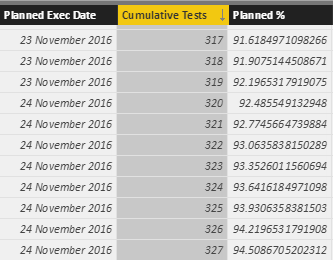
Sure thing, the data I'm using looks like this (finishing on 29 November 2016 with Planned % at 100):
The graph I've managed to produce thus far looks like this (note the final date of 29th Nov has 98.7%):
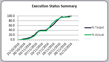
Ultimately I want to be able to plot the actual test execution progress against the planned execution dates, so it looks akin to this:
Thanks for the reply
- Mark as New
- Bookmark
- Subscribe
- Mute
- Subscribe to RSS Feed
- Permalink
- Report Inappropriate Content
Hi @Locken,
Sorry for late response, i just finished dinner after work. As my understand, Cummulative tests is Actual data, so how to calculated the target % ? and The Planned % is manually input or should re-calculated from some fields?
- Mark as New
- Bookmark
- Subscribe
- Mute
- Subscribe to RSS Feed
- Permalink
- Report Inappropriate Content
It's all good, my colleague figured out a workaround whereby he created a separate table of dates then used measures/relationships to plot the graph properly. Thanks anyway 🙂
Helpful resources

Microsoft Fabric Learn Together
Covering the world! 9:00-10:30 AM Sydney, 4:00-5:30 PM CET (Paris/Berlin), 7:00-8:30 PM Mexico City

Power BI Monthly Update - April 2024
Check out the April 2024 Power BI update to learn about new features.

| User | Count |
|---|---|
| 118 | |
| 107 | |
| 69 | |
| 68 | |
| 43 |
| User | Count |
|---|---|
| 148 | |
| 104 | |
| 104 | |
| 89 | |
| 66 |


