- Power BI forums
- Updates
- News & Announcements
- Get Help with Power BI
- Desktop
- Service
- Report Server
- Power Query
- Mobile Apps
- Developer
- DAX Commands and Tips
- Custom Visuals Development Discussion
- Health and Life Sciences
- Power BI Spanish forums
- Translated Spanish Desktop
- Power Platform Integration - Better Together!
- Power Platform Integrations (Read-only)
- Power Platform and Dynamics 365 Integrations (Read-only)
- Training and Consulting
- Instructor Led Training
- Dashboard in a Day for Women, by Women
- Galleries
- Community Connections & How-To Videos
- COVID-19 Data Stories Gallery
- Themes Gallery
- Data Stories Gallery
- R Script Showcase
- Webinars and Video Gallery
- Quick Measures Gallery
- 2021 MSBizAppsSummit Gallery
- 2020 MSBizAppsSummit Gallery
- 2019 MSBizAppsSummit Gallery
- Events
- Ideas
- Custom Visuals Ideas
- Issues
- Issues
- Events
- Upcoming Events
- Community Blog
- Power BI Community Blog
- Custom Visuals Community Blog
- Community Support
- Community Accounts & Registration
- Using the Community
- Community Feedback
Register now to learn Fabric in free live sessions led by the best Microsoft experts. From Apr 16 to May 9, in English and Spanish.
- Power BI forums
- Forums
- Get Help with Power BI
- Desktop
- Re: Using multiple filters and a measure as a sour...
- Subscribe to RSS Feed
- Mark Topic as New
- Mark Topic as Read
- Float this Topic for Current User
- Bookmark
- Subscribe
- Printer Friendly Page
- Mark as New
- Bookmark
- Subscribe
- Mute
- Subscribe to RSS Feed
- Permalink
- Report Inappropriate Content
Using a Multiple filters and a Measure as the Source and Destinations for a Sankey Visual
I have data that looks simplified looks something like this
| PersonID | Year | Report | Score | Level | ||||
| 123 | 20192020 | 1M | 65 | L2 | ||||
| 134 | 20192020 | 1M | 55 | L1 | ||||
| 123 | 20192020 | 1M | 67 | L2 | ||||
| 145 | 20192020 | 1M | 95 | L4 | ||||
| 123 | 20202021 | 1M | 75 | L3 | ||||
| 134 | 20202021 | 1M | 55 | L1 | ||||
| 134 | 20202021 | 1M | 45 | R | ||||
| 145 | 20202021 | 1M | 78 | L3 |

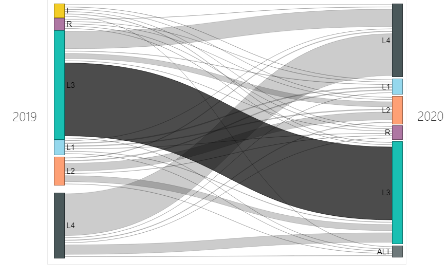
I'd like to produce a Sankey Chart that looks something like above.
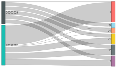
The best I can do is something like this:
I've tried every combination of source, destination, label, etc. without success.
I then tried to create to measures so that I could filter out the year and use one measure for the Destination and another for the Destination Labels.
and
I can pull these measures into a table and use them, but they will not drag into any of the Sankey fields.
I'm obviously missing something. I would like to do this in DAX without going to data tables.
Thoughts on how to proceed? Curious ?
SO
Solved! Go to Solution.
- Mark as New
- Bookmark
- Subscribe
- Mute
- Subscribe to RSS Feed
- Permalink
- Report Inappropriate Content
@SO What is the context of this data? What is it you want to communicate?
I don't fully understand, but have tried pivoting your data so that you have one column for source and one column for destination, I'm just not sure what to use for the values in these columns (I used Level and set to don't aggregate), but not every person ID has data for both years...
See file attached below signature.
Please @mention me in your reply if you want a response.
Copying DAX from this post? Click here for a hack to quickly replace it with your own table names
Has this post solved your problem? Please Accept as Solution so that others can find it quickly and to let the community know your problem has been solved.
If you found this post helpful, please give Kudos C
I work as a Microsoft trainer and consultant, specialising in Power BI and Power Query.
www.excelwithallison.com
- Mark as New
- Bookmark
- Subscribe
- Mute
- Subscribe to RSS Feed
- Permalink
- Report Inappropriate Content
Thanks very much Allison.
Each person has 6 scores for each reporting period and there are 6 reporting periods a year and there are 100K entrys per report. Pivoting the table is not an option for me so I was trying to find a way to use a measure to sort this out. We also use AnalysisServices.
You asked a great question, what am I trying to show? I'm trying to find people that have moved from one level to another over time. It appears that most remain at the same level, but some move up, and others down. I'd really like to have the pattern continue over several reports or years, but one step at a time. :-).
Thanks for attempt and much appreciated. I was able to generate my 'ideal' image by creating a small data set and doing what you did. Very intensive to do for each reporting period. Any more thoughts or ideas? I've watched many videos and read many forums and tried many measure codes, but I cannot get it to work for me.
- Mark as New
- Bookmark
- Subscribe
- Mute
- Subscribe to RSS Feed
- Permalink
- Report Inappropriate Content
@SO What is the context of this data? What is it you want to communicate?
I don't fully understand, but have tried pivoting your data so that you have one column for source and one column for destination, I'm just not sure what to use for the values in these columns (I used Level and set to don't aggregate), but not every person ID has data for both years...
See file attached below signature.
Please @mention me in your reply if you want a response.
Copying DAX from this post? Click here for a hack to quickly replace it with your own table names
Has this post solved your problem? Please Accept as Solution so that others can find it quickly and to let the community know your problem has been solved.
If you found this post helpful, please give Kudos C
I work as a Microsoft trainer and consultant, specialising in Power BI and Power Query.
www.excelwithallison.com
- Mark as New
- Bookmark
- Subscribe
- Mute
- Subscribe to RSS Feed
- Permalink
- Report Inappropriate Content
Thanks very much Allison.
Each person has 6 scores for each reporting period and there are 6 reporting periods a year and there are 100K entrys per report. Pivoting the table is not an option for me so I was trying to find a way to use a measure to sort this out. We also use AnalysisServices.
You asked a great question, what am I trying to show? I'm trying to find people that have moved from one level to another over time. It appears that most remain at the same level, but some move up, and others down. I'd really like to have the pattern continue over several reports or years, but one step at a time. :-).
Thanks for attempt and much appreciated. I was able to generate my 'ideal' image by creating a small data set and doing what you did. Very intensive to do for each reporting period. Any more thoughts or ideas? I've watched many videos and read many forums and tried many measure codes, but I cannot get it to work for me.
Helpful resources

Microsoft Fabric Learn Together
Covering the world! 9:00-10:30 AM Sydney, 4:00-5:30 PM CET (Paris/Berlin), 7:00-8:30 PM Mexico City

Power BI Monthly Update - April 2024
Check out the April 2024 Power BI update to learn about new features.

| User | Count |
|---|---|
| 112 | |
| 99 | |
| 73 | |
| 72 | |
| 49 |
| User | Count |
|---|---|
| 145 | |
| 109 | |
| 109 | |
| 90 | |
| 64 |

