- Power BI forums
- Updates
- News & Announcements
- Get Help with Power BI
- Desktop
- Service
- Report Server
- Power Query
- Mobile Apps
- Developer
- DAX Commands and Tips
- Custom Visuals Development Discussion
- Health and Life Sciences
- Power BI Spanish forums
- Translated Spanish Desktop
- Power Platform Integration - Better Together!
- Power Platform Integrations (Read-only)
- Power Platform and Dynamics 365 Integrations (Read-only)
- Training and Consulting
- Instructor Led Training
- Dashboard in a Day for Women, by Women
- Galleries
- Community Connections & How-To Videos
- COVID-19 Data Stories Gallery
- Themes Gallery
- Data Stories Gallery
- R Script Showcase
- Webinars and Video Gallery
- Quick Measures Gallery
- 2021 MSBizAppsSummit Gallery
- 2020 MSBizAppsSummit Gallery
- 2019 MSBizAppsSummit Gallery
- Events
- Ideas
- Custom Visuals Ideas
- Issues
- Issues
- Events
- Upcoming Events
- Community Blog
- Power BI Community Blog
- Custom Visuals Community Blog
- Community Support
- Community Accounts & Registration
- Using the Community
- Community Feedback
Register now to learn Fabric in free live sessions led by the best Microsoft experts. From Apr 16 to May 9, in English and Spanish.
- Power BI forums
- Forums
- Get Help with Power BI
- Desktop
- Using Slicers with Measures to select 'best' optio...
- Subscribe to RSS Feed
- Mark Topic as New
- Mark Topic as Read
- Float this Topic for Current User
- Bookmark
- Subscribe
- Printer Friendly Page
- Mark as New
- Bookmark
- Subscribe
- Mute
- Subscribe to RSS Feed
- Permalink
- Report Inappropriate Content
Using Slicers with Measures to select 'best' option and create summations of related data
Hi all,
I'm relatively new to Power BI and have been making pretty steady strides, but have hit a bit of a wall with some DAX I have been trying to piece together, Measures are still quite opaque to me. I'd really appreciate it if someone could help me out and perhaps explain the resulting DAX (assuming what I am after is achieveable! 🙂 ).
To outline the scenario (using my simplified data):
I have Servers in a variety of Cities.
I have Countries which have Pings to each of these Cities.
I have Users in a Country.
I would like to be able to create a visualisation where I can en/disable Servers, and then discover two pieces of information:
# How many Users are served by the active Servers (assuming a User uses the active Server with the best (i.e. lowest) Ping for them, being careful not to count someone twice if they can reach more than one Server with the same ping).
# In a table of Users, show which Server City and the Ping they would be getting based on their best available active Server.
- As a desirable but not necessary extra I would be interested in seeing what a query might look like if we were to also try and see what their 'fallback' Server would be if their 'best' Server was not available.
As an additional Slicer I've been looking at introducing a 'MinimumViablePing' which will also remove a Server-Country entry if their Ping is not good enough. I have some parts of this working but the above queries have hit my limit, I'll include CSVs for source data and my sample tables with DAX Measures so far below.
Source data:
Servers table:
| ServerCity |
| Cardiff |
| Edinburgh |
| London |
UserCountries table:
| Country |
| England |
| Scotland |
| Wales |
Users table:
| Username | Location |
| Alpha | England |
| Bravo | Scotland |
| Charlie | Scotland |
| Delta | Wales |
| Echo | Wales |
| Foxtrot | Wales |
Pings table:
| SourceCountry | TargetServer | Ping |
| England | Cardiff | 2 |
| England | Edinburgh | 2 |
| England | London | 1 |
| Scotland | Edinburgh | 1 |
| Scotland | London | 2 |
| Wales | Cardiff | 1 |
| Wales | Edinburgh | 2 |
| Wales | London | 3 |
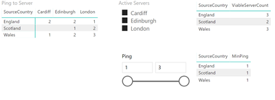
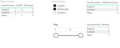
Here are some visualisations I have managed to make with my data so far.
All servers active (note, no Ping from Scotland to Cardiff so Scotland has one fewer ViableServer)
Only Cardiff and Edinburgh (note England's Min Ping is now 2)
Reduced Max Ping (note Wales can no longer reach London, reflected in ViableServerCount)
DAX for current Measures:
MinPing = MIN(Pings[Ping])
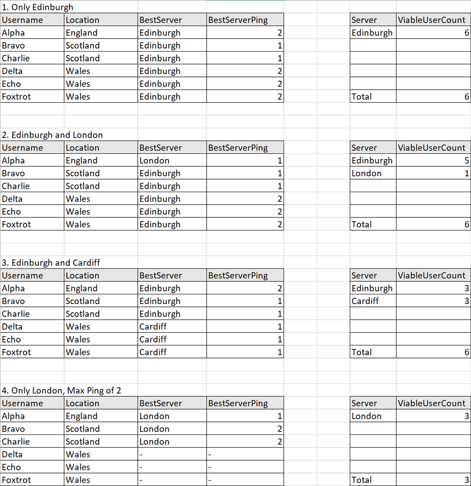
Here are some sample result tables I would like to make using the Slicers I have above (Active Servers selection, and Ping Range), the numbered title indicates options selected on the Slicers:

Thanks in advance!
- Mark as New
- Bookmark
- Subscribe
- Mute
- Subscribe to RSS Feed
- Permalink
- Report Inappropriate Content
Hi @BicycleBox ,
Thanks for your description, but I still a little confused about your requirement.
From I unserstood, it seems that you want to create a slicer for en/disable Servers so that you could get the filtered data with the slicer?
What is your desired output for your data sample? Is the last image in your post your desired output? If not, please share your expected output so that I could understand your logic better.
If it is convenient, could you share your data sample with table format so that we could copy and test on it?
Best Regards,
Cherry
If this post helps, then please consider Accept it as the solution to help the other members find it more quickly.
- Mark as New
- Bookmark
- Subscribe
- Mute
- Subscribe to RSS Feed
- Permalink
- Report Inappropriate Content
Hi @v-piga-msft ,
Thank you for your response! Sorry, I couldn't see how to add tables in the initial text editor, the option to edit the table came up once I'd added it in the HTML view, I've updated my post with those now, and hopefully clarified some parts. 🙂
Yes, the idea is to determine which users will have a valid connection and to which server depending on which servers we have active, and whether that user can reach them with a good enough ping. This is reflected in my sample results by the two tables:
The left shows which server each user would connect to (the one that is active, that they have the lowest ping for).
The right shows us a count for each server of how many users are assigned to that server (those who can reach it, and it is their lowest ping).
I hope that helps clear things up, do ask if I'm still confusing matters and I can try to provide more specifics!
Thanks!
- Mark as New
- Bookmark
- Subscribe
- Mute
- Subscribe to RSS Feed
- Permalink
- Report Inappropriate Content
I have made some headway with this, though could still use some help to get my final queries over the line. 🙂
Referencing this post:
https://powerpivotpro.com/2015/07/rankx-with-ascending-order-to-show-lowest-quotes-by-vendors/
Translating the equivalent values of Server to Vendor, Quote to Ping and Product to Country.
I have managed to construct a visualisation such that for a given country I can show which server is best for it:
I'd like to focus on the right-hand table I am trying to achieve for now.
I cannot work out how to integrate the results of these values in some new measures to get the final tables and counts I am looking for. I feel like I need some DAX in a Measure to merge together a new table which will give me a Username, their Country, and its RankedServerName, and then, placing ServerName and my new measure in a table it should count the rows of the matching RankedServerName, which should give me the right-hand table I was trying to create.
To try and provide another way of describing this for clarity: in the context of the original tutorial I linked, I would guess this would be equivalent to finding, for each Vendor, every Product for which they provided the best quote, and then taking it a step further beyond their model, perhaps consider an additional table of Customers each of which would like to buy a single Product, and then we could work out how many customers would ultimately be served by buying from each Vendor.
Helpful resources

Microsoft Fabric Learn Together
Covering the world! 9:00-10:30 AM Sydney, 4:00-5:30 PM CET (Paris/Berlin), 7:00-8:30 PM Mexico City

Power BI Monthly Update - April 2024
Check out the April 2024 Power BI update to learn about new features.

| User | Count |
|---|---|
| 112 | |
| 100 | |
| 80 | |
| 64 | |
| 57 |
| User | Count |
|---|---|
| 146 | |
| 110 | |
| 93 | |
| 84 | |
| 67 |


