- Power BI forums
- Updates
- News & Announcements
- Get Help with Power BI
- Desktop
- Service
- Report Server
- Power Query
- Mobile Apps
- Developer
- DAX Commands and Tips
- Custom Visuals Development Discussion
- Health and Life Sciences
- Power BI Spanish forums
- Translated Spanish Desktop
- Power Platform Integration - Better Together!
- Power Platform Integrations (Read-only)
- Power Platform and Dynamics 365 Integrations (Read-only)
- Training and Consulting
- Instructor Led Training
- Dashboard in a Day for Women, by Women
- Galleries
- Community Connections & How-To Videos
- COVID-19 Data Stories Gallery
- Themes Gallery
- Data Stories Gallery
- R Script Showcase
- Webinars and Video Gallery
- Quick Measures Gallery
- 2021 MSBizAppsSummit Gallery
- 2020 MSBizAppsSummit Gallery
- 2019 MSBizAppsSummit Gallery
- Events
- Ideas
- Custom Visuals Ideas
- Issues
- Issues
- Events
- Upcoming Events
- Community Blog
- Power BI Community Blog
- Custom Visuals Community Blog
- Community Support
- Community Accounts & Registration
- Using the Community
- Community Feedback
Register now to learn Fabric in free live sessions led by the best Microsoft experts. From Apr 16 to May 9, in English and Spanish.
- Power BI forums
- Forums
- Get Help with Power BI
- Desktop
- Re: Using Slicer Value to Limit Data
- Subscribe to RSS Feed
- Mark Topic as New
- Mark Topic as Read
- Float this Topic for Current User
- Bookmark
- Subscribe
- Printer Friendly Page
- Mark as New
- Bookmark
- Subscribe
- Mute
- Subscribe to RSS Feed
- Permalink
- Report Inappropriate Content
Using Slicer Value to Limit Data
I have a slicer dropdown which is a list of weeks from a table
The user selects a week and aggregations of that data (e.g. sales) are shown in various cards on screen
I'd also like to have a chart which displays all the history of sales by week up to the week selection
Bit stuck on how to do the chart bit. Can anyone help please?
- Mark as New
- Bookmark
- Subscribe
- Mute
- Subscribe to RSS Feed
- Permalink
- Report Inappropriate Content
Hi @johnmc,
Assuming that you have a weeknum column, you could create a measure like below.
Measure =
IF (
    ISFILTERED ( 'table'[weeknum] ),
    CALCULATE (
        SUM ( 'table'[Sales] ),
        FILTER (
            'table',
            WEEKNUM ( 'table'[Date] ) = WEEKNUM ( MAX ( 'table'[Date] ) )
        )
    ),
    BLANK ()
)
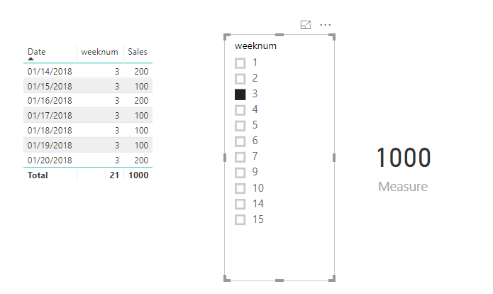
Then when you select the weeknum in a slicer, you will get the weekly total sales.
If you still need help, please share some data sample and your desired output so that we could help further investigate on it?
Best Regards,
Cherry
If this post helps, then please consider Accept it as the solution to help the other members find it more quickly.
- Mark as New
- Bookmark
- Subscribe
- Mute
- Subscribe to RSS Feed
- Permalink
- Report Inappropriate Content
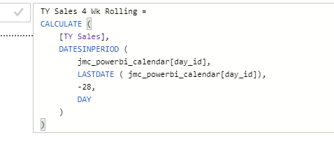
Hi - thanks for the replies and the direction so far. I've posted screenshots of my process
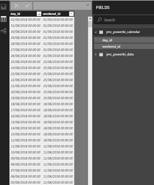
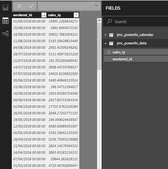
I have a calendar table and data table which are linked.
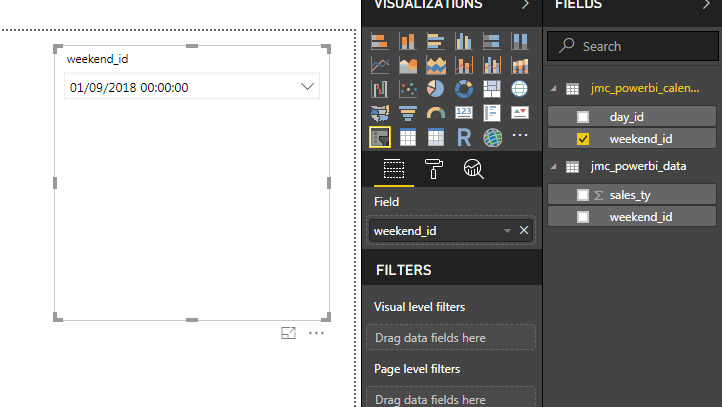
I then create a drop down slicer based on the weekend_id in calendar
I then create a couple of measures - TY Sales and TY Sales 4 Wk Rolling
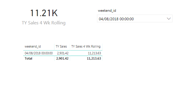
I then add a card and a table to the report.
Card = TY Sales 4 Wk Rolling
Table = weekend_id from calendar and the x2 created sales measures
The card is displaying the correct value
How would I go about getting the table to show a row by row history of say 52 weeks up to the selection date?
In methods so far I can only get one or the other to happen


- Mark as New
- Bookmark
- Subscribe
- Mute
- Subscribe to RSS Feed
- Permalink
- Report Inappropriate Content
You would need to create a measure that does an ALL and then FILTERs that down based upon the date being less than the chosen date. Sample data would help. Please see this post regarding How to Get Your Question Answered Quickly: https://community.powerbi.com/t5/Community-Blog/How-to-Get-Your-Question-Answered-Quickly/ba-p/38490
@ me in replies or I'll lose your thread!!!
Instead of a Kudo, please vote for this idea
Become an expert!: Enterprise DNA
External Tools: MSHGQM
YouTube Channel!: Microsoft Hates Greg
Latest book!: The Definitive Guide to Power Query (M)
DAX is easy, CALCULATE makes DAX hard...
Helpful resources

Microsoft Fabric Learn Together
Covering the world! 9:00-10:30 AM Sydney, 4:00-5:30 PM CET (Paris/Berlin), 7:00-8:30 PM Mexico City

Power BI Monthly Update - April 2024
Check out the April 2024 Power BI update to learn about new features.

| User | Count |
|---|---|
| 114 | |
| 101 | |
| 78 | |
| 75 | |
| 49 |
| User | Count |
|---|---|
| 145 | |
| 108 | |
| 107 | |
| 89 | |
| 61 |
