- Power BI forums
- Updates
- News & Announcements
- Get Help with Power BI
- Desktop
- Service
- Report Server
- Power Query
- Mobile Apps
- Developer
- DAX Commands and Tips
- Custom Visuals Development Discussion
- Health and Life Sciences
- Power BI Spanish forums
- Translated Spanish Desktop
- Power Platform Integration - Better Together!
- Power Platform Integrations (Read-only)
- Power Platform and Dynamics 365 Integrations (Read-only)
- Training and Consulting
- Instructor Led Training
- Dashboard in a Day for Women, by Women
- Galleries
- Community Connections & How-To Videos
- COVID-19 Data Stories Gallery
- Themes Gallery
- Data Stories Gallery
- R Script Showcase
- Webinars and Video Gallery
- Quick Measures Gallery
- 2021 MSBizAppsSummit Gallery
- 2020 MSBizAppsSummit Gallery
- 2019 MSBizAppsSummit Gallery
- Events
- Ideas
- Custom Visuals Ideas
- Issues
- Issues
- Events
- Upcoming Events
- Community Blog
- Power BI Community Blog
- Custom Visuals Community Blog
- Community Support
- Community Accounts & Registration
- Using the Community
- Community Feedback
Register now to learn Fabric in free live sessions led by the best Microsoft experts. From Apr 16 to May 9, in English and Spanish.
- Power BI forums
- Forums
- Get Help with Power BI
- Desktop
- Using Multiple Measures in A Visual (Spider/Radar ...
- Subscribe to RSS Feed
- Mark Topic as New
- Mark Topic as Read
- Float this Topic for Current User
- Bookmark
- Subscribe
- Printer Friendly Page
- Mark as New
- Bookmark
- Subscribe
- Mute
- Subscribe to RSS Feed
- Permalink
- Report Inappropriate Content
Using Multiple Measures in A Visual (Spider/Radar Chart or any other visual besides table/matrix)
I have some industrial data with the table name 'December' consisting of many columns, but to simplify I have showed 3 columns below:
Here, the 'Source' denotes the name of the alarm, the 'TimeActive' is not important, and the 'Hour' denotes the hour of the day when the alarm occured. I need to display the data (basically the count of source) in visuals. For this, I have a slicer giving the user the option to select the range of Hours from which to choose to display the data for those particular hours.
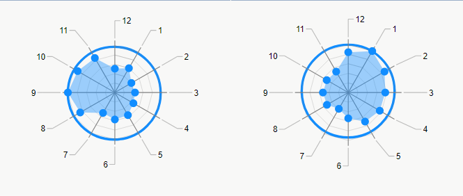
The problem is, I want to display the data for the hours that the user has not selected, as well, and this should be displayed as zero. The reason for this is, that I am displaying the number of alarms on a spider chart/radar chart like this:
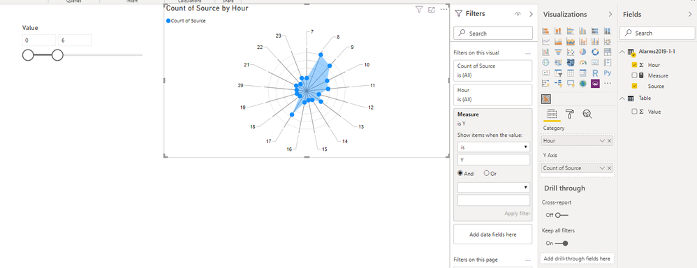
This works fine, when all the hours have been selected. However, when the user selects a range of hours like, for instance, 0-9, then the clock like structure of the radar chart is ruined as all the categories for all the hours not selected just disappear. I need a data structure or technique in which these categories do not disappear but instead show up as zero value on the chart. To address this, I have tried many things, including, using DAX as,
0_count = IF(ISBLANK(COUNTROWS(FILTER('December', December[Hour] == 0))), 0, COUNTROWS(FILTER('December', December[Hour] == 0)))
| Hour | Count |
| 0 | 0_count |
| 1 | 1_count |
| 2 | 2_count |
| 3 | 3_count |
But even this is not possible to do using any technique that I have come across.
Can someone please help me out or has some suggestions as to what to do? It seems Power BI has some excellent features, but always somehow manages to fall just short of perfection due to a missing feature.
Solved! Go to Solution.
- Mark as New
- Bookmark
- Subscribe
- Mute
- Subscribe to RSS Feed
- Permalink
- Report Inappropriate Content
HI @uni_student,
Please remove the measure on 'visual level filter' and use below measure formula to replace 'source' field which you used on Y axis:
Measure =
IF (
    MAX ( 'Alarms2019-1-1'[Hour] ) IN ALLSELECTED ( 'Table'[Value] ),
    0,
    COUNT ( 'Alarms2019-1-1'[Source] )
)
It will dynamically replace selected hours with zero and keep other 'count of source' not changes.
Regards,
Xiaoxin Sheng
If this post helps, please consider accept as solution to help other members find it more quickly.
- Mark as New
- Bookmark
- Subscribe
- Mute
- Subscribe to RSS Feed
- Permalink
- Report Inappropriate Content
Perhaps try using a disconnected table of hours. Use that in your radar chart. Construct your measure like:
VAR __Alarms =
SWITCH('DisconnectedHours'[Hour],
1,CALCULATE([Alarms Measure],'Table'[Hour]=1,
2,CALCULATE([Alarms Measure],'Table'[Hour]=2,
...
)
RETURN
IF(ISBLANK(__Alarms),0,__Alarms)
If you could post as text, I (or others) could experiment with it.
@ me in replies or I'll lose your thread!!!
Instead of a Kudo, please vote for this idea
Become an expert!: Enterprise DNA
External Tools: MSHGQM
YouTube Channel!: Microsoft Hates Greg
Latest book!: The Definitive Guide to Power Query (M)
DAX is easy, CALCULATE makes DAX hard...
- Mark as New
- Bookmark
- Subscribe
- Mute
- Subscribe to RSS Feed
- Permalink
- Report Inappropriate Content
Hi, thanks for replying. But I have the same problem as the previous solution. I did try the method you suggested, however, the data does not get filtered dynamically. That is, when the user selects hour range 0-5, for example, the other hours (6-23) should show 0 on the radar chart. Instead the values remain fixed. I can achieve the same by just turning off slicer interaction with the radar chart.
I realize that calculated tables do not get refreshed on slicer selection, only on data refresh. So is there any way to get the above requirement working?
I have attached a pbix file if you want to play around with it. Google Drive Link For PBIX File
Thanks a lot.
- Mark as New
- Bookmark
- Subscribe
- Mute
- Subscribe to RSS Feed
- Permalink
- Report Inappropriate Content
Hi @uni_student,
You can create a calculated table with 0 ~23 as the source of the slicer that not related to raw table records.
Then you can write a measure formula to compare selected value and raw table records to return tag and use it on visual level filter:
Table = GENERATESERIES(0,23,1)Measure =
IF (
MAX ( 'Alarms2019-1-1'[Hour] ) IN ALLSELECTED ( 'Table'[Value] ),
"N",
"Y"
)
Regards,
Xiaoxin SHeng
If this post helps, please consider accept as solution to help other members find it more quickly.
- Mark as New
- Bookmark
- Subscribe
- Mute
- Subscribe to RSS Feed
- Permalink
- Report Inappropriate Content
Thank You so much for your reply! And I am learning a few new things from these replies. But this still does not solve my problem. Let me be bit more clear.
In the PIBIX file that I have attached, I basically want the radar chart to not change shape. It should retain the same 24 hour categories, i.e. as when there is no slicer selection. When there is a slicer selection, for instance, hours 0-10, the radar chart should show the number of sources (or alarms) for hours 0-10. For hours 11-23, the categories in the radar chart correspinding to 11-23 should not disappear. Instead, the number of sources in this NOT SELECTED range should go to 0. In this way, the 24 categories of the radar chart will remin intact.
So, if this worked, it would be something like,
0_count = IF(ISBLANK(COUNTROWS(FILTER('Alarms2019-1-1', Alarms2019-1-1[Hour] == 0))), 0, COUNTROWS(FILTER('Alarms2019-1-1', Alarms2019-1-1[Hour] == 0)))
1_count = IF(ISBLANK(COUNTROWS(FILTER('Alarms2019-1-1', Alarms2019-1-1[Hour] == 1))), 0, COUNTROWS(FILTER('Alarms2019-1-1', Alarms2019-1-1[Hour] == 1)))
.
.
.
23_count = ....
So, we would have 24 such measures. If Power BI allowed to put these measures into a new table in a single column and allowed real time refresh of this new table, then I would be able to use this column in my radar chart, and my number of categories would remain the same with changing slicer selections. Only the 'Y' values of the radar chart would change with changing slicer selections.
Is there any other possible way to achieve this, or am I just wasting my time?
- Mark as New
- Bookmark
- Subscribe
- Mute
- Subscribe to RSS Feed
- Permalink
- Report Inappropriate Content
HI @uni_student,
Please remove the measure on 'visual level filter' and use below measure formula to replace 'source' field which you used on Y axis:
Measure =
IF (
    MAX ( 'Alarms2019-1-1'[Hour] ) IN ALLSELECTED ( 'Table'[Value] ),
    0,
    COUNT ( 'Alarms2019-1-1'[Source] )
)
It will dynamically replace selected hours with zero and keep other 'count of source' not changes.
Regards,
Xiaoxin Sheng
If this post helps, please consider accept as solution to help other members find it more quickly.
- Mark as New
- Bookmark
- Subscribe
- Mute
- Subscribe to RSS Feed
- Permalink
- Report Inappropriate Content
One approach is to make a simple DAX calculated table with something like
Hour = GenerateSeries(1,12,1) and use that Hour[Value] column in the visual
You can then write a measure like this
NewMeasure = Calculate([OriginalMeasure], TreatAs(Values[Hour[Value]), OriginalTable[Hour]) +0
That way the slicer on your original hour column won't also filter your visual "axis".
If this works for you, please mark it as the solution. Kudos are appreciated too. Please let me know if not.
Regards,
Pat
Did I answer your question? Mark my post as a solution! Kudos are also appreciated!
To learn more about Power BI, follow me on Twitter or subscribe on YouTube.
@mahoneypa HoosierBI on YouTube
- Mark as New
- Bookmark
- Subscribe
- Mute
- Subscribe to RSS Feed
- Permalink
- Report Inappropriate Content
Thank you for replying. So I did try the method you suggested, however, the data does not get filtered dynamically. That is, when the user selects hour range 0-5, for example, the other hours (6-23) should show 0 on the radar chart. Instead the values remain fixed. I can achieve the same by just turning off slicer interaction with the radar chart.
I realize that calculated tables do not get refreshed on slicer selection, only on data refresh. So is there any way to get the above requirement working?
I have attached a pbix file if you want to play around with it.
Thanks a lot. Google Drive Link for PBIX File
Helpful resources

Microsoft Fabric Learn Together
Covering the world! 9:00-10:30 AM Sydney, 4:00-5:30 PM CET (Paris/Berlin), 7:00-8:30 PM Mexico City

Power BI Monthly Update - April 2024
Check out the April 2024 Power BI update to learn about new features.

| User | Count |
|---|---|
| 110 | |
| 94 | |
| 82 | |
| 66 | |
| 58 |
| User | Count |
|---|---|
| 151 | |
| 121 | |
| 104 | |
| 87 | |
| 67 |


