- Power BI forums
- Updates
- News & Announcements
- Get Help with Power BI
- Desktop
- Service
- Report Server
- Power Query
- Mobile Apps
- Developer
- DAX Commands and Tips
- Custom Visuals Development Discussion
- Health and Life Sciences
- Power BI Spanish forums
- Translated Spanish Desktop
- Power Platform Integration - Better Together!
- Power Platform Integrations (Read-only)
- Power Platform and Dynamics 365 Integrations (Read-only)
- Training and Consulting
- Instructor Led Training
- Dashboard in a Day for Women, by Women
- Galleries
- Community Connections & How-To Videos
- COVID-19 Data Stories Gallery
- Themes Gallery
- Data Stories Gallery
- R Script Showcase
- Webinars and Video Gallery
- Quick Measures Gallery
- 2021 MSBizAppsSummit Gallery
- 2020 MSBizAppsSummit Gallery
- 2019 MSBizAppsSummit Gallery
- Events
- Ideas
- Custom Visuals Ideas
- Issues
- Issues
- Events
- Upcoming Events
- Community Blog
- Power BI Community Blog
- Custom Visuals Community Blog
- Community Support
- Community Accounts & Registration
- Using the Community
- Community Feedback
Register now to learn Fabric in free live sessions led by the best Microsoft experts. From Apr 16 to May 9, in English and Spanish.
- Power BI forums
- Forums
- Get Help with Power BI
- Desktop
- Using 2 numeric values at different granularities ...
- Subscribe to RSS Feed
- Mark Topic as New
- Mark Topic as Read
- Float this Topic for Current User
- Bookmark
- Subscribe
- Printer Friendly Page
- Mark as New
- Bookmark
- Subscribe
- Mute
- Subscribe to RSS Feed
- Permalink
- Report Inappropriate Content
Using 2 numeric values at different granularities on the same visualisation
I have a visualisation which is at transaction level and shows all transactions for an account.
I now want to add some additional data in another table which is at account level.
I don't seem to have the option to 'not summarize' the account level data and it tries to aggregate it by sum, count, etc.
Is there any way I can mix the data at different granularity levels?
Thanks
Simon
Solved! Go to Solution.
- Mark as New
- Bookmark
- Subscribe
- Mute
- Subscribe to RSS Feed
- Permalink
- Report Inappropriate Content
Hi Frank
Thank you for taking the time to respond.
I have actually resolved the problem but will give some more information in case it helps someone else.
I have 2 tables (below). AccountsData is at transaction level (multiple transactions per account) and AccountsDataSummary is at account level.
If I tried to create a visualization that included data from both tables (a table with a list of transactions from AccountsData and a card with OpeningBalance from AccountsDataSummary) I would get a massive number in the card as below:
I managed to correct this by editing the relationship between the tables and changing the cross filter direction from single to both.
My visualization now looks like this:
Thanks again for the help.
I hope this is useful.
Simon
- Mark as New
- Bookmark
- Subscribe
- Mute
- Subscribe to RSS Feed
- Permalink
- Report Inappropriate Content
Hi @simonroyjones,
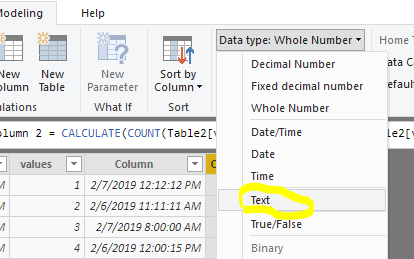
How about changing the columns to text type? If it doesn't meet your requirement, kindly share your sample data and excepted result to me. Please upload your files to One Drive and share the link here.
Regards,
Frank
If this post helps, then please consider Accept it as the solution to help the others find it more quickly.
- Mark as New
- Bookmark
- Subscribe
- Mute
- Subscribe to RSS Feed
- Permalink
- Report Inappropriate Content
Hi Frank
Thank you for taking the time to respond.
I have actually resolved the problem but will give some more information in case it helps someone else.
I have 2 tables (below). AccountsData is at transaction level (multiple transactions per account) and AccountsDataSummary is at account level.
If I tried to create a visualization that included data from both tables (a table with a list of transactions from AccountsData and a card with OpeningBalance from AccountsDataSummary) I would get a massive number in the card as below:
I managed to correct this by editing the relationship between the tables and changing the cross filter direction from single to both.
My visualization now looks like this:
Thanks again for the help.
I hope this is useful.
Simon
- Mark as New
- Bookmark
- Subscribe
- Mute
- Subscribe to RSS Feed
- Permalink
- Report Inappropriate Content
I'm not clear on what you are asking for. Can you clarify? As in an example perhaps?
@ me in replies or I'll lose your thread!!!
Instead of a Kudo, please vote for this idea
Become an expert!: Enterprise DNA
External Tools: MSHGQM
YouTube Channel!: Microsoft Hates Greg
Latest book!: The Definitive Guide to Power Query (M)
DAX is easy, CALCULATE makes DAX hard...
Helpful resources

Microsoft Fabric Learn Together
Covering the world! 9:00-10:30 AM Sydney, 4:00-5:30 PM CET (Paris/Berlin), 7:00-8:30 PM Mexico City

Power BI Monthly Update - April 2024
Check out the April 2024 Power BI update to learn about new features.

| User | Count |
|---|---|
| 117 | |
| 105 | |
| 69 | |
| 67 | |
| 43 |
| User | Count |
|---|---|
| 151 | |
| 103 | |
| 102 | |
| 87 | |
| 63 |


