- Power BI forums
- Updates
- News & Announcements
- Get Help with Power BI
- Desktop
- Service
- Report Server
- Power Query
- Mobile Apps
- Developer
- DAX Commands and Tips
- Custom Visuals Development Discussion
- Health and Life Sciences
- Power BI Spanish forums
- Translated Spanish Desktop
- Power Platform Integration - Better Together!
- Power Platform Integrations (Read-only)
- Power Platform and Dynamics 365 Integrations (Read-only)
- Training and Consulting
- Instructor Led Training
- Dashboard in a Day for Women, by Women
- Galleries
- Community Connections & How-To Videos
- COVID-19 Data Stories Gallery
- Themes Gallery
- Data Stories Gallery
- R Script Showcase
- Webinars and Video Gallery
- Quick Measures Gallery
- 2021 MSBizAppsSummit Gallery
- 2020 MSBizAppsSummit Gallery
- 2019 MSBizAppsSummit Gallery
- Events
- Ideas
- Custom Visuals Ideas
- Issues
- Issues
- Events
- Upcoming Events
- Community Blog
- Power BI Community Blog
- Custom Visuals Community Blog
- Community Support
- Community Accounts & Registration
- Using the Community
- Community Feedback
Register now to learn Fabric in free live sessions led by the best Microsoft experts. From Apr 16 to May 9, in English and Spanish.
- Power BI forums
- Forums
- Get Help with Power BI
- Desktop
- Use the Marketplace Play Axis to show line graph d...
- Subscribe to RSS Feed
- Mark Topic as New
- Mark Topic as Read
- Float this Topic for Current User
- Bookmark
- Subscribe
- Printer Friendly Page
- Mark as New
- Bookmark
- Subscribe
- Mute
- Subscribe to RSS Feed
- Permalink
- Report Inappropriate Content
Use the Marketplace Play Axis to show line graph data over time dynamically
Hi there
I have a financial value plotted on a line graph over time from 2015 to 2019. The Date column is the First of the Month.
I want to use the play axis to do something a bit sexy to show this data dynamically, but is it possible to only have the data appear as the play axis runs through the months?
Jemma
Solved! Go to Solution.
- Mark as New
- Bookmark
- Subscribe
- Mute
- Subscribe to RSS Feed
- Permalink
- Report Inappropriate Content
Hi @Anonymous ,
Try this:
1. Create a separate table. No relationship between the two tables.
Table = DISTINCT('financials'[Date])2. Create a measure.
Measure = IF ( SELECTEDVALUE ( 'financials'[Date] ) < MIN ( 'Table'[Date] ), 1, -1 )
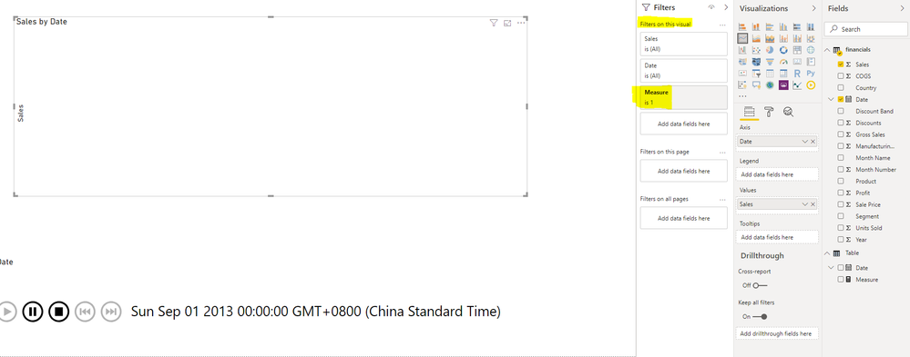
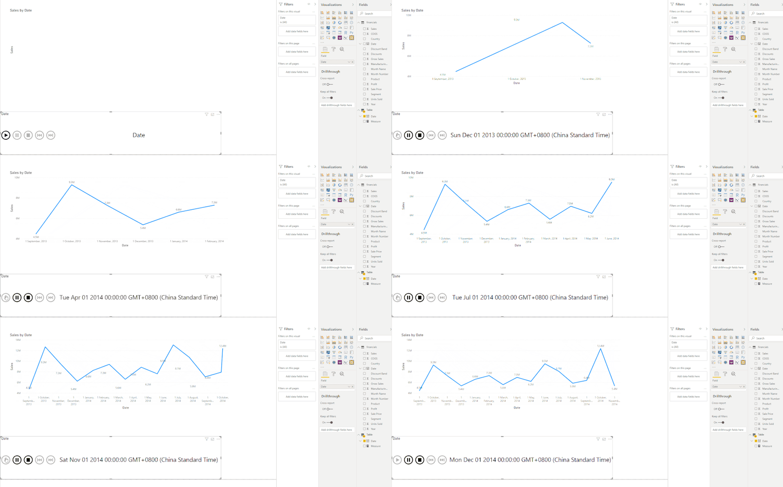
3. Put the measure above in "Filters on this visual" of line chart and filter it by "Measure is 1".
4. Put "Date" column from "Table" in Play Axis.
Best Regards,
Icey
If this post helps, then please consider Accept it as the solution to help the other members find it more quickly.
- Mark as New
- Bookmark
- Subscribe
- Mute
- Subscribe to RSS Feed
- Permalink
- Report Inappropriate Content
Hi @Anonymous ,
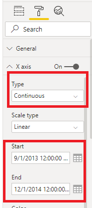
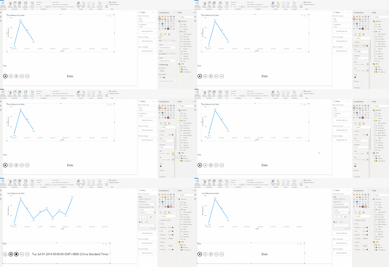
You can try to set the Start and End of X axis.
For details, please check the attached PBIX file.
Best Regards,
Icey
If this post helps, then please consider Accept it as the solution to help the other members find it more quickly.
- Mark as New
- Bookmark
- Subscribe
- Mute
- Subscribe to RSS Feed
- Permalink
- Report Inappropriate Content
Hello
This solution is great, thank you everyone. One upgrade I am trying to make is to have a heatmap and horizontal bar chart on the same page which changes based on the play axis (in addition to the dynamic line chart). These other 2 charts are timeseries however because I have created table with no connections I cannot get the play axis to drive all 3 charts. I know this is the principle this dynamic chart is based on but is there a workaround to get timeseries for all 3 connected but still maintain the dynamic building on the line chart?
- Mark as New
- Bookmark
- Subscribe
- Mute
- Subscribe to RSS Feed
- Permalink
- Report Inappropriate Content
Hi @Anonymous ,
Try this:
1. Create a separate table. No relationship between the two tables.
Table = DISTINCT('financials'[Date])2. Create a measure.
Measure = IF ( SELECTEDVALUE ( 'financials'[Date] ) < MIN ( 'Table'[Date] ), 1, -1 )
3. Put the measure above in "Filters on this visual" of line chart and filter it by "Measure is 1".
4. Put "Date" column from "Table" in Play Axis.
Best Regards,
Icey
If this post helps, then please consider Accept it as the solution to help the other members find it more quickly.
- Mark as New
- Bookmark
- Subscribe
- Mute
- Subscribe to RSS Feed
- Permalink
- Report Inappropriate Content
@Icey this works! So simple! Thank you so much massive kudos to you our Client will love this 🙂
- Mark as New
- Bookmark
- Subscribe
- Mute
- Subscribe to RSS Feed
- Permalink
- Report Inappropriate Content
Hi there me again, our Data Scientist loves this graph but wants the months to be visible already, so the axis doesn't move as much (it starts at 500k but goes up to 1.4m by the end. So he wants the data line to appear gradually once they press play. So the line appears on an already existing axis.
Is this at all possible????
- Mark as New
- Bookmark
- Subscribe
- Mute
- Subscribe to RSS Feed
- Permalink
- Report Inappropriate Content
- Mark as New
- Bookmark
- Subscribe
- Mute
- Subscribe to RSS Feed
- Permalink
- Report Inappropriate Content
Hi @Icey yep this worked, I had to press play on the Play Axis and then pause, in order to get the x axis to turn into a date/time field because otherwise, it did not allow me to enter dates.
It defaulted to 1970 for some reason so I changed the default dates and now the axis appears straight away when you press play, and the line appears for each month which looks really effective.
This pitch is for a very big player so if we get their business you will have contributed!
- Mark as New
- Bookmark
- Subscribe
- Mute
- Subscribe to RSS Feed
- Permalink
- Report Inappropriate Content
Hi there me again, our Data Scientist loves this graph but wants the months to be visible already, so the axis doesn't move as much (it starts at 500k but goes up to 1.4m by the end. So he wants the data line to appear gradually once they press play. So the line appears on an already existing axis.
Is this at all possible????
- Mark as New
- Bookmark
- Subscribe
- Mute
- Subscribe to RSS Feed
- Permalink
- Report Inappropriate Content
@Anonymous it all depends what visual you are using, play axis is just a slicer which will scroll thru the values of the column you provide it to run on.
Subscribe to the @PowerBIHowTo YT channel for an upcoming video on List and Record functions in Power Query!!
Learn Power BI and Fabric - subscribe to our YT channel - Click here: @PowerBIHowTo
If my solution proved useful, I'd be delighted to receive Kudos. When you put effort into asking a question, it's equally thoughtful to acknowledge and give Kudos to the individual who helped you solve the problem. It's a small gesture that shows appreciation and encouragement! ❤
Did I answer your question? Mark my post as a solution. Proud to be a Super User! Appreciate your Kudos 🙂
Feel free to email me with any of your BI needs.
- Mark as New
- Bookmark
- Subscribe
- Mute
- Subscribe to RSS Feed
- Permalink
- Report Inappropriate Content
Hi @parry2k yeah Play Axis might not be the solution, I was using a line graph, but when you press play it just shows a single dot per month thus breaking the line graph entirely.
What I want to see, is a line which magically appears chronologically until all the months are displayed. It's for a client pitch and i'm just trying to show off Power BI and make some sexy visuals.
- Mark as New
- Bookmark
- Subscribe
- Mute
- Subscribe to RSS Feed
- Permalink
- Report Inappropriate Content
@Anonymous gotcha what you are trying to do, so do you have cummulative total on the line?? I guess it show one point at a time even if it is cummulative total and you want line to grow from base to whatever period you are in. correct?
Subscribe to the @PowerBIHowTo YT channel for an upcoming video on List and Record functions in Power Query!!
Learn Power BI and Fabric - subscribe to our YT channel - Click here: @PowerBIHowTo
If my solution proved useful, I'd be delighted to receive Kudos. When you put effort into asking a question, it's equally thoughtful to acknowledge and give Kudos to the individual who helped you solve the problem. It's a small gesture that shows appreciation and encouragement! ❤
Did I answer your question? Mark my post as a solution. Proud to be a Super User! Appreciate your Kudos 🙂
Feel free to email me with any of your BI needs.
- Mark as New
- Bookmark
- Subscribe
- Mute
- Subscribe to RSS Feed
- Permalink
- Report Inappropriate Content
@parry2k you are right on - except it's not cumulative, but essentially I want it to plot a new point at a time, growing from the first month, but keeping the previous points there.
If this isn't possible, a cumulative graph is another option...
Jemma
- Mark as New
- Bookmark
- Subscribe
- Mute
- Subscribe to RSS Feed
- Permalink
- Report Inappropriate Content
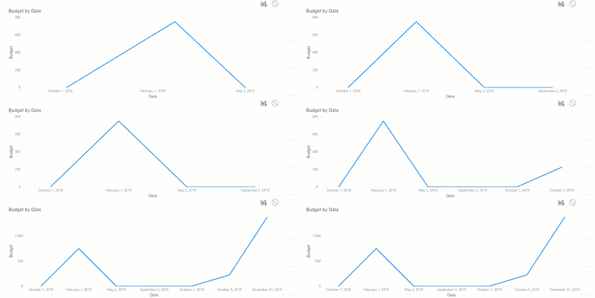
@Anonymous I guess you want something like this??
Subscribe to the @PowerBIHowTo YT channel for an upcoming video on List and Record functions in Power Query!!
Learn Power BI and Fabric - subscribe to our YT channel - Click here: @PowerBIHowTo
If my solution proved useful, I'd be delighted to receive Kudos. When you put effort into asking a question, it's equally thoughtful to acknowledge and give Kudos to the individual who helped you solve the problem. It's a small gesture that shows appreciation and encouragement! ❤
Did I answer your question? Mark my post as a solution. Proud to be a Super User! Appreciate your Kudos 🙂
Feel free to email me with any of your BI needs.
- Mark as New
- Bookmark
- Subscribe
- Mute
- Subscribe to RSS Feed
- Permalink
- Report Inappropriate Content
- Mark as New
- Bookmark
- Subscribe
- Mute
- Subscribe to RSS Feed
- Permalink
- Report Inappropriate Content
@Anonymous sorry have to go for a meeting. If possible, send me pbix file with sample data (remove sensitive information before sharing) and I will get you the solution.
Subscribe to the @PowerBIHowTo YT channel for an upcoming video on List and Record functions in Power Query!!
Learn Power BI and Fabric - subscribe to our YT channel - Click here: @PowerBIHowTo
If my solution proved useful, I'd be delighted to receive Kudos. When you put effort into asking a question, it's equally thoughtful to acknowledge and give Kudos to the individual who helped you solve the problem. It's a small gesture that shows appreciation and encouragement! ❤
Did I answer your question? Mark my post as a solution. Proud to be a Super User! Appreciate your Kudos 🙂
Feel free to email me with any of your BI needs.
Helpful resources

Microsoft Fabric Learn Together
Covering the world! 9:00-10:30 AM Sydney, 4:00-5:30 PM CET (Paris/Berlin), 7:00-8:30 PM Mexico City

Power BI Monthly Update - April 2024
Check out the April 2024 Power BI update to learn about new features.

| User | Count |
|---|---|
| 109 | |
| 96 | |
| 77 | |
| 66 | |
| 54 |
| User | Count |
|---|---|
| 144 | |
| 104 | |
| 102 | |
| 88 | |
| 63 |
