- Power BI forums
- Updates
- News & Announcements
- Get Help with Power BI
- Desktop
- Service
- Report Server
- Power Query
- Mobile Apps
- Developer
- DAX Commands and Tips
- Custom Visuals Development Discussion
- Health and Life Sciences
- Power BI Spanish forums
- Translated Spanish Desktop
- Power Platform Integration - Better Together!
- Power Platform Integrations (Read-only)
- Power Platform and Dynamics 365 Integrations (Read-only)
- Training and Consulting
- Instructor Led Training
- Dashboard in a Day for Women, by Women
- Galleries
- Community Connections & How-To Videos
- COVID-19 Data Stories Gallery
- Themes Gallery
- Data Stories Gallery
- R Script Showcase
- Webinars and Video Gallery
- Quick Measures Gallery
- 2021 MSBizAppsSummit Gallery
- 2020 MSBizAppsSummit Gallery
- 2019 MSBizAppsSummit Gallery
- Events
- Ideas
- Custom Visuals Ideas
- Issues
- Issues
- Events
- Upcoming Events
- Community Blog
- Power BI Community Blog
- Custom Visuals Community Blog
- Community Support
- Community Accounts & Registration
- Using the Community
- Community Feedback
Register now to learn Fabric in free live sessions led by the best Microsoft experts. From Apr 16 to May 9, in English and Spanish.
- Power BI forums
- Forums
- Get Help with Power BI
- Desktop
- Re: Use a variable in filter as operand
- Subscribe to RSS Feed
- Mark Topic as New
- Mark Topic as Read
- Float this Topic for Current User
- Bookmark
- Subscribe
- Printer Friendly Page
- Mark as New
- Bookmark
- Subscribe
- Mute
- Subscribe to RSS Feed
- Permalink
- Report Inappropriate Content
Use a variable in filter as operand
I have the following tables in Power BI:
FactData
Filtering Table
I need to create another table programmatically (using DAX) to filter the Fact Table using the selected item from the filtering table. Here is what I have done:
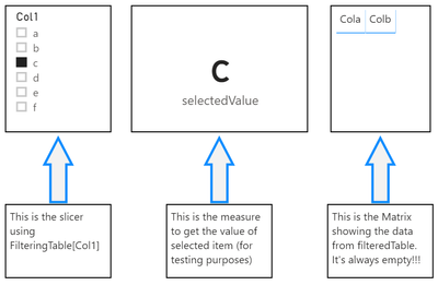
1. Insert a Slicer with the "Filtering Table" data.
2. Create the filtered table using this DAX statement:
filteredFact =
 filter(
  all(FactData),
  [Cola]=SELECTEDVALUE(filteringTable[Col1])
 )
3. Created a measure to make sure the selectedValue is returning data:
selectedValue = SELECTEDVALUE(filteringTable[Col1])Expected Result
I expect to get back in FilteredTable only the rows selected from the filter containing FilteringTable[Col1]
Actual Result
I always get an empty table.
Solved! Go to Solution.
- Mark as New
- Bookmark
- Subscribe
- Mute
- Subscribe to RSS Feed
- Permalink
- Report Inappropriate Content
Hi @BoNDoK
Let me know if you'd like to get below results:
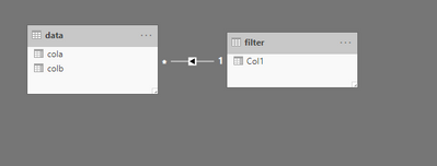
1. DONOT manage the relationship between them
2. Add a measure and drag it to the filter pane in FactData table visual, set it as 1
Measure = IF(SELECTEDVALUE('Filtering Table'[Col1])=MAX(FactData[Cola]),1)
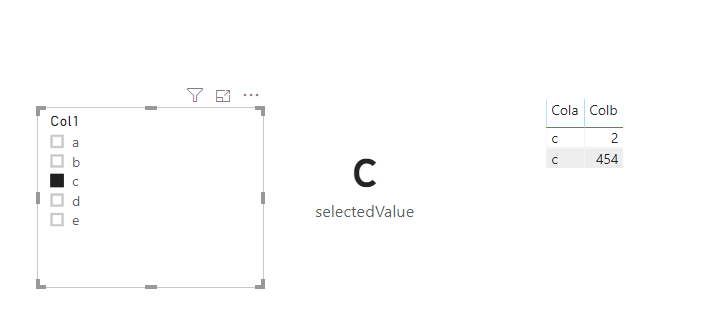
3. final results:
Pbix attached.
If this post helps, then please consider Accept it as the solution to help the other members find it more
quickly.
- Mark as New
- Bookmark
- Subscribe
- Mute
- Subscribe to RSS Feed
- Permalink
- Report Inappropriate Content
Hi Dina Ye,
Thanks a lot!!! This is exactly what I wanted to achieve. But can you please explain to me how this visual level filter is doing this magic? I see it working but I don't understand what is happening behind the scene.
Regards,
BoNDoK
- Mark as New
- Bookmark
- Subscribe
- Mute
- Subscribe to RSS Feed
- Permalink
- Report Inappropriate Content
Hi @BoNDoK ,
Not sure what you are trying to do, but with the two tables as a starting point, and then create a relationship, I can get to the selected outcome.
Let me know if you have any questions.
If this solves your issues, please mark it as the solution, so that others can find it easily. Kudos 👍are nice too.
Nathaniel
Did I answer your question? Mark my post as a solution!
Proud to be a Super User!
- Mark as New
- Bookmark
- Subscribe
- Mute
- Subscribe to RSS Feed
- Permalink
- Report Inappropriate Content
Hi Nathaniel,
Thank you for your response.
I cannot add this relationship due to other needed relationships in my model. I have a requirement from a user, to show custom legends on a line chart. And to achieve it, I need to be able to establish the connection I described without using Power BI relationships.
Regards,
BoNDoK
- Mark as New
- Bookmark
- Subscribe
- Mute
- Subscribe to RSS Feed
- Permalink
- Report Inappropriate Content
@BoNDoK you cannot create a calculate table using slicers. if you explain what you are trying to achieve and why you need this calculated table
Subscribe to the @PowerBIHowTo YT channel for an upcoming video on List and Record functions in Power Query!!
Learn Power BI and Fabric - subscribe to our YT channel - Click here: @PowerBIHowTo
If my solution proved useful, I'd be delighted to receive Kudos. When you put effort into asking a question, it's equally thoughtful to acknowledge and give Kudos to the individual who helped you solve the problem. It's a small gesture that shows appreciation and encouragement! ❤
Did I answer your question? Mark my post as a solution. Proud to be a Super User! Appreciate your Kudos 🙂
Feel free to email me with any of your BI needs.
- Mark as New
- Bookmark
- Subscribe
- Mute
- Subscribe to RSS Feed
- Permalink
- Report Inappropriate Content
Hi Parry,
Here is what I need to achieve:
I have a sales table, with a hierarchy (region, country, product category, product subcategory) and date dimension. The user would like to see the numbers on a line chart, with the hierarchy as a slicer, and date on x-axis and the trick is: when any item of the slicer is selected: the chart legend should show the children of the node selected, and if nothing is selected it should show the first level nodes (regions).
My approach is:
1. Transpose the fact table so each of the 4 levels is on a separate line.
2. Use the transposed table as the legend. But extra filtering is needed and that's why I would like to filter based on the selected member of a slicer.
Thank you,
BoNDoK
Helpful resources

Microsoft Fabric Learn Together
Covering the world! 9:00-10:30 AM Sydney, 4:00-5:30 PM CET (Paris/Berlin), 7:00-8:30 PM Mexico City

Power BI Monthly Update - April 2024
Check out the April 2024 Power BI update to learn about new features.

| User | Count |
|---|---|
| 106 | |
| 93 | |
| 75 | |
| 62 | |
| 50 |
| User | Count |
|---|---|
| 147 | |
| 107 | |
| 105 | |
| 87 | |
| 61 |


