- Power BI forums
- Updates
- News & Announcements
- Get Help with Power BI
- Desktop
- Service
- Report Server
- Power Query
- Mobile Apps
- Developer
- DAX Commands and Tips
- Custom Visuals Development Discussion
- Health and Life Sciences
- Power BI Spanish forums
- Translated Spanish Desktop
- Power Platform Integration - Better Together!
- Power Platform Integrations (Read-only)
- Power Platform and Dynamics 365 Integrations (Read-only)
- Training and Consulting
- Instructor Led Training
- Dashboard in a Day for Women, by Women
- Galleries
- Community Connections & How-To Videos
- COVID-19 Data Stories Gallery
- Themes Gallery
- Data Stories Gallery
- R Script Showcase
- Webinars and Video Gallery
- Quick Measures Gallery
- 2021 MSBizAppsSummit Gallery
- 2020 MSBizAppsSummit Gallery
- 2019 MSBizAppsSummit Gallery
- Events
- Ideas
- Custom Visuals Ideas
- Issues
- Issues
- Events
- Upcoming Events
- Community Blog
- Power BI Community Blog
- Custom Visuals Community Blog
- Community Support
- Community Accounts & Registration
- Using the Community
- Community Feedback
Register now to learn Fabric in free live sessions led by the best Microsoft experts. From Apr 16 to May 9, in English and Spanish.
- Power BI forums
- Forums
- Get Help with Power BI
- Desktop
- Re: Use a measure an an axis (dynamic axis selecti...
- Subscribe to RSS Feed
- Mark Topic as New
- Mark Topic as Read
- Float this Topic for Current User
- Bookmark
- Subscribe
- Printer Friendly Page
- Mark as New
- Bookmark
- Subscribe
- Mute
- Subscribe to RSS Feed
- Permalink
- Report Inappropriate Content
Use a measure an an axis (dynamic axis selection)
So, I am trying to create a dynamic column chart, looking at the distribution of employees salary. I would like to be able to give the user the ability to select their own salary intervals (e.g. 2k, 5k, 10k etc).
I have successfuly created a measure field to do the calculation, based on a slicer, using:
Interval = if(HASONEVALUE(tbl_PayInterval[Interval]),
roundup(sum('Basic Pay'[BASIC_PAY])/values(tbl_PayInterval[Interval]),0)*values(tbl_PayInterval[Interval]),0)
This rounds up the pay for each record in the table to the nearest selected interval (where tbl_PayInterval is my single-column table that feeds the slicer).
The problem is that I can't then use the Interval field as an x axis for a column chart (it won't let me)
I could use a calculated field as an axis, but I can't create the same results: it returns zeros based on the if(HASONEVALUE returning false.
Any suggestions, please? Thanks!
- Mark as New
- Bookmark
- Subscribe
- Mute
- Subscribe to RSS Feed
- Permalink
- Report Inappropriate Content
AFAIK from @MattAllington, to use as axis you have to make calculated column, not measure
excel-inside.pro
- Mark as New
- Bookmark
- Subscribe
- Mute
- Subscribe to RSS Feed
- Permalink
- Report Inappropriate Content
Thanks - I think that is the conclusion I came to. But, is it possible to create a calculated column that does what I want it to - ie calculate a value based on a slicer selection?
- Mark as New
- Bookmark
- Subscribe
- Mute
- Subscribe to RSS Feed
- Permalink
- Report Inappropriate Content
Yes you can but for this you need to use additional table. Please refer to below link. This will give you some idea how to achieve this. This is for excel but you can easily conver this to Power BI 🙂
http://sqljason.com/2012/11/measure-selection-using-slicers-in.html
- Mark as New
- Bookmark
- Subscribe
- Mute
- Subscribe to RSS Feed
- Permalink
- Report Inappropriate Content
Thanks for taking the time to respond - I'm not sure this works though. The essence is that the calculated measure, based on a slicer, can't be used as a axis, or a row/column header in a pivot.
I've pulled together what I've done to show how the data is structured and what works here: http://bit.ly/29a9NSX
Note - ideally I'd like a user to choose any interval, through a text imput box, but I know that's not possible, hence the slicer.
- Mark as New
- Bookmark
- Subscribe
- Mute
- Subscribe to RSS Feed
- Permalink
- Report Inappropriate Content
Any update?
Is it still not possible to use a measure for an axis? Or to filter (e.g. date filter) a calculated column?
- Mark as New
- Bookmark
- Subscribe
- Mute
- Subscribe to RSS Feed
- Permalink
- Report Inappropriate Content
Just to mention, I also tried creating additional columns: "nearest 2000", "nearest 5000", "nearest 10000" and using the switch function in another new column to select the correct values:
ColAxis = switch(HASONEVALUE(tbl_Interval[Interval_Key]),
MIN(tbl_Interval[Interval_Key])=1,BasicPay[Nearest_2k],
	min(tbl_Interval[Interval_Key])=2,BasicPay[Nearest_5k],
	min(tbl_Interval[Interval_Key])=3,BasicPay[Nearest_10k])
- Mark as New
- Bookmark
- Subscribe
- Mute
- Subscribe to RSS Feed
- Permalink
- Report Inappropriate Content
...cont
But this doesn't seem to work - the ColAxis column doesn't change when teh slicer value is changed.
- Mark as New
- Bookmark
- Subscribe
- Mute
- Subscribe to RSS Feed
- Permalink
- Report Inappropriate Content
If you want to place the calculated results as an x axis, you have to define a calculated column. You used the same DAX formula for the calculated column and it always returns zero, because the column results will not be affected by the Slicer. It is like column results are calculated before you select one interval value. So the “IF(HASONEVALUE)” will always return False.
As I understand it, you want the IntervalMsr results to be the data range in the x axis. And the IntervalMsr results is based on the Slicer selection. So the x axis will change based on the slicer value.
In this scenario, I suggest to create a new hierarchy and use the drill down function without a slicer. Please refer to following steps.
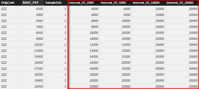
- Create four columns with below formula. Replace 20000 with other values (e.g. 10000, 5000, 2000) for other columns.
Interval_Of_20000 = ROUNDUP ( CALCULATE ( SUM ( BasicPay[BAISC_PAY] ), ALLEXCEPT ( BasicPay, BasicPay[OrigCode], BasicPay[BAISC_PAY] ) ) / 20000, 0 ) * 20000 - Right click “Interval_Of_20000” and create a new hierarchy. Right click other three columns and select ‘Add to Interval_Of_20000 Hierarchy’.
- Drag column chart into your canvas and change interval by “Drill” function.
- Mark as New
- Bookmark
- Subscribe
- Mute
- Subscribe to RSS Feed
- Permalink
- Report Inappropriate Content
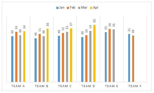
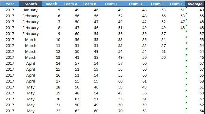
How can I achieve this chart layout with the data below.
Data :
My chart is showing April data for all Team followed by each month.
Thanks,
Triparna
Helpful resources

Microsoft Fabric Learn Together
Covering the world! 9:00-10:30 AM Sydney, 4:00-5:30 PM CET (Paris/Berlin), 7:00-8:30 PM Mexico City

Power BI Monthly Update - April 2024
Check out the April 2024 Power BI update to learn about new features.

| User | Count |
|---|---|
| 111 | |
| 94 | |
| 83 | |
| 67 | |
| 59 |
| User | Count |
|---|---|
| 151 | |
| 121 | |
| 104 | |
| 87 | |
| 67 |


