- Power BI forums
- Updates
- News & Announcements
- Get Help with Power BI
- Desktop
- Service
- Report Server
- Power Query
- Mobile Apps
- Developer
- DAX Commands and Tips
- Custom Visuals Development Discussion
- Health and Life Sciences
- Power BI Spanish forums
- Translated Spanish Desktop
- Power Platform Integration - Better Together!
- Power Platform Integrations (Read-only)
- Power Platform and Dynamics 365 Integrations (Read-only)
- Training and Consulting
- Instructor Led Training
- Dashboard in a Day for Women, by Women
- Galleries
- Community Connections & How-To Videos
- COVID-19 Data Stories Gallery
- Themes Gallery
- Data Stories Gallery
- R Script Showcase
- Webinars and Video Gallery
- Quick Measures Gallery
- 2021 MSBizAppsSummit Gallery
- 2020 MSBizAppsSummit Gallery
- 2019 MSBizAppsSummit Gallery
- Events
- Ideas
- Custom Visuals Ideas
- Issues
- Issues
- Events
- Upcoming Events
- Community Blog
- Power BI Community Blog
- Custom Visuals Community Blog
- Community Support
- Community Accounts & Registration
- Using the Community
- Community Feedback
Register now to learn Fabric in free live sessions led by the best Microsoft experts. From Apr 16 to May 9, in English and Spanish.
- Power BI forums
- Forums
- Get Help with Power BI
- Desktop
- Use Measure as Axis in visual
- Subscribe to RSS Feed
- Mark Topic as New
- Mark Topic as Read
- Float this Topic for Current User
- Bookmark
- Subscribe
- Printer Friendly Page
- Mark as New
- Bookmark
- Subscribe
- Mute
- Subscribe to RSS Feed
- Permalink
- Report Inappropriate Content
Use Measure as Axis in visual
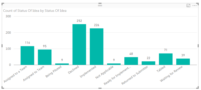
I am trying to create a visual similar to this:
but I need to include some values that are sumations of some of the columns. For example, a total column that is a sum of all the values. Another is a value called "Accpeted" that is a sum of Imlplemented, Assigned to Team, Ready for Implementation, and Being Piloted.
I've created measures to generate all these numbers for me, but I cannot get the visualization to allow me to use the measure name for the axis label. Is there a way to do that, maybe through a calulated table? I'm new to Power BI and visual analytics in general. Thanks in advance for any help.
Solved! Go to Solution.
- Mark as New
- Bookmark
- Subscribe
- Mute
- Subscribe to RSS Feed
- Permalink
- Report Inappropriate Content
I solved the issue. I created a new table with the axis lables in the first column, then used If statements to look at the value in the first column. If it was one of the subtotals, it returned the measure I created. If it was an actual status, I used:
CALCULATE(counta('Idea Factory One Utility'[Status Of Idea]),
FILTER(all('Idea Factory One Utility'), 'Idea Factory One Utility'[Status Of Idea]=Idea_Status[Status Type]))
- Mark as New
- Bookmark
- Subscribe
- Mute
- Subscribe to RSS Feed
- Permalink
- Report Inappropriate Content
Hi, I assume that you have a whole table of data that has all the projects on it with some sort of mixture of flags that in an order give you whatever the status is. What you will want to do is make a calculated column (on the modelling tab) and make a column that has all the logic in it to create each of teh the statuses you want on your axis. This is just an IF() statement or if you want a SWTICH(). SO you will have something like:
Status = IF(OR(Table[status] = "accepted",Table[status] = "just about accepted"),"Accepted" ...etc.... )))
Satus = SWITCH(Table[status], "accepted","Accepted","just about accepted","Accepted" ....etc... )))
You then use the status column as the x axis. You should need any other measures that a count of projects..
// If this is an answer to your question please mark as such
- Mark as New
- Bookmark
- Subscribe
- Mute
- Subscribe to RSS Feed
- Permalink
- Report Inappropriate Content
Hi - I also am unclear how to use the if or swtich statements particularly if we are creating the new 'dummy' table to just hold the axis lables and it does not have any relationship with the fact or table that holds the measures.
I have to categories that I want on the axis Direct and Sub and I have 4 measures total where 2 need to show in the Sub category and 2 others need to show in the Direct category. i've just one measure calculation for each category below.
To show in Direct category:
To show in Sub category:
The attempted SWITCH statement, I could not get SWITCH to accept just the dummy 'axis' column I created as the first argument

- Mark as New
- Bookmark
- Subscribe
- Mute
- Subscribe to RSS Feed
- Permalink
- Report Inappropriate Content
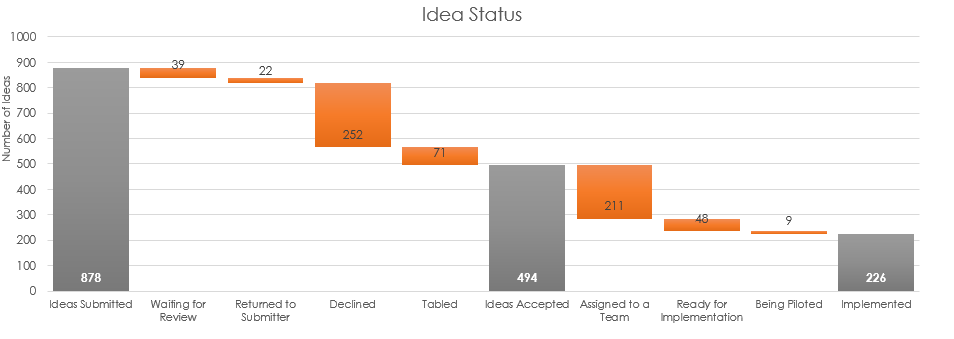
That gets me part of the way there. I need to also include a "subtotal" as a vlaue on the axis. Here is the original graph that I'm trying to recreate
.
The grey bars are sub totals of the actual statuses. It was created in excel using three series. The Grey bar is one, the orange is another, and the "clear" bar is the third. In the series for the grey bars, the value for the orange and clear is zero, making it appear they are not there. This can be acomplished because I can manually indicate the values for the axis and then assign data to the three series.
I've got all the values I need, I created them using measures, but I can't figure out how to get that measure to align with an axis label. Is there a way to create a new table with the axis labels in a column, and then refernce the measures in the next column?
Any help is appreciated.
- Mark as New
- Bookmark
- Subscribe
- Mute
- Subscribe to RSS Feed
- Permalink
- Report Inappropriate Content
I solved the issue. I created a new table with the axis lables in the first column, then used If statements to look at the value in the first column. If it was one of the subtotals, it returned the measure I created. If it was an actual status, I used:
CALCULATE(counta('Idea Factory One Utility'[Status Of Idea]),
     FILTER(all('Idea Factory One Utility'),
     'Idea Factory One Utility'[Status Of Idea]=Idea_Status[Status Type]))
This retuned the values that I needed for the visualtion. Its a little brute force, but it worked.
- Mark as New
- Bookmark
- Subscribe
- Mute
- Subscribe to RSS Feed
- Permalink
- Report Inappropriate Content
Hi taylorrc, it seems a great solution !
But I don't understand how you inplement your "IF statements" to look at your table with x labels
and return the correct measure : subtotal or the value.
Could show me the differents steps you implemented ?
Thank you and have a nice day !
Fred
- Mark as New
- Bookmark
- Subscribe
- Mute
- Subscribe to RSS Feed
- Permalink
- Report Inappropriate Content
I solved the issue. I created a new table with the axis lables in the first column, then used If statements to look at the value in the first column. If it was one of the subtotals, it returned the measure I created. If it was an actual status, I used:
CALCULATE(counta('Idea Factory One Utility'[Status Of Idea]),
FILTER(all('Idea Factory One Utility'), 'Idea Factory One Utility'[Status Of Idea]=Idea_Status[Status Type]))
Helpful resources

Microsoft Fabric Learn Together
Covering the world! 9:00-10:30 AM Sydney, 4:00-5:30 PM CET (Paris/Berlin), 7:00-8:30 PM Mexico City

Power BI Monthly Update - April 2024
Check out the April 2024 Power BI update to learn about new features.

| User | Count |
|---|---|
| 107 | |
| 94 | |
| 77 | |
| 63 | |
| 50 |
| User | Count |
|---|---|
| 147 | |
| 106 | |
| 104 | |
| 87 | |
| 61 |


