- Power BI forums
- Updates
- News & Announcements
- Get Help with Power BI
- Desktop
- Service
- Report Server
- Power Query
- Mobile Apps
- Developer
- DAX Commands and Tips
- Custom Visuals Development Discussion
- Health and Life Sciences
- Power BI Spanish forums
- Translated Spanish Desktop
- Power Platform Integration - Better Together!
- Power Platform Integrations (Read-only)
- Power Platform and Dynamics 365 Integrations (Read-only)
- Training and Consulting
- Instructor Led Training
- Dashboard in a Day for Women, by Women
- Galleries
- Community Connections & How-To Videos
- COVID-19 Data Stories Gallery
- Themes Gallery
- Data Stories Gallery
- R Script Showcase
- Webinars and Video Gallery
- Quick Measures Gallery
- 2021 MSBizAppsSummit Gallery
- 2020 MSBizAppsSummit Gallery
- 2019 MSBizAppsSummit Gallery
- Events
- Ideas
- Custom Visuals Ideas
- Issues
- Issues
- Events
- Upcoming Events
- Community Blog
- Power BI Community Blog
- Custom Visuals Community Blog
- Community Support
- Community Accounts & Registration
- Using the Community
- Community Feedback
Register now to learn Fabric in free live sessions led by the best Microsoft experts. From Apr 16 to May 9, in English and Spanish.
- Power BI forums
- Forums
- Get Help with Power BI
- Desktop
- Re: Urgent! Change bar color
- Subscribe to RSS Feed
- Mark Topic as New
- Mark Topic as Read
- Float this Topic for Current User
- Bookmark
- Subscribe
- Printer Friendly Page
- Mark as New
- Bookmark
- Subscribe
- Mute
- Subscribe to RSS Feed
- Permalink
- Report Inappropriate Content
Urgent! Change bar color
I have a filter month(Jan, Feb, Mar...)
I want to show a graph with all the Month data in one bar chart to show the trend.
For example: when I choose a single month, I need to show all the month data ,then I need to delete the interation relationship. But How should I highlight the month I choose in the month trend graph? Thanks!
Solved! Go to Solution.
- Mark as New
- Bookmark
- Subscribe
- Mute
- Subscribe to RSS Feed
- Permalink
- Report Inappropriate Content
Hi Tom,
Becasue I have so many other calculations exsit. So I would like to use the related table as the filter. By this stitution, I should I build the dax to highlight the filter I choose? Thanks! We can use the exist example. @TomMartens
- Mark as New
- Bookmark
- Subscribe
- Mute
- Subscribe to RSS Feed
- Permalink
- Report Inappropriate Content
Hey,
I'm not sure if I fully understand your requirement.
Here you will find a little pbix file this pbix contains 2 tables one just with month names (used on a slicer) and a 2nd table used on a bar chart. Please be aware that both of the tables are not related. There is a measure
vizAid Highlight SelectedMonth =
var thisSelectedMonth = SELECTEDVALUE('Months - Unrelated'[Month],BLANK())
var highlightColor =
    IF(AND(NOT(ISBLANK(thisSelectedMonth)), FIRSTNONBLANK('Fact'[Month],0) = thisSelectedMonth)
        ,"darkred"
        ,BLANK()
    )
return highlightColor
assigned to the table Fact.
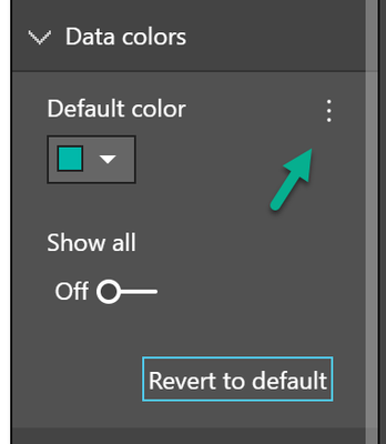
This measure is used to highlight the selection from the slicter in the column chart. This is done by using the measure from the conditional formattiong option for the data color in the column chart:
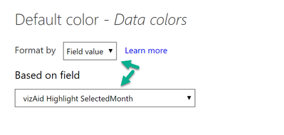
And then selecting the measure in the "Format by Field value" option:
This is how it looks like for a selected month:
Hopefully this is what you are looking for.
Regards,
Tom
Did I answer your question? Mark my post as a solution, this will help others!
Proud to be a Super User!
I accept Kudos 😉
Hamburg, Germany
- Mark as New
- Bookmark
- Subscribe
- Mute
- Subscribe to RSS Feed
- Permalink
- Report Inappropriate Content
Nice Tom, Based filter selection bar color changing, is there any possability with out any slicer/filter just click on bar selection.
- Mark as New
- Bookmark
- Subscribe
- Mute
- Subscribe to RSS Feed
- Permalink
- Report Inappropriate Content
Thanks Tom! Sorry I can not download the pdix file since I do not have the permission, do you know how should I reach the pdix?
Actually My data is like this, could you please help me check if the previous solution still work?
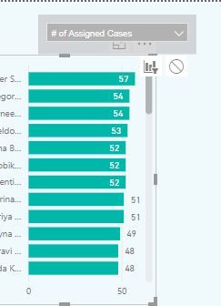
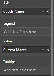
Th bar chart Y-AXIS is the name of people from user table, and the filter(sclier) is measure I created. SO I have two filter, for filter one is the different kinds of indicators, which will be interative with bar chart, filter two is the people's name, which will do not have relationshi with bar since I want to show all the people on one chart, but I want to hightlight the person once I choose this person on the filter, please see below graph: @TomMartens
And below is the value(current month) dax function(it is a switch funtion of the filter on the bar chart top):
- Mark as New
- Bookmark
- Subscribe
- Mute
- Subscribe to RSS Feed
- Permalink
- Report Inappropriate Content
Hey,
2 things,
- I do not fully understand your requirement, maybe you can create a little pbix that reflects your requirement, upload the pbix to onedrive or dropbox and share the link
- I updated the link in my 1st post, now you should be able to download my sample file
But maybe you just can adjust this measure:
vizAid Highlight SelectedUser =
var thisSelecteUser = SELECTEDVALUE('<nameofyourtable>'[nameofthecolumnthatcontainstheuser],BLANK())
var highlightColor =
    IF(AND(NOT(ISBLANK(thisSelecteUser)), FIRSTNONBLANK('theothertable'[nameoftheusercolumn],0) = thisSelecteUser)
        ,"darkred"
        ,BLANK()
    )
return highlightColor
Regards,
Tom
Did I answer your question? Mark my post as a solution, this will help others!
Proud to be a Super User!
I accept Kudos 😉
Hamburg, Germany
- Mark as New
- Bookmark
- Subscribe
- Mute
- Subscribe to RSS Feed
- Permalink
- Report Inappropriate Content
Thanks Toms. That works for me to put the second(unrelated table as the filter).
One more question, if I want to use this filter to control the report level, once I use the unrelated table filter to control the graph, how should I control the other designed graph? Thanks!
- Mark as New
- Bookmark
- Subscribe
- Mute
- Subscribe to RSS Feed
- Permalink
- Report Inappropriate Content
Hey,
basically it's this that you have to consider either if you use the unrelated table as a slicer or as an axis.
If you use the unrelated table as a slicer you have to consider to create measures like so:
Total Something =
CALCULATE(
	SUM('<yourtable>'[yourcolumn])
	,TREATAAS(VALUES('<unrelatedtable>'[columnfromtheslicer]), 'nameofthetabletobefiltered'[columntobefiltered])
	,...additional filter
)
The DAX function establishes some kind of relationship between the unrelated table and the table to be filtered.
The other way round is more complex 🙂
Regards,
Tom
Did I answer your question? Mark my post as a solution, this will help others!
Proud to be a Super User!
I accept Kudos 😉
Hamburg, Germany
- Mark as New
- Bookmark
- Subscribe
- Mute
- Subscribe to RSS Feed
- Permalink
- Report Inappropriate Content
Hi Tom,
Thank you so much for your response. My stitution is to use the user filter to fill out all the report pages. And only one graph will be highlighted by color by the user choosen. My understanding is to use the un-related filter as the filter, and the related the user name only apply to the single graph X-axis? If this is correct, for the below dax function:
Total Something =
CALCULATE(
	SUM('<yourtable>'[yourcolumn])
	,TREATAAS(VALUES('<unrelatedtable>'[columnfromtheslicer]), 'nameofthetabletobefiltered'[columntobefiltered])
	,...additional filter
)

I would like to know what is this measure used for? And what is the SUM('<yourtable>'[yourcolumn]) refer to? Since I only need to
relate this two filter, do I need to add the third additional filter? Thanks! @TomMartens - Mark as New
- Bookmark
- Subscribe
- Mute
- Subscribe to RSS Feed
- Permalink
- Report Inappropriate Content
Hey,
please create a little scribble that depicts the interaction between the slicer, the visual that has to be highlighted and other visuals.
Please prepare a with sample data (either use enter data or an xlsx as source) that reflects your model, upload the pbix and if necessary also an xlsx to onedrive or dropbox and share the link.
Regards,
Tom
Did I answer your question? Mark my post as a solution, this will help others!
Proud to be a Super User!
I accept Kudos 😉
Hamburg, Germany
- Mark as New
- Bookmark
- Subscribe
- Mute
- Subscribe to RSS Feed
- Permalink
- Report Inappropriate Content
Hi Tom,
Becasue I have so many other calculations exsit. So I would like to use the related table as the filter. By this stitution, I should I build the dax to highlight the filter I choose? Thanks! We can use the exist example. @TomMartens
Helpful resources

Microsoft Fabric Learn Together
Covering the world! 9:00-10:30 AM Sydney, 4:00-5:30 PM CET (Paris/Berlin), 7:00-8:30 PM Mexico City

Power BI Monthly Update - April 2024
Check out the April 2024 Power BI update to learn about new features.

| User | Count |
|---|---|
| 114 | |
| 99 | |
| 75 | |
| 73 | |
| 49 |
| User | Count |
|---|---|
| 145 | |
| 109 | |
| 109 | |
| 90 | |
| 64 |


