- Power BI forums
- Updates
- News & Announcements
- Get Help with Power BI
- Desktop
- Service
- Report Server
- Power Query
- Mobile Apps
- Developer
- DAX Commands and Tips
- Custom Visuals Development Discussion
- Health and Life Sciences
- Power BI Spanish forums
- Translated Spanish Desktop
- Power Platform Integration - Better Together!
- Power Platform Integrations (Read-only)
- Power Platform and Dynamics 365 Integrations (Read-only)
- Training and Consulting
- Instructor Led Training
- Dashboard in a Day for Women, by Women
- Galleries
- Community Connections & How-To Videos
- COVID-19 Data Stories Gallery
- Themes Gallery
- Data Stories Gallery
- R Script Showcase
- Webinars and Video Gallery
- Quick Measures Gallery
- 2021 MSBizAppsSummit Gallery
- 2020 MSBizAppsSummit Gallery
- 2019 MSBizAppsSummit Gallery
- Events
- Ideas
- Custom Visuals Ideas
- Issues
- Issues
- Events
- Upcoming Events
- Community Blog
- Power BI Community Blog
- Custom Visuals Community Blog
- Community Support
- Community Accounts & Registration
- Using the Community
- Community Feedback
Register now to learn Fabric in free live sessions led by the best Microsoft experts. From Apr 16 to May 9, in English and Spanish.
- Power BI forums
- Forums
- Get Help with Power BI
- Desktop
- Re: Unstructured Table
- Subscribe to RSS Feed
- Mark Topic as New
- Mark Topic as Read
- Float this Topic for Current User
- Bookmark
- Subscribe
- Printer Friendly Page
- Mark as New
- Bookmark
- Subscribe
- Mute
- Subscribe to RSS Feed
- Permalink
- Report Inappropriate Content
Unstructured Table
Hi Team,
Thank you so much for your help, now I have another query...
How can I work on Trend Analysis/Line chart in the below one.

Thanks,
Kali
Solved! Go to Solution.
- Mark as New
- Bookmark
- Subscribe
- Mute
- Subscribe to RSS Feed
- Permalink
- Report Inappropriate Content
Hi Kalidass,
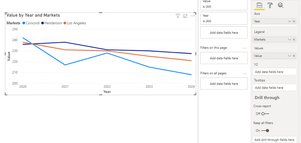
To create a trend chart, you have to unpivot the table.
You will get this view and then use year and Value to build a trend line.
Result:
_______________
If I helped, please accept the solution and give kudos! 😀
- Mark as New
- Bookmark
- Subscribe
- Mute
- Subscribe to RSS Feed
- Permalink
- Report Inappropriate Content
Hi @Anonymous ,
Is this problem solved?
If it is solved, please always accept the replies making sense as solution to your question so that people who may have the same question can get the solution directly.
If not, please let me know.
Best Regards,
Icey
- Mark as New
- Bookmark
- Subscribe
- Mute
- Subscribe to RSS Feed
- Permalink
- Report Inappropriate Content
@Anonymous
Unpivot the data create tables/dimensions for the Market, Keys and year to create star schema model
https://radacad.com/pivot-and-unpivot-with-power-bi
Market = distinct(all(Table[Market]))
Keys= distinct(all(Table[Keys]))
Year= distinct(all(Table[Year])) //You will get after Unpivot
Join them back with table
Refer:https://docs.microsoft.com/en-us/power-bi/guidance/
Microsoft Power BI Learning Resources, 2023 !!
Learn Power BI - Full Course with Dec-2022, with Window, Index, Offset, 100+ Topics !!
Did I answer your question? Mark my post as a solution! Appreciate your Kudos !! Proud to be a Super User! !!
- Mark as New
- Bookmark
- Subscribe
- Mute
- Subscribe to RSS Feed
- Permalink
- Report Inappropriate Content
Hi @Anonymous ,
Before generating any trend/line chart, you will have to modify the structure of the data, so that you can have a DATE column on your x-axis on the chart.
For this what you can do is following:
- Go to Edit Query section.
- Naviagte to the data-set that you have shown below.
- Select all the date columns - 2020 to 2028.
- Go to Transform and Unpivot the selected columns.
- You will send up with following columns:
- Markets
- Keys
- Attribute
- Value
- Attribute column will have date values - 2020 to 2028. Rename this column to DATE or whatever you want.
- Now you can use this column to generate some trend chart.
If this helps and resolves the issue, appreciate a Kudos and mark it as a Solution! 🙂
Thanks,
Pragati
- Mark as New
- Bookmark
- Subscribe
- Mute
- Subscribe to RSS Feed
- Permalink
- Report Inappropriate Content
Hi Kalidass,
To create a trend chart, you have to unpivot the table.
You will get this view and then use year and Value to build a trend line.
Result:
_______________
If I helped, please accept the solution and give kudos! 😀
Helpful resources

Microsoft Fabric Learn Together
Covering the world! 9:00-10:30 AM Sydney, 4:00-5:30 PM CET (Paris/Berlin), 7:00-8:30 PM Mexico City

Power BI Monthly Update - April 2024
Check out the April 2024 Power BI update to learn about new features.

| User | Count |
|---|---|
| 111 | |
| 100 | |
| 80 | |
| 64 | |
| 58 |
| User | Count |
|---|---|
| 148 | |
| 111 | |
| 93 | |
| 84 | |
| 66 |


