- Power BI forums
- Updates
- News & Announcements
- Get Help with Power BI
- Desktop
- Service
- Report Server
- Power Query
- Mobile Apps
- Developer
- DAX Commands and Tips
- Custom Visuals Development Discussion
- Health and Life Sciences
- Power BI Spanish forums
- Translated Spanish Desktop
- Power Platform Integration - Better Together!
- Power Platform Integrations (Read-only)
- Power Platform and Dynamics 365 Integrations (Read-only)
- Training and Consulting
- Instructor Led Training
- Dashboard in a Day for Women, by Women
- Galleries
- Community Connections & How-To Videos
- COVID-19 Data Stories Gallery
- Themes Gallery
- Data Stories Gallery
- R Script Showcase
- Webinars and Video Gallery
- Quick Measures Gallery
- 2021 MSBizAppsSummit Gallery
- 2020 MSBizAppsSummit Gallery
- 2019 MSBizAppsSummit Gallery
- Events
- Ideas
- Custom Visuals Ideas
- Issues
- Issues
- Events
- Upcoming Events
- Community Blog
- Power BI Community Blog
- Custom Visuals Community Blog
- Community Support
- Community Accounts & Registration
- Using the Community
- Community Feedback
Register now to learn Fabric in free live sessions led by the best Microsoft experts. From Apr 16 to May 9, in English and Spanish.
- Power BI forums
- Forums
- Get Help with Power BI
- Desktop
- Re: Unfamiliar icon on relationship lines in Model...
- Subscribe to RSS Feed
- Mark Topic as New
- Mark Topic as Read
- Float this Topic for Current User
- Bookmark
- Subscribe
- Printer Friendly Page
- Mark as New
- Bookmark
- Subscribe
- Mute
- Subscribe to RSS Feed
- Permalink
- Report Inappropriate Content
Unfamiliar icon on relationship lines in Model View
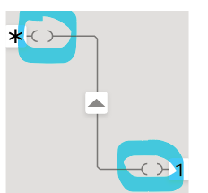
One of my clients encountered this the other day, and I confess I've never seen this before. When they create a relationship between a DirectQuery table and an Imported table, they're getting a funny-looking "parentheses" symbol on the connector line, like this:
No idea why. I'd be grateful for any insight anyone would care to offer. Thanks!
Solved! Go to Solution.
- Mark as New
- Bookmark
- Subscribe
- Mute
- Subscribe to RSS Feed
- Permalink
- Report Inappropriate Content
This indicates a limited relationship.
The Microsoft Documentation describes it here:
https://docs.microsoft.com/en-us/power-bi/transform-model/desktop-relationships-understand#limited-r...
It's also worth checking out Alberto Ferarri's article here:
https://www.sqlbi.com/articles/strong-and-weak-relationships-in-power-bi/
Prior post:
https://community.powerbi.com/t5/Desktop/Strange-relationship/m-p/2199738
- Mark as New
- Bookmark
- Subscribe
- Mute
- Subscribe to RSS Feed
- Permalink
- Report Inappropriate Content
Speaking for myself, my scenario is that when I add additional data source to an existing dataset with one of the queries that is over 1 million lines, the relationship would not work completely, it's over the capacity.
- Mark as New
- Bookmark
- Subscribe
- Mute
- Subscribe to RSS Feed
- Permalink
- Report Inappropriate Content
For the sake of additional context if anyone else hits on this topic, here’s a forum post about the same funny icons where a MS person says there’s no mention of it in the documentation, “which also shows that it’s probably not important”…
https://community.powerbi.com/t5/Desktop/Composite-Model-2-0-New-Relationship-icon-type/td-p/1890829
- Mark as New
- Bookmark
- Subscribe
- Mute
- Subscribe to RSS Feed
- Permalink
- Report Inappropriate Content
This indicates a limited relationship.
The Microsoft Documentation describes it here:
https://docs.microsoft.com/en-us/power-bi/transform-model/desktop-relationships-understand#limited-r...
It's also worth checking out Alberto Ferarri's article here:
https://www.sqlbi.com/articles/strong-and-weak-relationships-in-power-bi/
Prior post:
https://community.powerbi.com/t5/Desktop/Strange-relationship/m-p/2199738
- Mark as New
- Bookmark
- Subscribe
- Mute
- Subscribe to RSS Feed
- Permalink
- Report Inappropriate Content
@AlexisOlson, thanks so much for replying! I have a question about this, though: when I first saw this example, that was the exact thought I had -- that it represented a limited relationship. But, I haven't been able to find any documentation that mentions this visual representation, nor have I been able to reproduce the effect by adding a limited relationship to a model using the most recent build of Power BI Desktop. Do you know when this functionality was added? Does anything else need to be true for it to appear in the Model View?
Thanks again!
- Mark as New
- Bookmark
- Subscribe
- Mute
- Subscribe to RSS Feed
- Permalink
- Report Inappropriate Content
I think it's fairly recent (within the last 6 months?).
I learned about it from the Mastering Tabular video course by the SQLBI guys. The 'Limited relationships' video is apparently one of the free preview videos in this course, so you may want to check it out. I don't know more about it than they cover or what can be gleaned from the other links I provided.
- Mark as New
- Bookmark
- Subscribe
- Mute
- Subscribe to RSS Feed
- Permalink
- Report Inappropriate Content
They do not really give much content for FREE.. Only the outline and sales pitch. Bare bones. Outline is very strategic and impressive though 😉
Helpful resources

Microsoft Fabric Learn Together
Covering the world! 9:00-10:30 AM Sydney, 4:00-5:30 PM CET (Paris/Berlin), 7:00-8:30 PM Mexico City

Power BI Monthly Update - April 2024
Check out the April 2024 Power BI update to learn about new features.

| User | Count |
|---|---|
| 115 | |
| 100 | |
| 88 | |
| 69 | |
| 61 |
| User | Count |
|---|---|
| 151 | |
| 120 | |
| 103 | |
| 87 | |
| 68 |

