- Power BI forums
- Updates
- News & Announcements
- Get Help with Power BI
- Desktop
- Service
- Report Server
- Power Query
- Mobile Apps
- Developer
- DAX Commands and Tips
- Custom Visuals Development Discussion
- Health and Life Sciences
- Power BI Spanish forums
- Translated Spanish Desktop
- Power Platform Integration - Better Together!
- Power Platform Integrations (Read-only)
- Power Platform and Dynamics 365 Integrations (Read-only)
- Training and Consulting
- Instructor Led Training
- Dashboard in a Day for Women, by Women
- Galleries
- Community Connections & How-To Videos
- COVID-19 Data Stories Gallery
- Themes Gallery
- Data Stories Gallery
- R Script Showcase
- Webinars and Video Gallery
- Quick Measures Gallery
- 2021 MSBizAppsSummit Gallery
- 2020 MSBizAppsSummit Gallery
- 2019 MSBizAppsSummit Gallery
- Events
- Ideas
- Custom Visuals Ideas
- Issues
- Issues
- Events
- Upcoming Events
- Community Blog
- Power BI Community Blog
- Custom Visuals Community Blog
- Community Support
- Community Accounts & Registration
- Using the Community
- Community Feedback
Register now to learn Fabric in free live sessions led by the best Microsoft experts. From Apr 16 to May 9, in English and Spanish.
- Power BI forums
- Forums
- Get Help with Power BI
- Desktop
- Re: Understanding the KPI visual (distance to goal...
- Subscribe to RSS Feed
- Mark Topic as New
- Mark Topic as Read
- Float this Topic for Current User
- Bookmark
- Subscribe
- Printer Friendly Page
- Mark as New
- Bookmark
- Subscribe
- Mute
- Subscribe to RSS Feed
- Permalink
- Report Inappropriate Content
Understanding the KPI visual (distance to goal)
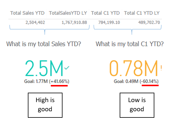
So I recently ran into a problem with the Power Bi KPI visual. I got two KPI's, one is good when it's higer, the other good when it's lower than the previous year.
In the formatting pane, I configured them to show the "Goal" and also the "Distance". Now it is this this "distance" that I can't understand. As you can see in the image, the KPI on the right has a negative percentage. This appeared when I configured the KPI as "Lower is good".
So I see to possible meanings for this "distance".
- How much more or less the current value is than your target/threshold value.
- How much you currently have to gain or lose to achieve your target/threshold value.
For the KPI on the right, logic 1 sounds right. For the other one it's logic 2. So there seems to be a problem. From what I can see, the distance value shouldn't change from positive to negative because you adjust the "Higher is good" setting. There should not be a connection in my mind.
So Anyone here with an explanation for me? Or is this maybe a bug?
- Mark as New
- Bookmark
- Subscribe
- Mute
- Subscribe to RSS Feed
- Permalink
- Report Inappropriate Content
You can actually circumvent this problem.
- Change the KPI configuration to Higher is good.
Now the distance is good but the colour is not. - Therefore change the configuration of the colours the other way around:
- Good = Red colour
- Neutral = Yellow colour
- Bad = Green colour
Should work like you wish now.
- Mark as New
- Bookmark
- Subscribe
- Mute
- Subscribe to RSS Feed
- Permalink
- Report Inappropriate Content
I am having the same issue. When you say lower is good, the trend automatically change the sign which is not a good thing.
One solution is to still use higher is good, the flip the green to red and red to green.
But still the check sign become bad meaning and ! become good. Just not making sense.
Please fix.
- Mark as New
- Bookmark
- Subscribe
- Mute
- Subscribe to RSS Feed
- Permalink
- Report Inappropriate Content
I have exact the same question.
First why Microsoft does not allow configuring % thresholds like Below 80% target Red, Between 81%-99% Amber and 100%+ Green.
It is not a hard thing. But it looks like there is a esoteric black box that decides the color outcome.
At least if we could know the triggers for each color, even if configuring is not alowed.
Regards
Pedro
- Mark as New
- Bookmark
- Subscribe
- Mute
- Subscribe to RSS Feed
- Permalink
- Report Inappropriate Content
HI @Wouter1,
I'm not clarify for your data and measure formula, can you please share these for test?
>>From what I can see, the distance value shouldn't change from positive to negative because you adjust the "Higher is good" setting. There should not be a connection in my mind.
Based on you screenshot I know current value is less than previous, kpi calculation formula should similar as (current -previous)/current. (I test with your data and get result -0.601377..)
Regards,
XIaoxin Sheng
If this post helps, please consider accept as solution to help other members find it more quickly.
Helpful resources

Microsoft Fabric Learn Together
Covering the world! 9:00-10:30 AM Sydney, 4:00-5:30 PM CET (Paris/Berlin), 7:00-8:30 PM Mexico City

Power BI Monthly Update - April 2024
Check out the April 2024 Power BI update to learn about new features.

| User | Count |
|---|---|
| 108 | |
| 98 | |
| 78 | |
| 66 | |
| 53 |
| User | Count |
|---|---|
| 139 | |
| 100 | |
| 95 | |
| 85 | |
| 63 |

