- Power BI forums
- Updates
- News & Announcements
- Get Help with Power BI
- Desktop
- Service
- Report Server
- Power Query
- Mobile Apps
- Developer
- DAX Commands and Tips
- Custom Visuals Development Discussion
- Health and Life Sciences
- Power BI Spanish forums
- Translated Spanish Desktop
- Power Platform Integration - Better Together!
- Power Platform Integrations (Read-only)
- Power Platform and Dynamics 365 Integrations (Read-only)
- Training and Consulting
- Instructor Led Training
- Dashboard in a Day for Women, by Women
- Galleries
- Community Connections & How-To Videos
- COVID-19 Data Stories Gallery
- Themes Gallery
- Data Stories Gallery
- R Script Showcase
- Webinars and Video Gallery
- Quick Measures Gallery
- 2021 MSBizAppsSummit Gallery
- 2020 MSBizAppsSummit Gallery
- 2019 MSBizAppsSummit Gallery
- Events
- Ideas
- Custom Visuals Ideas
- Issues
- Issues
- Events
- Upcoming Events
- Community Blog
- Power BI Community Blog
- Custom Visuals Community Blog
- Community Support
- Community Accounts & Registration
- Using the Community
- Community Feedback
Register now to learn Fabric in free live sessions led by the best Microsoft experts. From Apr 16 to May 9, in English and Spanish.
- Power BI forums
- Forums
- Get Help with Power BI
- Desktop
- Two Axis for Clustured Bar/Column Chart
- Subscribe to RSS Feed
- Mark Topic as New
- Mark Topic as Read
- Float this Topic for Current User
- Bookmark
- Subscribe
- Printer Friendly Page
- Mark as New
- Bookmark
- Subscribe
- Mute
- Subscribe to RSS Feed
- Permalink
- Report Inappropriate Content
Two Axis for Clustured Bar/Column Chart
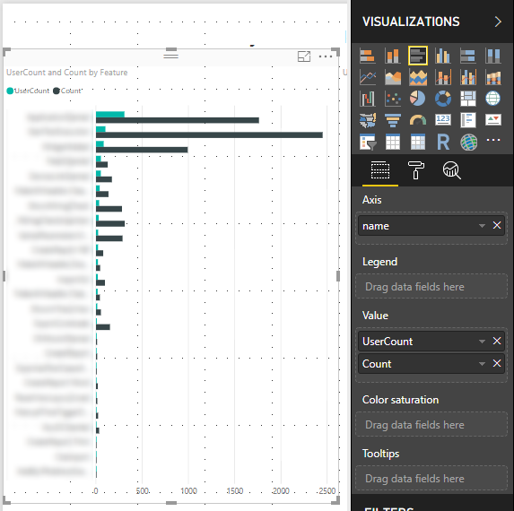
I would like to use the clustured bar chart with 2 x-axis. I use these charts with exactly two "Value" set.
I have seen that a secondary axis is supported by Combo charts but not for the chart I need it for.
Background info: I show the feature usage of an application within this chart. I get two values per feature: UserCount (how many user used this feature at least once) and the total usage count. I could show this information in two different diagrams but it has advantages if they are shown together in one clustered bar chart diagram. This way it is easy to see that the most used feature might not be the feature that most users used at least once.
Is there a way to achieve this?
- Mark as New
- Bookmark
- Subscribe
- Mute
- Subscribe to RSS Feed
- Permalink
- Report Inappropriate Content
Hi @jbe ,
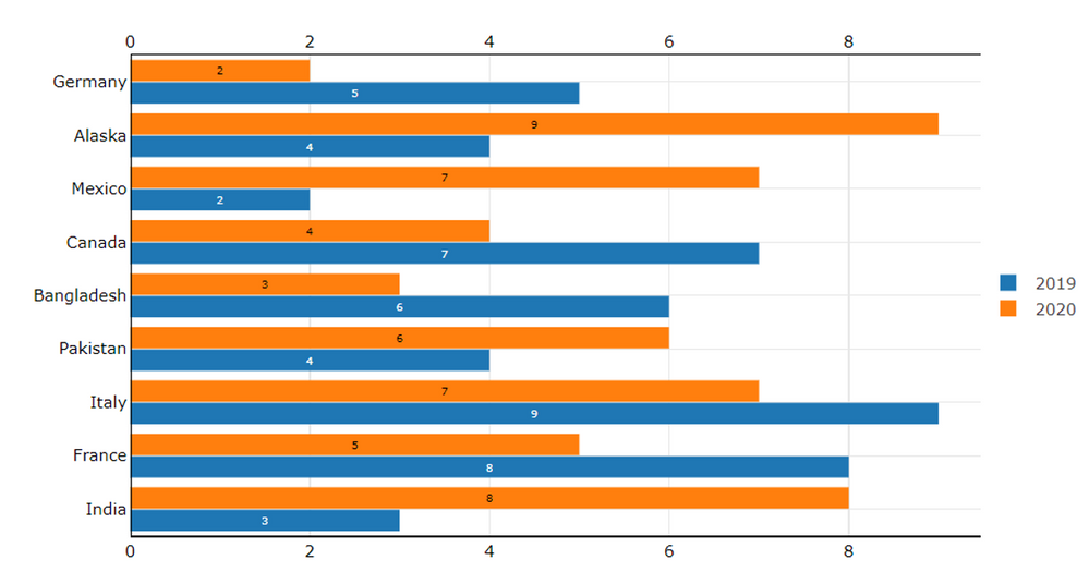
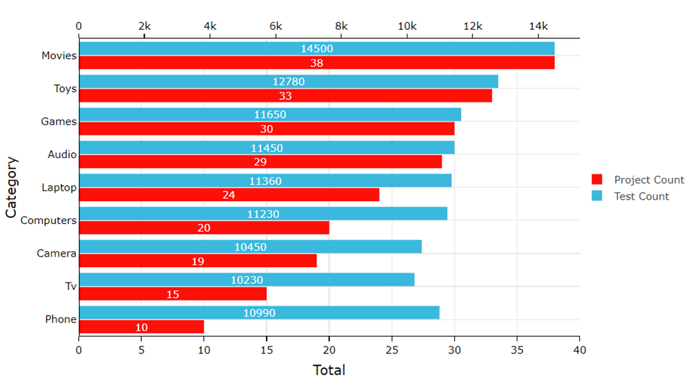
You can use a custom visual like below for the Dual X-axis on the Clustered Bar Chart.


Download link for the custom visual file on this page
https://pbivizedit.com/gallery/dual-x-axis-bar-chart
This was made with our Custom Visual creator tool PBIVizEdit.com. With this tool,
- anyone, irrespective of technical skills, can create their own visuals
- 15 minutes to create a visual from scratch
- opens up many additional attributes to edit (for e.g. labels, tooltips, legends position, etc)
Give this a shot and let us know if you face any problems/errors.
You can use the editor to modify your visual further (some modifications cannot be done in the Power BI window and have to be in the editor).
Thanks,
Team PBIVizEdit
- Mark as New
- Bookmark
- Subscribe
- Mute
- Subscribe to RSS Feed
- Permalink
- Report Inappropriate Content
It looks like you have it displayed there in your image, You might try it as a line and column chart, that will typically give you 2 axis. What is the second axis for? Does it normalize the data somehow or how does it look different than below?
You could always check out the custom visuals or use an R or Python visual.
@ me in replies or I'll lose your thread!!!
Instead of a Kudo, please vote for this idea
Become an expert!: Enterprise DNA
External Tools: MSHGQM
YouTube Channel!: Microsoft Hates Greg
Latest book!: The Definitive Guide to Power Query (M)
DAX is easy, CALCULATE makes DAX hard...
- Mark as New
- Bookmark
- Subscribe
- Mute
- Subscribe to RSS Feed
- Permalink
- Report Inappropriate Content
I need the second x-axis just to normalize the data. Count is always much more than UserCount. Without a separate axis it is very difficult to read / interpret the UserCount columns.
I tried the line and column chart but the line is the wrong visualization type for this data. I set the line stroke to 0 and enabled the visualization of the data points. But the result was not good. The data points were hard to read. Count and UserCount should be shown as columns.
Creating custom visuals or R/Python visuals is beyond the effort I have planned to invest.
- Mark as New
- Bookmark
- Subscribe
- Mute
- Subscribe to RSS Feed
- Permalink
- Report Inappropriate Content
HI @jbe,
AFAIK, current power bi not contain visual who suitable for your requirement, I'd like to suggest you to use r visual to manually draw graph with multiple axises.
If you are not familiar with r script, you can also consider to write a measure to modify unit.
count of column(10x) =
COUNT ( table[column] ) / 10
Regards,
Xiaoxin Sheng
If this post helps, please consider accept as solution to help other members find it more quickly.
- Mark as New
- Bookmark
- Subscribe
- Mute
- Subscribe to RSS Feed
- Permalink
- Report Inappropriate Content
I understand that there is no easy solution for my requirement. I'm not familiar with R Visual and I cannot modify the unit (e.g. show Bars in % with the highest one = 100%) as we need the absolute numbers.
Thanks for the help.
- Mark as New
- Bookmark
- Subscribe
- Mute
- Subscribe to RSS Feed
- Permalink
- Report Inappropriate Content
Hello,
I have a similar problem.
I also would like two axis in a column chart.
I want to split my data by region and by date.
I don't seem to be able to do both at the same time, as I did on Excel.
Thank you for your help,
Solene
Helpful resources

Microsoft Fabric Learn Together
Covering the world! 9:00-10:30 AM Sydney, 4:00-5:30 PM CET (Paris/Berlin), 7:00-8:30 PM Mexico City

Power BI Monthly Update - April 2024
Check out the April 2024 Power BI update to learn about new features.

| User | Count |
|---|---|
| 111 | |
| 95 | |
| 80 | |
| 68 | |
| 59 |
| User | Count |
|---|---|
| 150 | |
| 119 | |
| 104 | |
| 87 | |
| 67 |


