- Power BI forums
- Updates
- News & Announcements
- Get Help with Power BI
- Desktop
- Service
- Report Server
- Power Query
- Mobile Apps
- Developer
- DAX Commands and Tips
- Custom Visuals Development Discussion
- Health and Life Sciences
- Power BI Spanish forums
- Translated Spanish Desktop
- Power Platform Integration - Better Together!
- Power Platform Integrations (Read-only)
- Power Platform and Dynamics 365 Integrations (Read-only)
- Training and Consulting
- Instructor Led Training
- Dashboard in a Day for Women, by Women
- Galleries
- Community Connections & How-To Videos
- COVID-19 Data Stories Gallery
- Themes Gallery
- Data Stories Gallery
- R Script Showcase
- Webinars and Video Gallery
- Quick Measures Gallery
- 2021 MSBizAppsSummit Gallery
- 2020 MSBizAppsSummit Gallery
- 2019 MSBizAppsSummit Gallery
- Events
- Ideas
- Custom Visuals Ideas
- Issues
- Issues
- Events
- Upcoming Events
- Community Blog
- Power BI Community Blog
- Custom Visuals Community Blog
- Community Support
- Community Accounts & Registration
- Using the Community
- Community Feedback
Register now to learn Fabric in free live sessions led by the best Microsoft experts. From Apr 16 to May 9, in English and Spanish.
- Power BI forums
- Forums
- Get Help with Power BI
- Desktop
- Tw graphs into one with different x axis
- Subscribe to RSS Feed
- Mark Topic as New
- Mark Topic as Read
- Float this Topic for Current User
- Bookmark
- Subscribe
- Printer Friendly Page
- Mark as New
- Bookmark
- Subscribe
- Mute
- Subscribe to RSS Feed
- Permalink
- Report Inappropriate Content
Tw graphs into one with different x axis
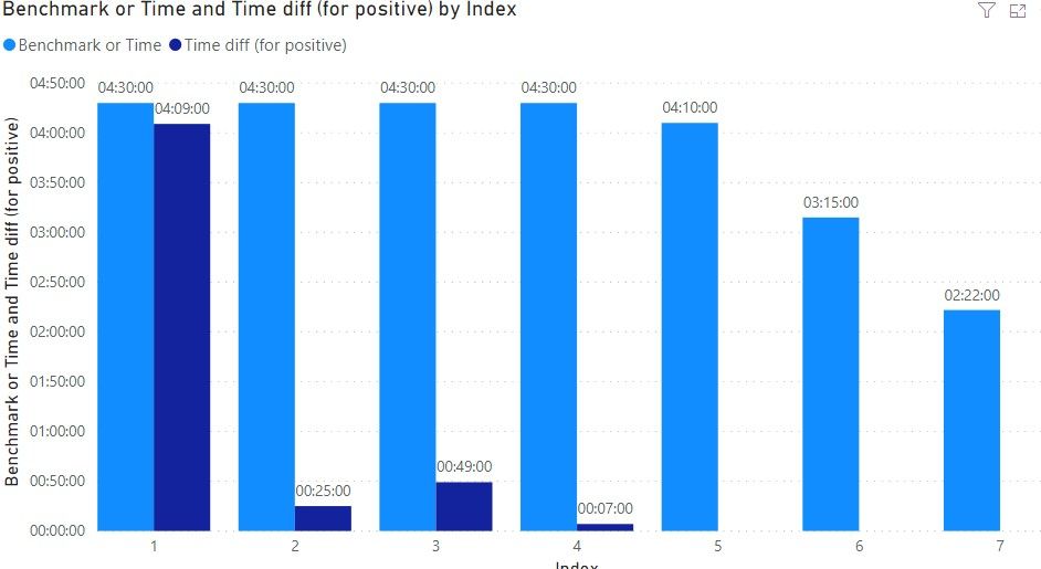
Hey guys,I made two units of the same graphs, cause i need to do few of them like that, but would like to connect them into one if possible like shown below into one x axis with different categories, any way to go around it? That TR would be index
This is my pbix :
https://gofile.io/d/glrl5I
this is what I've got right now:
Regards,
Gediminas
- Mark as New
- Bookmark
- Subscribe
- Mute
- Subscribe to RSS Feed
- Permalink
- Report Inappropriate Content
Hi @Anonymous ,
How about the result after you follow the suggestions mentioned in my original post?
Could you please provide more details or expected result about it If it doesn't meet your requirement?
If you've fixed the issue on your own please kindly share your solution. If the above posts help, please kindly mark it as a solution to help others find it more quickly.
Best regards,
Community Support Team _ zhenbw
If this post helps, then please consider Accept it as the solution to help the other members find it more quickly.
- Mark as New
- Bookmark
- Subscribe
- Mute
- Subscribe to RSS Feed
- Permalink
- Report Inappropriate Content
Hi @Anonymous ,
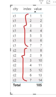
Do you want there are two ranges from one to seven on the same x Axis like this?
If yes, there is no way to combine them.
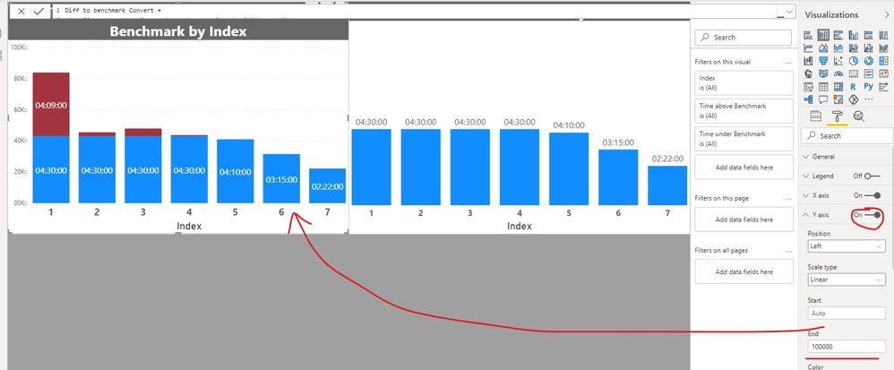
You can create two stacked column charts and put them together like this,
Or maybe you can try the clustered column chart.
May I ask why you want to combine the X Axis?
You can describe your requirements in more detail, we will try to find a better solution.
Best regards,
Community Support Team _ zhenbw
If this post helps, then please consider Accept it as the solution to help the other members find it more quickly.
- Mark as New
- Bookmark
- Subscribe
- Mute
- Subscribe to RSS Feed
- Permalink
- Report Inappropriate Content
@v-zhenbw-msft @MFelix It seems like all I need now is to connect the graph so I would have one Y axis for all of them, if that makes sense, I have got this on my official one right now and need to connect them onto one Y axis.
- Mark as New
- Bookmark
- Subscribe
- Mute
- Subscribe to RSS Feed
- Permalink
- Report Inappropriate Content
Hi @Anonymous ,
If you want to show the indexes 1-7 in each city, you need to create a table structure like this,
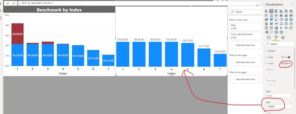
Or you can create a visual for each, and show the visuals side by side. Y axis can be closed after the left visual, then you need to unify their Y-axis range.
You can refer the pbix that we have shared.
If you have any question, please kindly ask here and we will try to resolve it.
Best regards,
Community Support Team _ zhenbw
If this post helps, then please consider Accept it as the solution to help the other members find it more quickly.
BTW, pbix as attached.
- Mark as New
- Bookmark
- Subscribe
- Mute
- Subscribe to RSS Feed
- Permalink
- Report Inappropriate Content
Hi @Anonymous ,
How do they connect in term of axis? what is the common field?
Regards
Miguel Félix
Did I answer your question? Mark my post as a solution!
Proud to be a Super User!
Check out my blog: Power BI em Português- Mark as New
- Bookmark
- Subscribe
- Mute
- Subscribe to RSS Feed
- Permalink
- Report Inappropriate Content
@v-zhenbw-msft How did you combine them like that in your second picture, so you only have one Y axis?
- Mark as New
- Bookmark
- Subscribe
- Mute
- Subscribe to RSS Feed
- Permalink
- Report Inappropriate Content
Hi @v-zhenbw-msft , so basically I got the task to visualise the drive time between certain places, so it goes like City1 - City2 then City 3- City4 and etc, just like below. And basically I Yeah, i need to connect the graphs so it makes them into one long graph with all the stops in it if that makes sense. On the x axis, like below there would be 1 to 7 and then there is another length of drive time and indexes 1-7 again.
- Mark as New
- Bookmark
- Subscribe
- Mute
- Subscribe to RSS Feed
- Permalink
- Report Inappropriate Content
Hi @Anonymous ,
I'm not undedrstanding what is the final result you need, in your PBIX file the two charts are exactly the same. What is the split that you would like to add here?
I understand the image you take about the two values in the X-axis however I cannot relate that with your data/graphs.
Can you share a little bit more insight?
Regards
Miguel Félix
Did I answer your question? Mark my post as a solution!
Proud to be a Super User!
Check out my blog: Power BI em PortuguêsHelpful resources

Microsoft Fabric Learn Together
Covering the world! 9:00-10:30 AM Sydney, 4:00-5:30 PM CET (Paris/Berlin), 7:00-8:30 PM Mexico City

Power BI Monthly Update - April 2024
Check out the April 2024 Power BI update to learn about new features.

| User | Count |
|---|---|
| 110 | |
| 94 | |
| 82 | |
| 66 | |
| 58 |
| User | Count |
|---|---|
| 151 | |
| 121 | |
| 104 | |
| 87 | |
| 67 |


