- Power BI forums
- Updates
- News & Announcements
- Get Help with Power BI
- Desktop
- Service
- Report Server
- Power Query
- Mobile Apps
- Developer
- DAX Commands and Tips
- Custom Visuals Development Discussion
- Health and Life Sciences
- Power BI Spanish forums
- Translated Spanish Desktop
- Power Platform Integration - Better Together!
- Power Platform Integrations (Read-only)
- Power Platform and Dynamics 365 Integrations (Read-only)
- Training and Consulting
- Instructor Led Training
- Dashboard in a Day for Women, by Women
- Galleries
- Community Connections & How-To Videos
- COVID-19 Data Stories Gallery
- Themes Gallery
- Data Stories Gallery
- R Script Showcase
- Webinars and Video Gallery
- Quick Measures Gallery
- 2021 MSBizAppsSummit Gallery
- 2020 MSBizAppsSummit Gallery
- 2019 MSBizAppsSummit Gallery
- Events
- Ideas
- Custom Visuals Ideas
- Issues
- Issues
- Events
- Upcoming Events
- Community Blog
- Power BI Community Blog
- Custom Visuals Community Blog
- Community Support
- Community Accounts & Registration
- Using the Community
- Community Feedback
Register now to learn Fabric in free live sessions led by the best Microsoft experts. From Apr 16 to May 9, in English and Spanish.
- Power BI forums
- Forums
- Get Help with Power BI
- Desktop
- Re: Turn off data labels in clustered bar chart
- Subscribe to RSS Feed
- Mark Topic as New
- Mark Topic as Read
- Float this Topic for Current User
- Bookmark
- Subscribe
- Printer Friendly Page
- Mark as New
- Bookmark
- Subscribe
- Mute
- Subscribe to RSS Feed
- Permalink
- Report Inappropriate Content
Turn off data labels in clustered bar chart
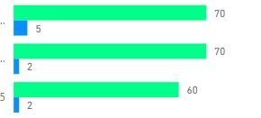
The sample screenshot below is from a clustered bar chart. Is there away i can turn off data labels for the green bars but retain the labels for the blue bars?
If i turn of data labels, labels are turned off for both the blue & green bars but i would to only hide the labels for the green bars but retain them for the blue bars.
Solved! Go to Solution.
- Mark as New
- Bookmark
- Subscribe
- Mute
- Subscribe to RSS Feed
- Permalink
- Report Inappropriate Content
Sure can!
In your chart's visualisation settings, click on the Format tab, expand the settings for Data Labels, then towards the end of that list there is an option for 'Customise Series'
Switch that on, and you'll have additional options to customise the labels for each column (select the series from drop down list).
Note - I'm using the latest (June 2018) update for Power BI, which has new features for label customisation (yay!). So if you don't see Customise Series in your label options, you just need to download the latest version of Power BI Desktop and reopen your file.
Edit to add: This only seems to be available if there are multiple Values in your chart. If you have one Value that you are segmenting into different columns using a Legend then that presently won't give you additional options for customised labels.
- Mark as New
- Bookmark
- Subscribe
- Mute
- Subscribe to RSS Feed
- Permalink
- Report Inappropriate Content
Great tip, thank you.
Helpful resources

Microsoft Fabric Learn Together
Covering the world! 9:00-10:30 AM Sydney, 4:00-5:30 PM CET (Paris/Berlin), 7:00-8:30 PM Mexico City

Power BI Monthly Update - April 2024
Check out the April 2024 Power BI update to learn about new features.

| User | Count |
|---|---|
| 110 | |
| 97 | |
| 77 | |
| 63 | |
| 55 |
| User | Count |
|---|---|
| 143 | |
| 109 | |
| 89 | |
| 84 | |
| 66 |

