- Power BI forums
- Updates
- News & Announcements
- Get Help with Power BI
- Desktop
- Service
- Report Server
- Power Query
- Mobile Apps
- Developer
- DAX Commands and Tips
- Custom Visuals Development Discussion
- Health and Life Sciences
- Power BI Spanish forums
- Translated Spanish Desktop
- Power Platform Integration - Better Together!
- Power Platform Integrations (Read-only)
- Power Platform and Dynamics 365 Integrations (Read-only)
- Training and Consulting
- Instructor Led Training
- Dashboard in a Day for Women, by Women
- Galleries
- Community Connections & How-To Videos
- COVID-19 Data Stories Gallery
- Themes Gallery
- Data Stories Gallery
- R Script Showcase
- Webinars and Video Gallery
- Quick Measures Gallery
- 2021 MSBizAppsSummit Gallery
- 2020 MSBizAppsSummit Gallery
- 2019 MSBizAppsSummit Gallery
- Events
- Ideas
- Custom Visuals Ideas
- Issues
- Issues
- Events
- Upcoming Events
- Community Blog
- Power BI Community Blog
- Custom Visuals Community Blog
- Community Support
- Community Accounts & Registration
- Using the Community
- Community Feedback
Register now to learn Fabric in free live sessions led by the best Microsoft experts. From Apr 16 to May 9, in English and Spanish.
- Power BI forums
- Forums
- Get Help with Power BI
- Desktop
- Re: Trying to display a measure in the legend not ...
- Subscribe to RSS Feed
- Mark Topic as New
- Mark Topic as Read
- Float this Topic for Current User
- Bookmark
- Subscribe
- Printer Friendly Page
- Mark as New
- Bookmark
- Subscribe
- Mute
- Subscribe to RSS Feed
- Permalink
- Report Inappropriate Content
Trying to display a measure in the legend not tootltips
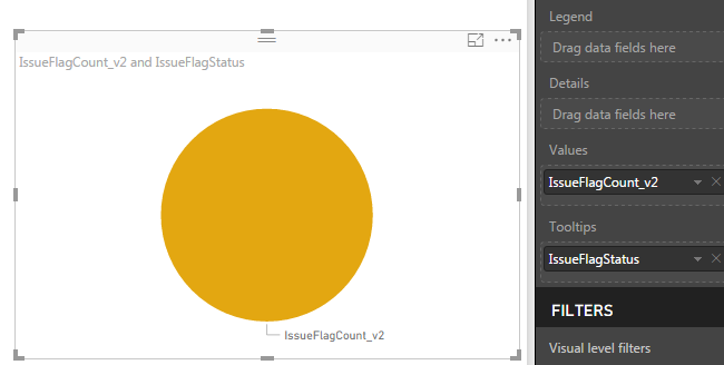
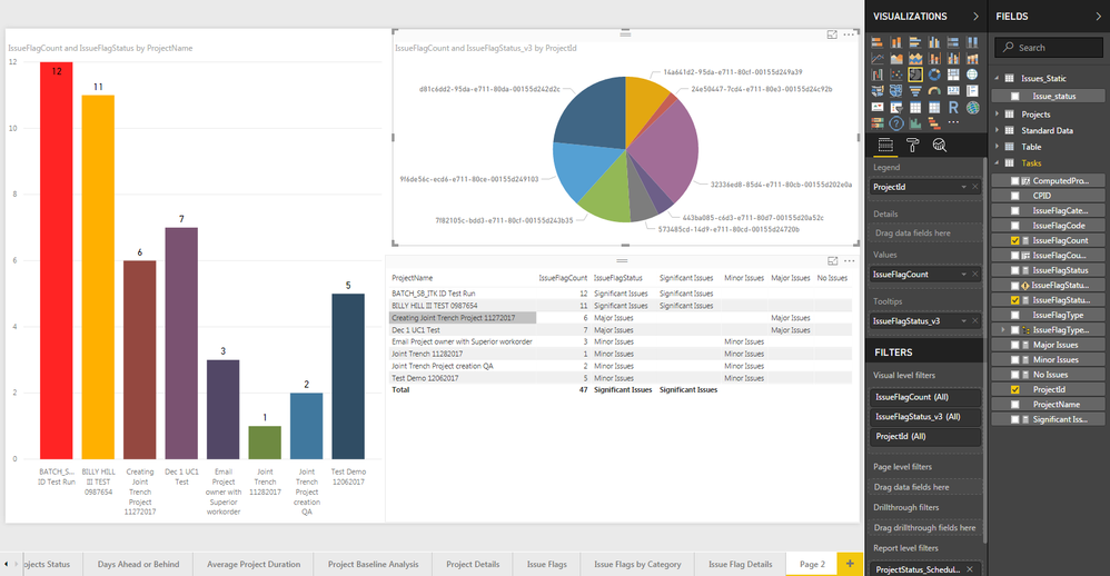
I am trying to display a chart where I can show projects in my organization which have any issues where a projects has 0 issues,>1,>5,>10 issues as different catogories. I can show the projects with any issues in a table format as shown below but when I am trying to display them in a bar chart or a pie chart the 'issuestatus' is only displaying it in the tooltips and not in the legend or values. I want to show a pie or a bar chart to display the no. of projects which have no issues(=0), minor(3<>6), major(6<>10) or significant issues(>10). Below are the DAX queries that I wrote and images of the visuals. Please let me know if there is any alternative solution to this.
(Column)ComputedProjectID = IF(Tasks[IssueFlagCode]<>"",Tasks[ProjectId])
(Column)IssueFlagCount = CALCULATE(COUNT(Tasks[ComputedProjectID]),Tasks[IssueFlagCode]<>"")
(Measure)IssueFlagStatus = IF([IssueFlagCount]>10,"Significant Issues", IF(AND([IssueFlagCount]<=10,[IssueFlagCount]>5),"Major Issues",IF(AND([IssueFlagCount]<=5,[IssueFlagCount]>=1),"Minor Issues","No Issues")))
- Mark as New
- Bookmark
- Subscribe
- Mute
- Subscribe to RSS Feed
- Permalink
- Report Inappropriate Content
Did you ever figure this out?
- Mark as New
- Bookmark
- Subscribe
- Mute
- Subscribe to RSS Feed
- Permalink
- Report Inappropriate Content
Generally you need to use the disconnected table trick for something like that I believe. See article here:
@ me in replies or I'll lose your thread!!!
Instead of a Kudo, please vote for this idea
Become an expert!: Enterprise DNA
External Tools: MSHGQM
YouTube Channel!: Microsoft Hates Greg
Latest book!: The Definitive Guide to Power Query (M)
DAX is easy, CALCULATE makes DAX hard...
- Mark as New
- Bookmark
- Subscribe
- Mute
- Subscribe to RSS Feed
- Permalink
- Report Inappropriate Content
@Greg_Deckler I tried the disconnected table trick to see if I can plot the measure as a legend but it is still showing me the newly created measure in the tooltips.
(Column)ComputedProjectID = IF(Tasks[IssueFlagCode]<>"",Tasks[ProjectId])
(Column)IssueFlagCount = CALCULATE(COUNT(Tasks[ComputedProjectID]),Tasks[IssueFlagCode]<>"")
Created New Measures
Significant Issues = IF(Tasks[IssueFlagCount]>10,"Significant Issues","")
Major Issues = IF(AND(Tasks[IssueFlagCount]<=10,Tasks[IssueFlagCount]>5),"Major Issues","")
Minor Issues = IF(AND(Tasks[IssueFlagCount]<=5,Tasks[IssueFlagCount]>=1),"Minor Issues","")
No Issues = IF(Tasks[IssueFlagCount]=0,"No Issues","")
Created new Table via the enter data query and add a column with the issue labels(significant,major,minor,no issues).
Created a new measure to tie everything together
IssueFlagStatus_v3 =
IF(
// This first IF condition forces the measure to evaluate in the context of the visual
HASONEVALUE(Tasks[ComputedProjectID]),
// This next condition avoids getting the error that the visual cannot be displayed
IF(HASONEVALUE(Issues_Static[Issue_status]),
// This switch statement uses the values from our Attendance slicer to determine which measure to display
SWITCH(
VALUES(Issues_Static[Issue_status]),
"Significant Issues",[Significant Issues],
"Major Issues",[Major Issues], "Minor Issues",[Minor Issues], "No Issues", [No Issues]
),
// If the Attendance slicer has not been selected, just display the date of the training
""
)
)
But even after using this I am not able to see the issue status in the vlaue/legend version and can only see it in the tooltips as before.
I tried creating them as a column but it is giving me the circular dependency error. Please let me know if I need to change anything in the code to make it work.
Thanks
Sridhar
Helpful resources

Microsoft Fabric Learn Together
Covering the world! 9:00-10:30 AM Sydney, 4:00-5:30 PM CET (Paris/Berlin), 7:00-8:30 PM Mexico City

Power BI Monthly Update - April 2024
Check out the April 2024 Power BI update to learn about new features.

| User | Count |
|---|---|
| 109 | |
| 99 | |
| 77 | |
| 66 | |
| 54 |
| User | Count |
|---|---|
| 144 | |
| 104 | |
| 102 | |
| 87 | |
| 64 |


