- Power BI forums
- Updates
- News & Announcements
- Get Help with Power BI
- Desktop
- Service
- Report Server
- Power Query
- Mobile Apps
- Developer
- DAX Commands and Tips
- Custom Visuals Development Discussion
- Health and Life Sciences
- Power BI Spanish forums
- Translated Spanish Desktop
- Power Platform Integration - Better Together!
- Power Platform Integrations (Read-only)
- Power Platform and Dynamics 365 Integrations (Read-only)
- Training and Consulting
- Instructor Led Training
- Dashboard in a Day for Women, by Women
- Galleries
- Community Connections & How-To Videos
- COVID-19 Data Stories Gallery
- Themes Gallery
- Data Stories Gallery
- R Script Showcase
- Webinars and Video Gallery
- Quick Measures Gallery
- 2021 MSBizAppsSummit Gallery
- 2020 MSBizAppsSummit Gallery
- 2019 MSBizAppsSummit Gallery
- Events
- Ideas
- Custom Visuals Ideas
- Issues
- Issues
- Events
- Upcoming Events
- Community Blog
- Power BI Community Blog
- Custom Visuals Community Blog
- Community Support
- Community Accounts & Registration
- Using the Community
- Community Feedback
Register now to learn Fabric in free live sessions led by the best Microsoft experts. From Apr 16 to May 9, in English and Spanish.
- Power BI forums
- Forums
- Get Help with Power BI
- Desktop
- Troubles with Date model relationships
- Subscribe to RSS Feed
- Mark Topic as New
- Mark Topic as Read
- Float this Topic for Current User
- Bookmark
- Subscribe
- Printer Friendly Page
- Mark as New
- Bookmark
- Subscribe
- Mute
- Subscribe to RSS Feed
- Permalink
- Report Inappropriate Content
Troubles with Date model relationships
Hello,
I'm trying to build a report for an issue tracking database. I have a Date Lookup (or Calendar), and I made a one-way one to many relationship between Date and "CreatedDate" on the database.
https://1drv.ms/u/s!Aj36wirhhGsTqZcgSCcTKFlA_pvJsA
On the report, I have a slicer that I plan to use filter graphics by date. The slicer behaves as if there was no relationship, or as if the relationships were not correct. The slicer starts at 1/1/2017, but if I move it to 1/2/2017, everything on my current graphics is filtered out (In other words, all the items are being associated with 1/1/2017, even tho issue dates expand from 2017 to 2021)
I follow all the troubleshooting steps here:
https://docs.microsoft.com/en-us/power-bi/guidance/relationships-troubleshoot
But issues persist.
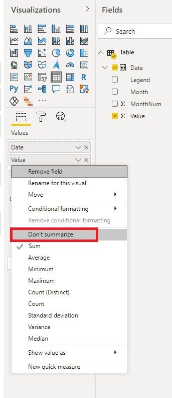
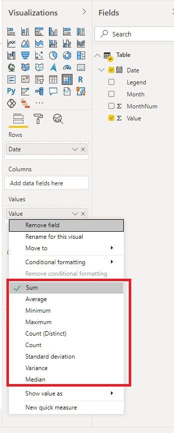
A strange observation I made is that a lot of the visuals are behaving as if each of the cells of my date columns were 'vector'. For instance, if I try to create a 'matrix' visual with one column being the "issue ids" and the other column being "created date", Power BI automatically creates "Earliest created date" when I put it 'created date' in "Values". On the Query editor, dates are set to "Do not Summarize", but its still doing it by default. I also click the arrow on the field that lets me swap to: "Latest, Count, Count (Distinct)" but I have no option to simply use the actual date value.
Please note that I'm obtaining this data from a PostgreSQL DB in "Import" mode (Not query). I'm suspecting that Power BI (2.88.1144.0 64-bit (December 2020)) has a bug and it is importing each cell of the data rows as a more complicated object.
Solved! Go to Solution.
- Mark as New
- Bookmark
- Subscribe
- Mute
- Subscribe to RSS Feed
- Permalink
- Report Inappropriate Content
Hi @Anonymous ,
A strange observation I made is that a lot of the visuals are behaving as if each of the cells of my date columns were 'vector'. For instance, if I try to create a 'matrix' visual with one column being the "issue ids" and the other column being "created date", Power BI automatically creates "Earliest created date" when I put it 'created date' in "Values". On the Query editor, dates are set to "Do not Summarize", but its still doing it by default. I also click the arrow on the field that lets me swap to: "Latest, Count, Count (Distinct)" but I have no option to simply use the actual date value.
Please note that I'm obtaining this data from a PostgreSQL DB in "Import" mode (Not query). I'm suspecting that Power BI (2.88.1144.0 64-bit (December 2020)) has a bug and it is importing each cell of the data rows as a more complicated object.
This is not a bug and is by design. When you put one column into the Values field of a visualization, it will be aggregated if there is no "Don't summarized" option.

In addition, for other issues, could you share us a dummy .pbix file for test? Please remove sensitive information and real data.
Best Regards,
Icey
If this post helps, then please consider Accept it as the solution to help the other members find it more quickly.
- Mark as New
- Bookmark
- Subscribe
- Mute
- Subscribe to RSS Feed
- Permalink
- Report Inappropriate Content
Hi @Anonymous ,
A strange observation I made is that a lot of the visuals are behaving as if each of the cells of my date columns were 'vector'. For instance, if I try to create a 'matrix' visual with one column being the "issue ids" and the other column being "created date", Power BI automatically creates "Earliest created date" when I put it 'created date' in "Values". On the Query editor, dates are set to "Do not Summarize", but its still doing it by default. I also click the arrow on the field that lets me swap to: "Latest, Count, Count (Distinct)" but I have no option to simply use the actual date value.
Please note that I'm obtaining this data from a PostgreSQL DB in "Import" mode (Not query). I'm suspecting that Power BI (2.88.1144.0 64-bit (December 2020)) has a bug and it is importing each cell of the data rows as a more complicated object.
This is not a bug and is by design. When you put one column into the Values field of a visualization, it will be aggregated if there is no "Don't summarized" option.

In addition, for other issues, could you share us a dummy .pbix file for test? Please remove sensitive information and real data.
Best Regards,
Icey
If this post helps, then please consider Accept it as the solution to help the other members find it more quickly.
- Mark as New
- Bookmark
- Subscribe
- Mute
- Subscribe to RSS Feed
- Permalink
- Report Inappropriate Content
@Anonymous it is really not clear, what data you are visualizing? What date column you are using in the slicer? You just simply shared a relationship which is good to know but doesn't tell anything. You need to provide more context. Read this post to get your answer quickly.
https://community.powerbi.com/t5/Community-Blog/How-to-Get-Your-Question-Answered-Quickly/ba-p/38490
Subscribe to the @PowerBIHowTo YT channel for an upcoming video on List and Record functions in Power Query!!
Learn Power BI and Fabric - subscribe to our YT channel - Click here: @PowerBIHowTo
If my solution proved useful, I'd be delighted to receive Kudos. When you put effort into asking a question, it's equally thoughtful to acknowledge and give Kudos to the individual who helped you solve the problem. It's a small gesture that shows appreciation and encouragement! ❤
Did I answer your question? Mark my post as a solution. Proud to be a Super User! Appreciate your Kudos 🙂
Feel free to email me with any of your BI needs.
- Mark as New
- Bookmark
- Subscribe
- Mute
- Subscribe to RSS Feed
- Permalink
- Report Inappropriate Content
@parry2k thankx for the reply. I tried to include pictures on my post but the post editor wasn't responding to my clicks.
"What data are you visualizing?"
I have a pie chart what shows me the distribution of the categories of the submitted issues (e.g. 20% Software, 70% Hardware, 10% other) that dates back over two years. My expectation was to use the slicer to dynamically filter-by-date the data presented by the pie chart.
"What date column you are using in the slicer?"
I have a Calendar or Date Lookup table that I created. Each row is a date, going back over two years. First column is in Date/Time Format, and it was 'Categorized' as a date column on the query editor. I created other columns based on the first one (Year, quarter, etc).
I created a one-way, many-to-one relationship between the "Date" column of my Issues database and the "Date" column of my Calendar lookup.
On the "Reports" view, I created a slicer, and I assign it the "Date" column of my Calendar Lookup table. Right now, all data dissapears from the pie charts when I move the left circle of the slicer, as if all data came from the same date (typical behavior of bad model Relationship)
Helpful resources

Microsoft Fabric Learn Together
Covering the world! 9:00-10:30 AM Sydney, 4:00-5:30 PM CET (Paris/Berlin), 7:00-8:30 PM Mexico City

Power BI Monthly Update - April 2024
Check out the April 2024 Power BI update to learn about new features.

| User | Count |
|---|---|
| 109 | |
| 99 | |
| 77 | |
| 66 | |
| 54 |
| User | Count |
|---|---|
| 144 | |
| 104 | |
| 102 | |
| 87 | |
| 64 |

