- Power BI forums
- Updates
- News & Announcements
- Get Help with Power BI
- Desktop
- Service
- Report Server
- Power Query
- Mobile Apps
- Developer
- DAX Commands and Tips
- Custom Visuals Development Discussion
- Health and Life Sciences
- Power BI Spanish forums
- Translated Spanish Desktop
- Power Platform Integration - Better Together!
- Power Platform Integrations (Read-only)
- Power Platform and Dynamics 365 Integrations (Read-only)
- Training and Consulting
- Instructor Led Training
- Dashboard in a Day for Women, by Women
- Galleries
- Community Connections & How-To Videos
- COVID-19 Data Stories Gallery
- Themes Gallery
- Data Stories Gallery
- R Script Showcase
- Webinars and Video Gallery
- Quick Measures Gallery
- 2021 MSBizAppsSummit Gallery
- 2020 MSBizAppsSummit Gallery
- 2019 MSBizAppsSummit Gallery
- Events
- Ideas
- Custom Visuals Ideas
- Issues
- Issues
- Events
- Upcoming Events
- Community Blog
- Power BI Community Blog
- Custom Visuals Community Blog
- Community Support
- Community Accounts & Registration
- Using the Community
- Community Feedback
Register now to learn Fabric in free live sessions led by the best Microsoft experts. From Apr 16 to May 9, in English and Spanish.
- Power BI forums
- Forums
- Get Help with Power BI
- Desktop
- Trouble with Line graph over time
- Subscribe to RSS Feed
- Mark Topic as New
- Mark Topic as Read
- Float this Topic for Current User
- Bookmark
- Subscribe
- Printer Friendly Page
- Mark as New
- Bookmark
- Subscribe
- Mute
- Subscribe to RSS Feed
- Permalink
- Report Inappropriate Content
Trouble with Line graph over time
I'm getting an unexpected visual when I try to create a line graph over time. I see what Power BI is doing, but I don't understand why, or how to get it to do what I want.
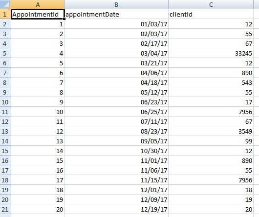
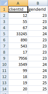
So I created 3 very simple Excel Files to serve as related tables (shown at very bottom). The first, my "appointments" table, has 20 records, and represents appointments with clients on different dates throughout the year (2017). The second table is a "clients" table, and it only has 2 columns - the clientId and a genderId. The third table is just a lookup table for genderId, and has 3 records for "female", "male", and "gender-neutral". So the relationships between the tables are simple: appointments.clientId = clients.clientId, and clients.genderId = lookup.lookupId.
I've created a line graph, with appointments.appointmentDate as my x axis, and "count of Genderid" as my value. In the "Legend" bucket, I 've put lookup.description, which is either "male", "female", or "gender-neutral".
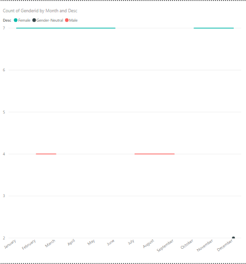
I'll show my tables below. This what I'm getting: All of the appointments in the appointments table have an appointmentDate within 2017, so I have only "2017" on the x-axis. That's expected, because you always start at the year level with a date field as the axis. HOWEVER, I have a value of "7" for "Female", a value of "4" for male, and a value of "2" for gender-neutral. That is NOT expected, because I have 20 appointments for all of 2017, not (7+4+2) = 13. I know why it's only showing 13—because I have only 13 *distinct* clientIds in those 20 appointments. 7 of them are female, 4 of them are male, and 2 of them are gender-neutral. But this is not what I want to see. What I want to see is a gender counted for each of my 20 appointments. Not just for each one of my 13 distinct clients.
So I turn on the drilldown for the visualization, and drill down to month, and I'm still not seeing what I want displayed.
For January, there was one appointment. That client was female, so I want to see 1 for female, 0 for male, and 0 for neutral.
In February, there were 2 appointments. One had a female client and one had a male client, so I want to see 1 for female, 1 for male, and 0 for neutral.
In March, there were 2 appointments; one was for a male client, and one was for clientId 12, who also had an appointment in January and is female. I don't care that she also had an appointment in January; on my line graph for March 2017, I still want to see a value of 1 for female and a value of 1 for male and a value of 0 for neutral.
In April, there were 2 appointments; both of them had female clients. So I want to see a value of 2 for female, a value of 0 for male, and a value of 0 for neutral.
And so on.
Below is the undesired graph which I am getting at the month level. Below that are my 3 simple tables. Please advise why Power BI is displaying this way, and how I can get it to display what I actually want to see, as explained above. Thank you!

Solved! Go to Solution.
- Mark as New
- Bookmark
- Subscribe
- Mute
- Subscribe to RSS Feed
- Permalink
- Report Inappropriate Content
Hi @cmaso,
Based on my test, you could refer to below steps:
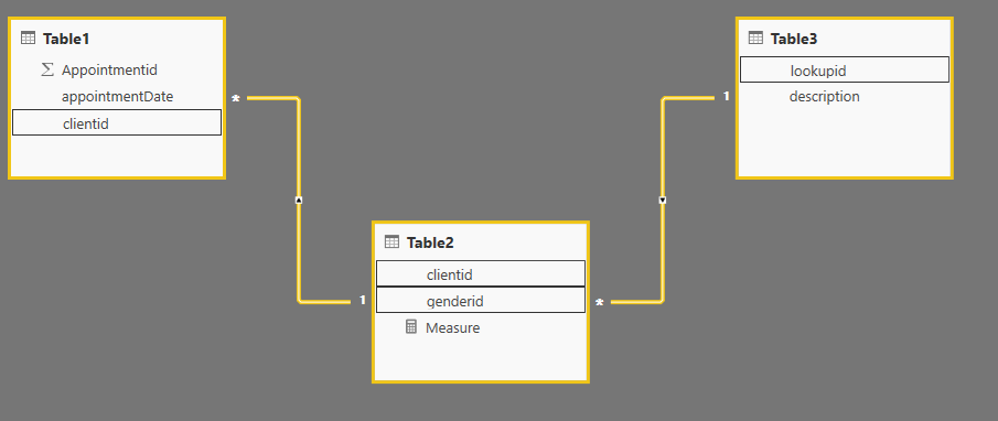
Sample data is your data post before and this is the relationship:
Create a measure:
Measure = IF(CALCULATE(COUNT(Table2[genderid]),FILTER(ALL('Table2'),'Table2'[genderid]=MAX('Table2'[genderid])),FILTER('Table1','Table1'[appointmentDate].[Month]=MAX('Table1'[appointmentDate].[Month])))=BLANK(),
0,
CALCULATE(COUNT(Table2[genderid]),FILTER(ALL('Table2'),'Table2'[genderid]=MAX('Table2'[genderid])),FILTER('Table1','Table1'[appointmentDate].[Month]=MAX('Table1'[appointmentDate].[Month]))))
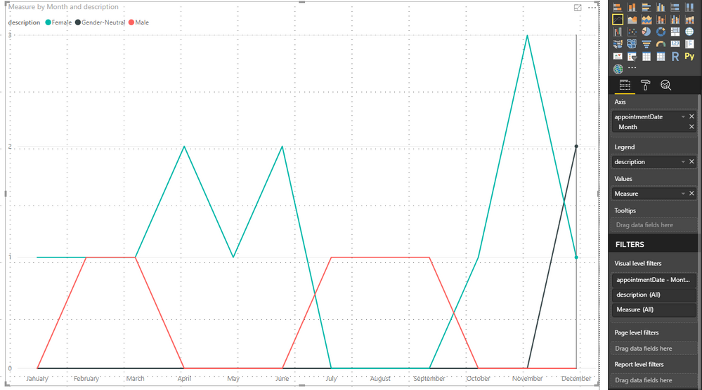
Result:
You could also download the pbix file to have a view:
https://www.dropbox.com/s/mlfbora4bsr9wue/Trouble%20with%20Line%20graph%20over%20time.pbix?dl=0
Regards,
Daniel He
If this post helps, then please consider Accept it as the solution to help the other members find it more quickly.
- Mark as New
- Bookmark
- Subscribe
- Mute
- Subscribe to RSS Feed
- Permalink
- Report Inappropriate Content
Hi @cmaso,
Could you please tell me if your problem has been solved? If it is, could you please mark the helpful replies as Answered?
Regards,
Daniel He
If this post helps, then please consider Accept it as the solution to help the other members find it more quickly.
- Mark as New
- Bookmark
- Subscribe
- Mute
- Subscribe to RSS Feed
- Permalink
- Report Inappropriate Content
Hi @cmaso,
Based on my test, you could refer to below steps:
Sample data is your data post before and this is the relationship:
Create a measure:
Measure = IF(CALCULATE(COUNT(Table2[genderid]),FILTER(ALL('Table2'),'Table2'[genderid]=MAX('Table2'[genderid])),FILTER('Table1','Table1'[appointmentDate].[Month]=MAX('Table1'[appointmentDate].[Month])))=BLANK(),
0,
CALCULATE(COUNT(Table2[genderid]),FILTER(ALL('Table2'),'Table2'[genderid]=MAX('Table2'[genderid])),FILTER('Table1','Table1'[appointmentDate].[Month]=MAX('Table1'[appointmentDate].[Month]))))
Result:
You could also download the pbix file to have a view:
https://www.dropbox.com/s/mlfbora4bsr9wue/Trouble%20with%20Line%20graph%20over%20time.pbix?dl=0
Regards,
Daniel He
If this post helps, then please consider Accept it as the solution to help the other members find it more quickly.
Helpful resources

Microsoft Fabric Learn Together
Covering the world! 9:00-10:30 AM Sydney, 4:00-5:30 PM CET (Paris/Berlin), 7:00-8:30 PM Mexico City

Power BI Monthly Update - April 2024
Check out the April 2024 Power BI update to learn about new features.

| User | Count |
|---|---|
| 112 | |
| 97 | |
| 84 | |
| 67 | |
| 61 |
| User | Count |
|---|---|
| 150 | |
| 120 | |
| 99 | |
| 87 | |
| 68 |
