- Power BI forums
- Updates
- News & Announcements
- Get Help with Power BI
- Desktop
- Service
- Report Server
- Power Query
- Mobile Apps
- Developer
- DAX Commands and Tips
- Custom Visuals Development Discussion
- Health and Life Sciences
- Power BI Spanish forums
- Translated Spanish Desktop
- Power Platform Integration - Better Together!
- Power Platform Integrations (Read-only)
- Power Platform and Dynamics 365 Integrations (Read-only)
- Training and Consulting
- Instructor Led Training
- Dashboard in a Day for Women, by Women
- Galleries
- Community Connections & How-To Videos
- COVID-19 Data Stories Gallery
- Themes Gallery
- Data Stories Gallery
- R Script Showcase
- Webinars and Video Gallery
- Quick Measures Gallery
- 2021 MSBizAppsSummit Gallery
- 2020 MSBizAppsSummit Gallery
- 2019 MSBizAppsSummit Gallery
- Events
- Ideas
- Custom Visuals Ideas
- Issues
- Issues
- Events
- Upcoming Events
- Community Blog
- Power BI Community Blog
- Custom Visuals Community Blog
- Community Support
- Community Accounts & Registration
- Using the Community
- Community Feedback
Register now to learn Fabric in free live sessions led by the best Microsoft experts. From Apr 16 to May 9, in English and Spanish.
- Power BI forums
- Forums
- Get Help with Power BI
- Desktop
- Trouble with Gauge Filtering (Percentage of Total ...
- Subscribe to RSS Feed
- Mark Topic as New
- Mark Topic as Read
- Float this Topic for Current User
- Bookmark
- Subscribe
- Printer Friendly Page
- Mark as New
- Bookmark
- Subscribe
- Mute
- Subscribe to RSS Feed
- Permalink
- Report Inappropriate Content
Trouble with Gauge Filtering (Percentage of Total Count)
Context:
I'm trying to create a report for all help-desk tickets for the current year. I'm pulling the data from a SQL database where each ticket is a new column in the table. To get the total number of tickets created, I'm simply counting the columns.
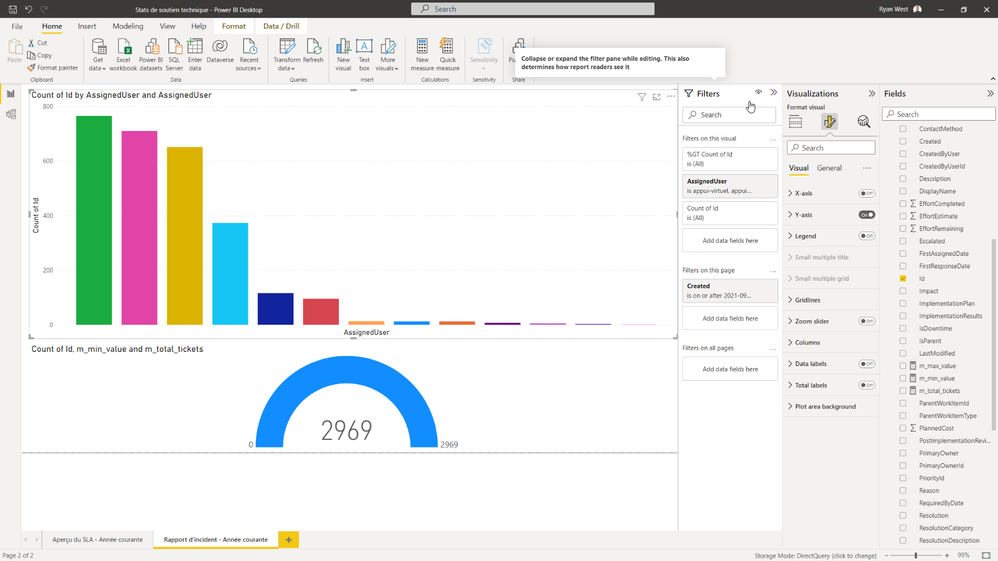
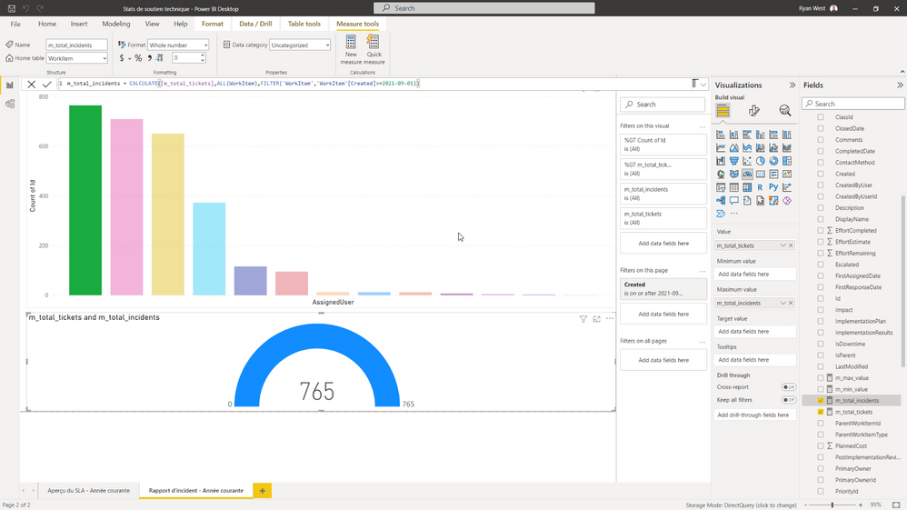
On this page of my report I'd like to be able to see how many tickets each help-desk agent has completed. You can see this illustrated in my screenshots below with the stacked column chart. Next, what I would like is to have the gauge visual show the percentage of tickets (of the grand total) that each help-desk agent completed. Ex: Agent-A did 765 tickets out of 2969 so, 25%.
Problem:
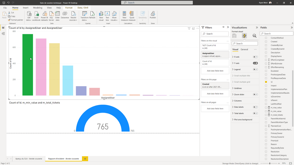
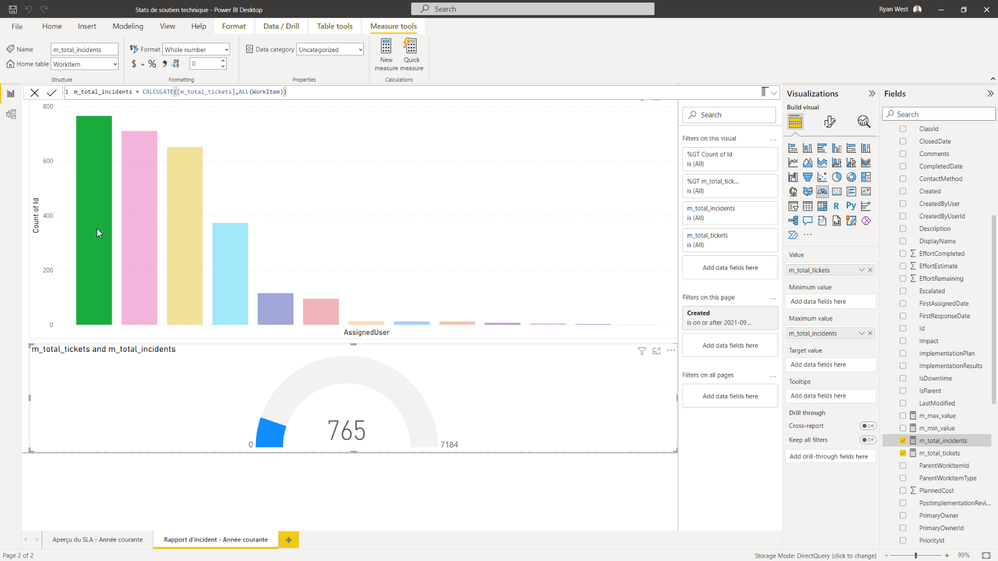
My problem is the gauge visual keeps filtering it's max value. I can never get it to show what I want.
In this photo we can see our total of 2969 tickets.
However, when clicking on an agents portion, the entire gauge visual filters its max value to only count the filtered tickets.
- Mark as New
- Bookmark
- Subscribe
- Mute
- Subscribe to RSS Feed
- Permalink
- Report Inappropriate Content
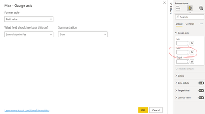
You might want to try going to "guage axis" and clicking the "fx" button next to it. Here you can set the max value dynamically 🙂
I believe there are CALENDARYEAR date functions so you could create a measure that counts a person's "max" value based on the current year and then insert it using the fx button.
Sorry if this is confusing or not what you wanted. Good luck!
Helpful resources

Microsoft Fabric Learn Together
Covering the world! 9:00-10:30 AM Sydney, 4:00-5:30 PM CET (Paris/Berlin), 7:00-8:30 PM Mexico City

Power BI Monthly Update - April 2024
Check out the April 2024 Power BI update to learn about new features.

| User | Count |
|---|---|
| 113 | |
| 99 | |
| 80 | |
| 70 | |
| 60 |
| User | Count |
|---|---|
| 149 | |
| 114 | |
| 107 | |
| 89 | |
| 67 |
