- Power BI forums
- Updates
- News & Announcements
- Get Help with Power BI
- Desktop
- Service
- Report Server
- Power Query
- Mobile Apps
- Developer
- DAX Commands and Tips
- Custom Visuals Development Discussion
- Health and Life Sciences
- Power BI Spanish forums
- Translated Spanish Desktop
- Power Platform Integration - Better Together!
- Power Platform Integrations (Read-only)
- Power Platform and Dynamics 365 Integrations (Read-only)
- Training and Consulting
- Instructor Led Training
- Dashboard in a Day for Women, by Women
- Galleries
- Community Connections & How-To Videos
- COVID-19 Data Stories Gallery
- Themes Gallery
- Data Stories Gallery
- R Script Showcase
- Webinars and Video Gallery
- Quick Measures Gallery
- 2021 MSBizAppsSummit Gallery
- 2020 MSBizAppsSummit Gallery
- 2019 MSBizAppsSummit Gallery
- Events
- Ideas
- Custom Visuals Ideas
- Issues
- Issues
- Events
- Upcoming Events
- Community Blog
- Power BI Community Blog
- Custom Visuals Community Blog
- Community Support
- Community Accounts & Registration
- Using the Community
- Community Feedback
Register now to learn Fabric in free live sessions led by the best Microsoft experts. From Apr 16 to May 9, in English and Spanish.
- Power BI forums
- Forums
- Get Help with Power BI
- Desktop
- Trouble with Data Count
- Subscribe to RSS Feed
- Mark Topic as New
- Mark Topic as Read
- Float this Topic for Current User
- Bookmark
- Subscribe
- Printer Friendly Page
- Mark as New
- Bookmark
- Subscribe
- Mute
- Subscribe to RSS Feed
- Permalink
- Report Inappropriate Content
Trouble with Data Count
I have a large database with various financial metrics including stock price. I want to show the trend of the stock price over time, however the line chart is displaying the count of stock price and I cannot figure out how to change this. The table below gives a basic idea of what the data looks like. Any suggestions?
| Date | Company A |
| 09/24/2007 | 40.87 |
| 09/25/2007 | 40.13 |
| 09/26/2007 | 40.4 |
| 09/27/2007 | 40.75 |
Solved! Go to Solution.
- Mark as New
- Bookmark
- Subscribe
- Mute
- Subscribe to RSS Feed
- Permalink
- Report Inappropriate Content
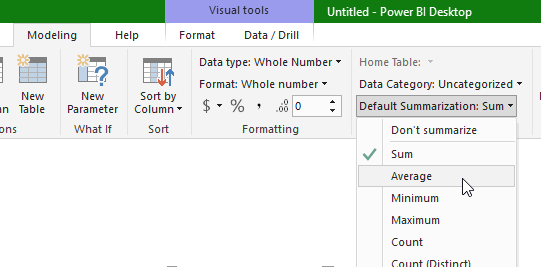
Change it to "Sum" or "Average" or any of the other aggregate measures; since you only have one value per date, "Sum" will work just fine.
In your case, "Average" might be the most prudent measure that you'd use in other visualizations, so I'd recommend you change the default aggregation. Select your Stock Price column and you'll find the option in the Modeling tab at the top. See screenshot:
- Mark as New
- Bookmark
- Subscribe
- Mute
- Subscribe to RSS Feed
- Permalink
- Report Inappropriate Content
if the values are formatted as decimals not text, you should just be able to put date into axis and company into values.
- Mark as New
- Bookmark
- Subscribe
- Mute
- Subscribe to RSS Feed
- Permalink
- Report Inappropriate Content
I have this problem when PowerBI see's my numeric values at Text or another format. Make sure the column is formatted as Decimal Number or another numeric like value. FOrrest
Please give Kudos or Mark as a Solution!
https://www.linkedin.com/in/forrest-hill-04480730/
Proud to give back to the community!
Thank You!
- Mark as New
- Bookmark
- Subscribe
- Mute
- Subscribe to RSS Feed
- Permalink
- Report Inappropriate Content
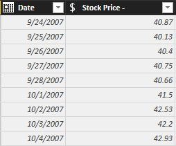
I appreciate the response, however I am still having trouble. I have formatted the stock price column as fixed decimal (see picture below). When I add the stock pric to the line chart, it immediatley changes to 'count of stock price'. What do you think the issue is? Could it simply be due to the large data set?
- Mark as New
- Bookmark
- Subscribe
- Mute
- Subscribe to RSS Feed
- Permalink
- Report Inappropriate Content
Change it to "Sum" or "Average" or any of the other aggregate measures; since you only have one value per date, "Sum" will work just fine.
In your case, "Average" might be the most prudent measure that you'd use in other visualizations, so I'd recommend you change the default aggregation. Select your Stock Price column and you'll find the option in the Modeling tab at the top. See screenshot:
- Mark as New
- Bookmark
- Subscribe
- Mute
- Subscribe to RSS Feed
- Permalink
- Report Inappropriate Content
Out of my understanding, you need Company A values as a Line against the dates.
Just drop the Date column into axis field(remove date hierarchy and select Date) and Company A into values field.
Helpful resources

Microsoft Fabric Learn Together
Covering the world! 9:00-10:30 AM Sydney, 4:00-5:30 PM CET (Paris/Berlin), 7:00-8:30 PM Mexico City

Power BI Monthly Update - April 2024
Check out the April 2024 Power BI update to learn about new features.

| User | Count |
|---|---|
| 111 | |
| 95 | |
| 80 | |
| 68 | |
| 59 |
| User | Count |
|---|---|
| 150 | |
| 119 | |
| 104 | |
| 87 | |
| 67 |


