- Power BI forums
- Updates
- News & Announcements
- Get Help with Power BI
- Desktop
- Service
- Report Server
- Power Query
- Mobile Apps
- Developer
- DAX Commands and Tips
- Custom Visuals Development Discussion
- Health and Life Sciences
- Power BI Spanish forums
- Translated Spanish Desktop
- Power Platform Integration - Better Together!
- Power Platform Integrations (Read-only)
- Power Platform and Dynamics 365 Integrations (Read-only)
- Training and Consulting
- Instructor Led Training
- Dashboard in a Day for Women, by Women
- Galleries
- Community Connections & How-To Videos
- COVID-19 Data Stories Gallery
- Themes Gallery
- Data Stories Gallery
- R Script Showcase
- Webinars and Video Gallery
- Quick Measures Gallery
- 2021 MSBizAppsSummit Gallery
- 2020 MSBizAppsSummit Gallery
- 2019 MSBizAppsSummit Gallery
- Events
- Ideas
- Custom Visuals Ideas
- Issues
- Issues
- Events
- Upcoming Events
- Community Blog
- Power BI Community Blog
- Custom Visuals Community Blog
- Community Support
- Community Accounts & Registration
- Using the Community
- Community Feedback
Register now to learn Fabric in free live sessions led by the best Microsoft experts. From Apr 16 to May 9, in English and Spanish.
- Power BI forums
- Forums
- Get Help with Power BI
- Desktop
- Trouble visualizing two data sources together.
- Subscribe to RSS Feed
- Mark Topic as New
- Mark Topic as Read
- Float this Topic for Current User
- Bookmark
- Subscribe
- Printer Friendly Page
- Mark as New
- Bookmark
- Subscribe
- Mute
- Subscribe to RSS Feed
- Permalink
- Report Inappropriate Content
Trouble visualizing two data sources together.
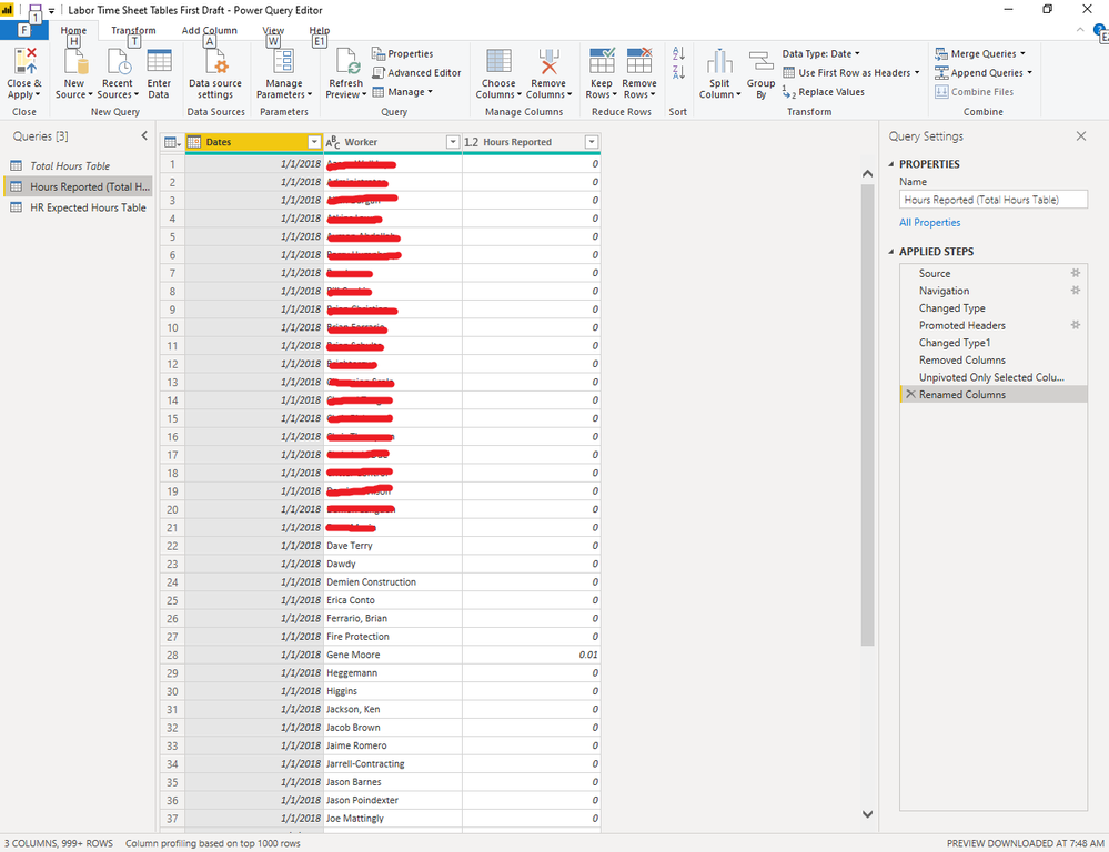
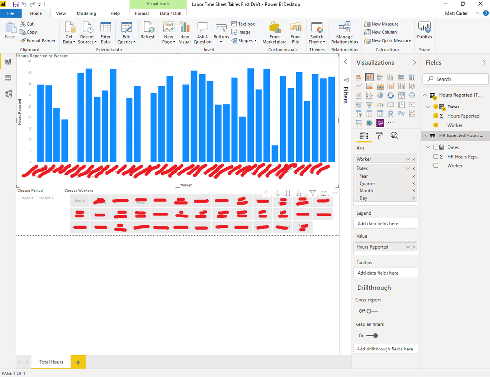
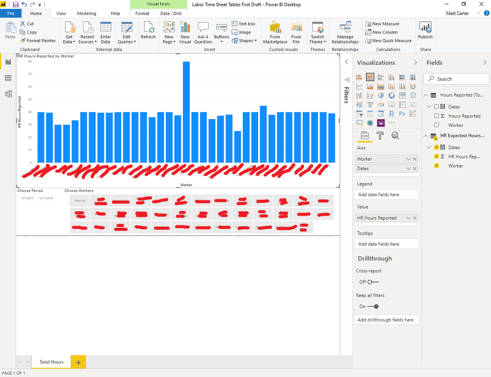
I've got 2 seemingly straightforward data sources. The first is a list of the hours our HR department said our workers were clocked in. The second is a list of the hours our workers reported working.
I'm trying to keep track of the discrepancies to encourage our workers to report their time more accuately. More accurate reporting gives us better data, etc. Whenever I use either data source separately in power BI they display correctly, as one would expect.
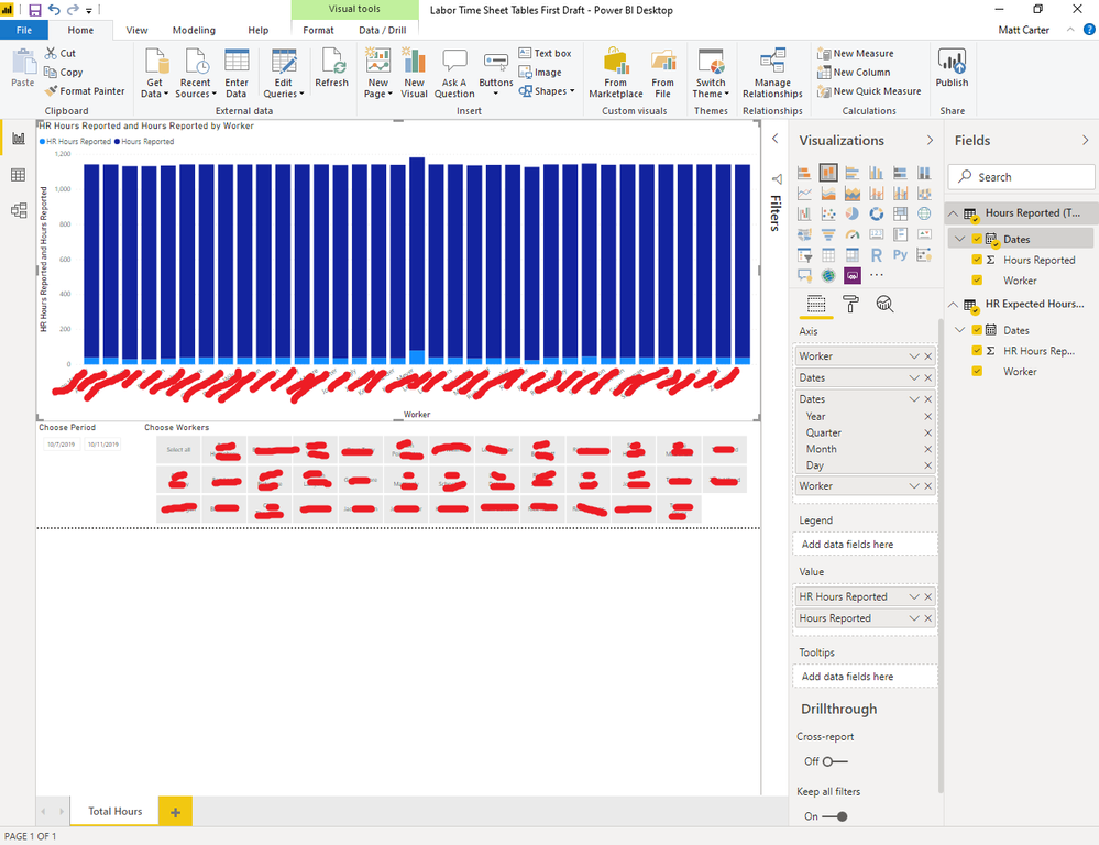
But whenever I try to use both these data sources in a single visualization one or the other data source displays incorrectly. If I understand the large number spike, it appears Power BI is displaying all the hours for one of the sources without regard to who worked them or what day.
Can anyone explain how I could combine both of these data sources into a single visualization to compare how many hours each worker reported working to how many hours HR said each worker was clocked in? I'm not sure what I'm doing incorrectly here.
Solved! Go to Solution.
- Mark as New
- Bookmark
- Subscribe
- Mute
- Subscribe to RSS Feed
- Permalink
- Report Inappropriate Content
@Anonymous
Method 1:
You could easily merge the two tables based on Date and Worker and create a single table with below columns. And then you could create the visual you want.
Date, Worker, Hr_reported_hrs, Emp_reported_hrs
Method 2:
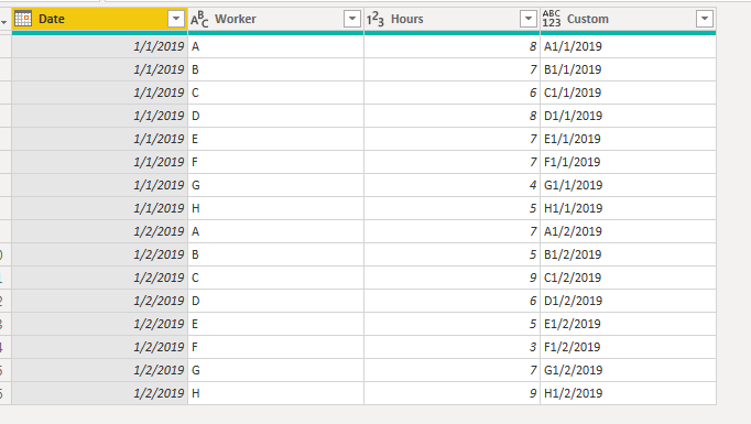
Create a key column in the tables combining worker and date
Custom = Text.From([Worker])&Text.From([Date]).
Define a relationship between the tables based on custom columns ( hopefully it will be a 1 to 1 relationship) and create the visual you need.
If this helps, mark it as a solution.
Kudos are nice too
Helpful resources

Microsoft Fabric Learn Together
Covering the world! 9:00-10:30 AM Sydney, 4:00-5:30 PM CET (Paris/Berlin), 7:00-8:30 PM Mexico City

Power BI Monthly Update - April 2024
Check out the April 2024 Power BI update to learn about new features.

| User | Count |
|---|---|
| 107 | |
| 93 | |
| 77 | |
| 65 | |
| 53 |
| User | Count |
|---|---|
| 147 | |
| 106 | |
| 104 | |
| 87 | |
| 61 |

