- Power BI forums
- Updates
- News & Announcements
- Get Help with Power BI
- Desktop
- Service
- Report Server
- Power Query
- Mobile Apps
- Developer
- DAX Commands and Tips
- Custom Visuals Development Discussion
- Health and Life Sciences
- Power BI Spanish forums
- Translated Spanish Desktop
- Power Platform Integration - Better Together!
- Power Platform Integrations (Read-only)
- Power Platform and Dynamics 365 Integrations (Read-only)
- Training and Consulting
- Instructor Led Training
- Dashboard in a Day for Women, by Women
- Galleries
- Community Connections & How-To Videos
- COVID-19 Data Stories Gallery
- Themes Gallery
- Data Stories Gallery
- R Script Showcase
- Webinars and Video Gallery
- Quick Measures Gallery
- 2021 MSBizAppsSummit Gallery
- 2020 MSBizAppsSummit Gallery
- 2019 MSBizAppsSummit Gallery
- Events
- Ideas
- Custom Visuals Ideas
- Issues
- Issues
- Events
- Upcoming Events
- Community Blog
- Power BI Community Blog
- Custom Visuals Community Blog
- Community Support
- Community Accounts & Registration
- Using the Community
- Community Feedback
Register now to learn Fabric in free live sessions led by the best Microsoft experts. From Apr 16 to May 9, in English and Spanish.
- Power BI forums
- Forums
- Get Help with Power BI
- Desktop
- Trouble visualising data
- Subscribe to RSS Feed
- Mark Topic as New
- Mark Topic as Read
- Float this Topic for Current User
- Bookmark
- Subscribe
- Printer Friendly Page
- Mark as New
- Bookmark
- Subscribe
- Mute
- Subscribe to RSS Feed
- Permalink
- Report Inappropriate Content
Trouble visualising data
So I am trying to visualise the breakdown of Helpdesk tickets, and I'm not having any luck.
Example: data is three text columns (Type/Sub Type/Catagory). So Type is the team (helpdesk, networks, deployment) And each type is subdivided, like with Deployment into the Sub Types of Install, quote and Purchase. Drilling further gives categories like with Install the categories are hardware and software. Not every Sub Type has categories.
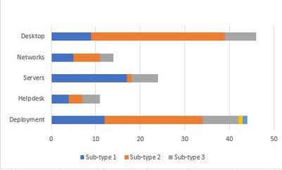
I was looking at a stacked bar chart to visualise it, but it does not appear to work. I had made the Axis the type(Department) and the values as distinct counts of the Sub Type, but all it gives me is a single undivided bar, it does not show the individual stacked Sub Types at all.
I'd like to avoid a double drill down. I appreciate I may well have to do one Drill down, but if it is possible to create one single visualisation that shows how Deployment had 134 calls out of those 78 are installs, with 23 of them being software. Can it be done?
Solved! Go to Solution.
- Mark as New
- Bookmark
- Subscribe
- Mute
- Subscribe to RSS Feed
- Permalink
- Report Inappropriate Content
Thank you Ashish,
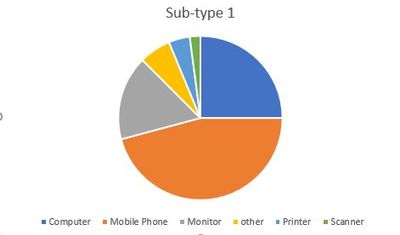
I had taken my quest off-line and found the perfect solution, a Nested Pie Chart. However, it does not look like BI supports Nested Pie Charts.
This lead me to the Sunburst downloadable visual from Microsoft, but since that is just doenut and wastes the middle, I am going with Sunburst by MAQ Software, which runs with the same idea but offers nested piecharts, with the addition of Data Labels, so that people can see without the need to hover.
It is still work in progress, but it is doing what I need.
- Mark as New
- Bookmark
- Subscribe
- Mute
- Subscribe to RSS Feed
- Permalink
- Report Inappropriate Content
Hi @Anonymous ,
According to your description, I created the test data.
I created a measure to count each category.
Take Type/Sub Type as the axis, Catagory as the legend, and measure as the value.
Measure = CALCULATE(COUNT('Table'[Type]),ALLEXCEPT('Table','Table'[Type],'Table'[Sub Type],'Table'[Catagory]))
Best Regards,
Liang
If this post helps, then please consider Accept it as the solution to help the other members find it more quickly.
- Mark as New
- Bookmark
- Subscribe
- Mute
- Subscribe to RSS Feed
- Permalink
- Report Inappropriate Content
Thank you, Liang
I personally find it a bit difficult to get much from that format, so our board will be totally lost. Let me give you a greater range of data and I'll see if I can Come up with the kind of graphic I think I am looking for, but I am open to any ideas on clearly presenting the data.
This is the break-down of all the options of the Deployment team:
| Type | Sub-Type | Catagory |
| Deployment | Install | Computer |
| Deployment | Install | Mobile Phone |
| Deployment | Install | Monitor |
| Deployment | Install | other |
| Deployment | Install | Printer |
| Deployment | Install | Scanner |
| Deployment | Procurement | Purchase Approves |
| Deployment | Procurement | Purchase Query |
| Deployment | Procurement | Quote sent |
| Deployment | Support | Equipment moves |
| Deployment | Support | Obsolete collection |
| Deployment | Support | Other |
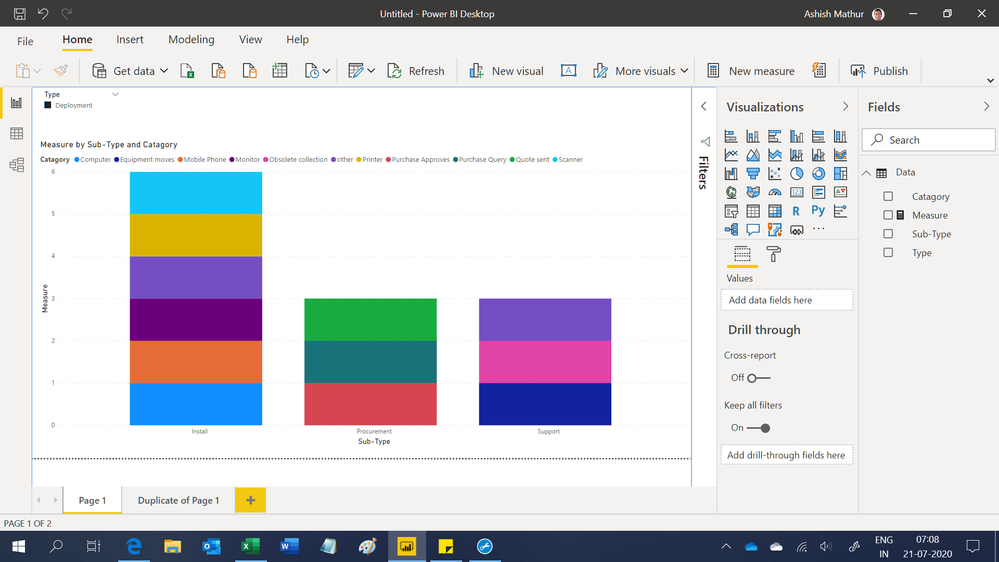
For me, in Power BI, I think I and looking to Drill Through
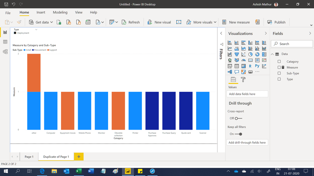
Which will drill through to a chart like
However, I am open to other ideas that may simplify this to a one-stage graph.
- Mark as New
- Bookmark
- Subscribe
- Mute
- Subscribe to RSS Feed
- Permalink
- Report Inappropriate Content
Hi,
I am not sure of what you want. You may download my PBI file from here.
Hope this helps.
Regards,
Ashish Mathur
http://www.ashishmathur.com
https://www.linkedin.com/in/excelenthusiasts/
- Mark as New
- Bookmark
- Subscribe
- Mute
- Subscribe to RSS Feed
- Permalink
- Report Inappropriate Content
Thank you Ashish,
I had taken my quest off-line and found the perfect solution, a Nested Pie Chart. However, it does not look like BI supports Nested Pie Charts.
This lead me to the Sunburst downloadable visual from Microsoft, but since that is just doenut and wastes the middle, I am going with Sunburst by MAQ Software, which runs with the same idea but offers nested piecharts, with the addition of Data Labels, so that people can see without the need to hover.
It is still work in progress, but it is doing what I need.
- Mark as New
- Bookmark
- Subscribe
- Mute
- Subscribe to RSS Feed
- Permalink
- Report Inappropriate Content
@Anonymous can you share sample data and expected output. I think I understood the problem but want to look at data before proposing any solution.
Subscribe to the @PowerBIHowTo YT channel for an upcoming video on List and Record functions in Power Query!!
Learn Power BI and Fabric - subscribe to our YT channel - Click here: @PowerBIHowTo
If my solution proved useful, I'd be delighted to receive Kudos. When you put effort into asking a question, it's equally thoughtful to acknowledge and give Kudos to the individual who helped you solve the problem. It's a small gesture that shows appreciation and encouragement! ❤
Did I answer your question? Mark my post as a solution. Proud to be a Super User! Appreciate your Kudos 🙂
Feel free to email me with any of your BI needs.
Helpful resources

Microsoft Fabric Learn Together
Covering the world! 9:00-10:30 AM Sydney, 4:00-5:30 PM CET (Paris/Berlin), 7:00-8:30 PM Mexico City

Power BI Monthly Update - April 2024
Check out the April 2024 Power BI update to learn about new features.

| User | Count |
|---|---|
| 110 | |
| 94 | |
| 80 | |
| 67 | |
| 59 |
| User | Count |
|---|---|
| 150 | |
| 119 | |
| 104 | |
| 87 | |
| 67 |


