- Power BI forums
- Updates
- News & Announcements
- Get Help with Power BI
- Desktop
- Service
- Report Server
- Power Query
- Mobile Apps
- Developer
- DAX Commands and Tips
- Custom Visuals Development Discussion
- Health and Life Sciences
- Power BI Spanish forums
- Translated Spanish Desktop
- Power Platform Integration - Better Together!
- Power Platform Integrations (Read-only)
- Power Platform and Dynamics 365 Integrations (Read-only)
- Training and Consulting
- Instructor Led Training
- Dashboard in a Day for Women, by Women
- Galleries
- Community Connections & How-To Videos
- COVID-19 Data Stories Gallery
- Themes Gallery
- Data Stories Gallery
- R Script Showcase
- Webinars and Video Gallery
- Quick Measures Gallery
- 2021 MSBizAppsSummit Gallery
- 2020 MSBizAppsSummit Gallery
- 2019 MSBizAppsSummit Gallery
- Events
- Ideas
- Custom Visuals Ideas
- Issues
- Issues
- Events
- Upcoming Events
- Community Blog
- Power BI Community Blog
- Custom Visuals Community Blog
- Community Support
- Community Accounts & Registration
- Using the Community
- Community Feedback
Register now to learn Fabric in free live sessions led by the best Microsoft experts. From Apr 16 to May 9, in English and Spanish.
- Power BI forums
- Forums
- Get Help with Power BI
- Desktop
- Re: Trouble makeing pie chart show as percent of S...
- Subscribe to RSS Feed
- Mark Topic as New
- Mark Topic as Read
- Float this Topic for Current User
- Bookmark
- Subscribe
- Printer Friendly Page
- Mark as New
- Bookmark
- Subscribe
- Mute
- Subscribe to RSS Feed
- Permalink
- Report Inappropriate Content
Trouble makeing pie chart show as percent of SELECTED total, instead of grand total
I will preface this as saying that 1) I understand that when I click on another GRAPH in my dashboard, the pie chart is programmed to automatically show only % of grand total and 2) I understand this can be solved by using the "slicers" visualization.
.....
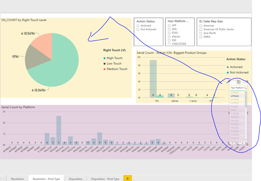
All data from my dashboard in question is from the same source data table. I already have 3 slicers to filter the 3 charts (two bar charts and one pie chart) on my dashboard and they work exactly as I like (When I select items from my slicers, the pie chart changes to showing slices as a % of total selected items). HOWEVER when I try to add a few specific OTHER slicers (slicers containing fields with more field options) my pie chart defaults to only showing % of grand total. What am I doing wrong that with a few specific fields in my dashboard, the pie chart will only show as percent of grand total? It seems to happen only with fields with a higher number of options (10+?). Could this be causing my problems?
When I use the slicers shown above, the pie chart works correctly and shows as a % of the SELECTED total.
When I create the NEW slicer that I want to add and I select an item from it, the pie chart does NOT display the percentages teh same way. Now they are showing as a % of the GRAND total
Solved! Go to Solution.
- Mark as New
- Bookmark
- Subscribe
- Mute
- Subscribe to RSS Feed
- Permalink
- Report Inappropriate Content
Hi @johnnyquest420,
I will preface this as saying that 1) I understand that when I click on another GRAPH in my dashboard, the pie chart is programmed to automatically show only % of grand total and 2) I understand this can be solved by using the "slicers" visualization.
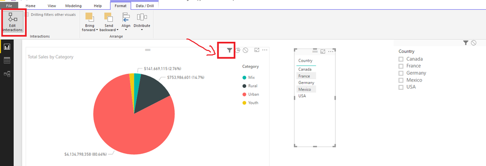
Based on my you should be able to use the Edit Interaction option under Format tab to make the the Visual/Graph and Slicer filter the Pie Chart in the same way(show as percent of selected total).
1. Select the Visual/Graph.
2. In Desktop, select Format > Interactions. To turn on the visualization interaction controls, select Edit interactions.
3. Select the filter icon on the Pie Chart.
Regards
Helpful resources

Microsoft Fabric Learn Together
Covering the world! 9:00-10:30 AM Sydney, 4:00-5:30 PM CET (Paris/Berlin), 7:00-8:30 PM Mexico City

Power BI Monthly Update - April 2024
Check out the April 2024 Power BI update to learn about new features.

| User | Count |
|---|---|
| 114 | |
| 100 | |
| 81 | |
| 70 | |
| 62 |
| User | Count |
|---|---|
| 148 | |
| 116 | |
| 104 | |
| 90 | |
| 65 |


