- Power BI forums
- Updates
- News & Announcements
- Get Help with Power BI
- Desktop
- Service
- Report Server
- Power Query
- Mobile Apps
- Developer
- DAX Commands and Tips
- Custom Visuals Development Discussion
- Health and Life Sciences
- Power BI Spanish forums
- Translated Spanish Desktop
- Power Platform Integration - Better Together!
- Power Platform Integrations (Read-only)
- Power Platform and Dynamics 365 Integrations (Read-only)
- Training and Consulting
- Instructor Led Training
- Dashboard in a Day for Women, by Women
- Galleries
- Community Connections & How-To Videos
- COVID-19 Data Stories Gallery
- Themes Gallery
- Data Stories Gallery
- R Script Showcase
- Webinars and Video Gallery
- Quick Measures Gallery
- 2021 MSBizAppsSummit Gallery
- 2020 MSBizAppsSummit Gallery
- 2019 MSBizAppsSummit Gallery
- Events
- Ideas
- Custom Visuals Ideas
- Issues
- Issues
- Events
- Upcoming Events
- Community Blog
- Power BI Community Blog
- Custom Visuals Community Blog
- Community Support
- Community Accounts & Registration
- Using the Community
- Community Feedback
Register now to learn Fabric in free live sessions led by the best Microsoft experts. From Apr 16 to May 9, in English and Spanish.
- Power BI forums
- Forums
- Get Help with Power BI
- Desktop
- Track Changes of Status Over A Period Of Time
- Subscribe to RSS Feed
- Mark Topic as New
- Mark Topic as Read
- Float this Topic for Current User
- Bookmark
- Subscribe
- Printer Friendly Page
- Mark as New
- Bookmark
- Subscribe
- Mute
- Subscribe to RSS Feed
- Permalink
- Report Inappropriate Content
Track Changes of Status Over A Period Of Time
Hello!
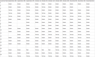
I am working on trying to show the changes of a project status for multiple projects throughout dates. The project status can either be green, yellow, red, or discovery. The status is updated each week. I have attached a sample data for visualization. I have also attached a picture as reference for the chart. Any ideas if we need to change how we track our data would be great as well!
R=Red
Y=Yellow
G=Green
D=Discovery
Solved! Go to Solution.
- Mark as New
- Bookmark
- Subscribe
- Mute
- Subscribe to RSS Feed
- Permalink
- Report Inappropriate Content
Unfortunately, as far as I know, Power BI does not have such visual to meet your needs.
- Mark as New
- Bookmark
- Subscribe
- Mute
- Subscribe to RSS Feed
- Permalink
- Report Inappropriate Content
Unfortunately, as far as I know, Power BI does not have such visual to meet your needs.
- Mark as New
- Bookmark
- Subscribe
- Mute
- Subscribe to RSS Feed
- Permalink
- Report Inappropriate Content
@kshabelski Can you post data as text?
Sorry, having trouble following, can you post sample data as text and expected output?
Not really enough information to go on, please first check if your issue is a common issue listed here: https://community.powerbi.com/t5/Community-Blog/Before-You-Post-Read-This/ba-p/1116882
Also, please see this post regarding How to Get Your Question Answered Quickly: https://community.powerbi.com/t5/Community-Blog/How-to-Get-Your-Question-Answered-Quickly/ba-p/38490
The most important parts are:
1. Sample data as text, use the table tool in the editing bar
2. Expected output from sample data
3. Explanation in words of how to get from 1. to 2.
@ me in replies or I'll lose your thread!!!
Instead of a Kudo, please vote for this idea
Become an expert!: Enterprise DNA
External Tools: MSHGQM
YouTube Channel!: Microsoft Hates Greg
Latest book!: The Definitive Guide to Power Query (M)
DAX is easy, CALCULATE makes DAX hard...
- Mark as New
- Bookmark
- Subscribe
- Mute
- Subscribe to RSS Feed
- Permalink
- Report Inappropriate Content
1. Manually inputted
| Customer Name | September 10th | September 19th | September 27th |
| A | Green | Yellow | Green |
| B | Yellow | Red | Yellow |
| C | Green | Red | Green |
| D | Green | Green | Green |
| E | Yellow | Green | Yellow |
| F | Yellow | Yellow | Yellow |
| G | Red | Red | Red |
2. Expected Output
Stacked Bar Chart
Y axis is Date
X axis customer name
Stacked data is The status for each date and each company
3. Explanation of how to get there
That's why I am here.
Helpful resources

Microsoft Fabric Learn Together
Covering the world! 9:00-10:30 AM Sydney, 4:00-5:30 PM CET (Paris/Berlin), 7:00-8:30 PM Mexico City

Power BI Monthly Update - April 2024
Check out the April 2024 Power BI update to learn about new features.

| User | Count |
|---|---|
| 107 | |
| 98 | |
| 78 | |
| 66 | |
| 53 |
| User | Count |
|---|---|
| 144 | |
| 104 | |
| 100 | |
| 86 | |
| 64 |


