- Power BI forums
- Updates
- News & Announcements
- Get Help with Power BI
- Desktop
- Service
- Report Server
- Power Query
- Mobile Apps
- Developer
- DAX Commands and Tips
- Custom Visuals Development Discussion
- Health and Life Sciences
- Power BI Spanish forums
- Translated Spanish Desktop
- Power Platform Integration - Better Together!
- Power Platform Integrations (Read-only)
- Power Platform and Dynamics 365 Integrations (Read-only)
- Training and Consulting
- Instructor Led Training
- Dashboard in a Day for Women, by Women
- Galleries
- Community Connections & How-To Videos
- COVID-19 Data Stories Gallery
- Themes Gallery
- Data Stories Gallery
- R Script Showcase
- Webinars and Video Gallery
- Quick Measures Gallery
- 2021 MSBizAppsSummit Gallery
- 2020 MSBizAppsSummit Gallery
- 2019 MSBizAppsSummit Gallery
- Events
- Ideas
- Custom Visuals Ideas
- Issues
- Issues
- Events
- Upcoming Events
- Community Blog
- Power BI Community Blog
- Custom Visuals Community Blog
- Community Support
- Community Accounts & Registration
- Using the Community
- Community Feedback
Register now to learn Fabric in free live sessions led by the best Microsoft experts. From Apr 16 to May 9, in English and Spanish.
- Power BI forums
- Forums
- Get Help with Power BI
- Desktop
- Re: TotalYTD function as a graph for different yea...
- Subscribe to RSS Feed
- Mark Topic as New
- Mark Topic as Read
- Float this Topic for Current User
- Bookmark
- Subscribe
- Printer Friendly Page
- Mark as New
- Bookmark
- Subscribe
- Mute
- Subscribe to RSS Feed
- Permalink
- Report Inappropriate Content
TotalYTD function as a graph for different years
Hello guys,
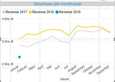
I want to build a measure to show the revenues per month for each year. I have done that, but they should be summarized each month.
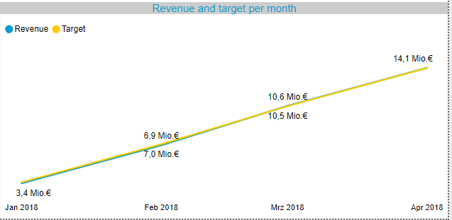
I have two examples for that, how it should look like. So all I need is a TotalYTD function for the year 2018 and 2017 I guess.
Thanks in advance!
Greetings,
Christopher
Solved! Go to Solution.
- Mark as New
- Bookmark
- Subscribe
- Mute
- Subscribe to RSS Feed
- Permalink
- Report Inappropriate Content
hi, @Anonymous
After my research, you could try this way:
Step1:
Add a year and month column for date column
Step2:
Use this formula to create a TotalYTD Measure
Measure = CALCULATE(SUM(Table1[Qty]),FILTER(ALL(Table1[Month]),Table1[Month]<=MAX(Table1[Month])))
Step3:
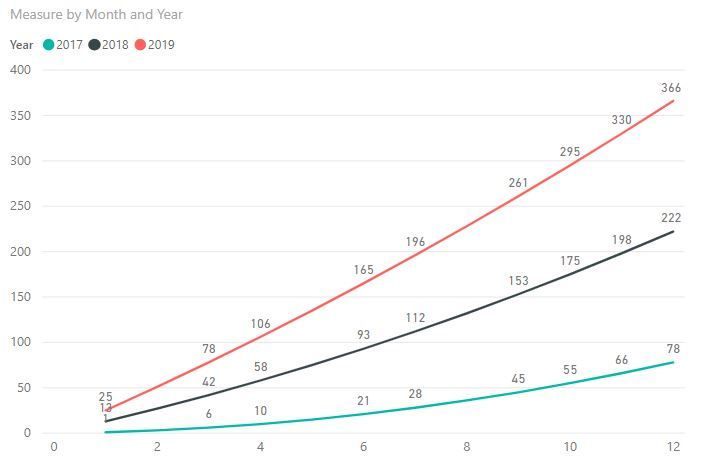
Drag month field into X-Axis and Year field into Legend
Result:
here is pbix file, please try it.
Best Regards,
Lin
If this post helps, then please consider Accept it as the solution to help the other members find it more quickly.
- Mark as New
- Bookmark
- Subscribe
- Mute
- Subscribe to RSS Feed
- Permalink
- Report Inappropriate Content
Is there an option to cut the graph in 2019 for the months in the future?
So when we have February 2019, the graph should only show the two months, actually it goes to linear line over the future months.
- Mark as New
- Bookmark
- Subscribe
- Mute
- Subscribe to RSS Feed
- Permalink
- Report Inappropriate Content
- Mark as New
- Bookmark
- Subscribe
- Mute
- Subscribe to RSS Feed
- Permalink
- Report Inappropriate Content
That works perfectly, thank you very much!!
- Mark as New
- Bookmark
- Subscribe
- Mute
- Subscribe to RSS Feed
- Permalink
- Report Inappropriate Content
Try setting your months on the axis and your year in the legend.
- Mark as New
- Bookmark
- Subscribe
- Mute
- Subscribe to RSS Feed
- Permalink
- Report Inappropriate Content
Hi @jvangrunderbeec,
thanks for your fast reply, but when I will do that, I have the problem that I only see the year 2019 with the TotalYTD function. When I choose only the revenue as the graph instead of the TotalYTD function, I will have the same like in the first screenshot.
- Mark as New
- Bookmark
- Subscribe
- Mute
- Subscribe to RSS Feed
- Permalink
- Report Inappropriate Content
Try this formula:
Cumulative Revenue =
VAR CurrDate =
MAX ( DateTable[Date] ) //Insert datetable date column
Var CalculateddMeasure =
CALCULATE(sum(Revenue)) //Insert to calculate number
RETURN
//Total
IF (
ISBLANK ( CalculateddMeasure );
BLANK ();
IF (
COUNTROWS ( FactTable ) > 0; //Insert FactTable name
CALCULATE (
CalculateddMeasure;
FILTER (
ALLSELECTED ( DateTable ); //Insert Date Table name
DateTable[Date] <= CurrDate //Insert Date Table Date column
&& YEAR ( DateTable[Date] ) = YEAR ( CurrDate ) //Insert Date table Date column
)
);
BLANK ()
)
)
)
- Mark as New
- Bookmark
- Subscribe
- Mute
- Subscribe to RSS Feed
- Permalink
- Report Inappropriate Content
@Anonymous
Are you sure then that the number is correct? isn't is counting all your date? So it says 2019 but it is for all the yaers
- Mark as New
- Bookmark
- Subscribe
- Mute
- Subscribe to RSS Feed
- Permalink
- Report Inappropriate Content
The first one is how it is actually, the screenshot below is how it should be (revenues are summarized). And there will compare the different years.
- Mark as New
- Bookmark
- Subscribe
- Mute
- Subscribe to RSS Feed
- Permalink
- Report Inappropriate Content
See if my Time Intelligence the Hard Way provides a different way of accomplishing what you are going for.
https://community.powerbi.com/t5/Quick-Measures-Gallery/Time-Intelligence-quot-The-Hard-Way-quot-TIT...
@ me in replies or I'll lose your thread!!!
Instead of a Kudo, please vote for this idea
Become an expert!: Enterprise DNA
External Tools: MSHGQM
YouTube Channel!: Microsoft Hates Greg
Latest book!: The Definitive Guide to Power Query (M)
DAX is easy, CALCULATE makes DAX hard...
Helpful resources

Microsoft Fabric Learn Together
Covering the world! 9:00-10:30 AM Sydney, 4:00-5:30 PM CET (Paris/Berlin), 7:00-8:30 PM Mexico City

Power BI Monthly Update - April 2024
Check out the April 2024 Power BI update to learn about new features.

| User | Count |
|---|---|
| 115 | |
| 100 | |
| 88 | |
| 68 | |
| 61 |
| User | Count |
|---|---|
| 152 | |
| 120 | |
| 102 | |
| 87 | |
| 68 |


