- Power BI forums
- Updates
- News & Announcements
- Get Help with Power BI
- Desktop
- Service
- Report Server
- Power Query
- Mobile Apps
- Developer
- DAX Commands and Tips
- Custom Visuals Development Discussion
- Health and Life Sciences
- Power BI Spanish forums
- Translated Spanish Desktop
- Power Platform Integration - Better Together!
- Power Platform Integrations (Read-only)
- Power Platform and Dynamics 365 Integrations (Read-only)
- Training and Consulting
- Instructor Led Training
- Dashboard in a Day for Women, by Women
- Galleries
- Community Connections & How-To Videos
- COVID-19 Data Stories Gallery
- Themes Gallery
- Data Stories Gallery
- R Script Showcase
- Webinars and Video Gallery
- Quick Measures Gallery
- 2021 MSBizAppsSummit Gallery
- 2020 MSBizAppsSummit Gallery
- 2019 MSBizAppsSummit Gallery
- Events
- Ideas
- Custom Visuals Ideas
- Issues
- Issues
- Events
- Upcoming Events
- Community Blog
- Power BI Community Blog
- Custom Visuals Community Blog
- Community Support
- Community Accounts & Registration
- Using the Community
- Community Feedback
Register now to learn Fabric in free live sessions led by the best Microsoft experts. From Apr 16 to May 9, in English and Spanish.
- Power BI forums
- Forums
- Get Help with Power BI
- Desktop
- Re: Total Bar in a clustered column chart
- Subscribe to RSS Feed
- Mark Topic as New
- Mark Topic as Read
- Float this Topic for Current User
- Bookmark
- Subscribe
- Printer Friendly Page
- Mark as New
- Bookmark
- Subscribe
- Mute
- Subscribe to RSS Feed
- Permalink
- Report Inappropriate Content
Total Bar in a clustered column chart
Hi All,
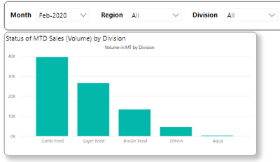
I have created a clustered column chart which has Divisions on the Axis and Volume in Values. The graph is filtered by slicers (I am using Period, Division and Region dimensions for the same).
I am trying a add a Total Bar in the same chart as shown below, which should get filtered by the slicer selections.
I have tried creating a measure as given below, but it does not work for the selection made using the slicers.
Regards
Viraj
- Mark as New
- Bookmark
- Subscribe
- Mute
- Subscribe to RSS Feed
- Permalink
- Report Inappropriate Content
Hey @VIrajMP ,
basically, it's not possible to show axis labels that are not present in the column.
To overcomes this, you have to either to think out of the box, and create an "other" member as shown in this article: https://www.sqlbi.com/articles/showing-the-top-5-products-and-others-row/
You can adopt this to show the total instead of the other.
Another approach is to use visuals that provide the feature of showing a Total like the Zebra BI Charts custom visual available from the Appsource custom visual store (be aware that additional licensing fees may be necessary):
Hopefully, this provides some new ideas on how to tackle your challenge.
Regards,
Tom
Did I answer your question? Mark my post as a solution, this will help others!
Proud to be a Super User!
I accept Kudos 😉
Hamburg, Germany
- Mark as New
- Bookmark
- Subscribe
- Mute
- Subscribe to RSS Feed
- Permalink
- Report Inappropriate Content
Hi @TomMartens ,
I will surely try and figure out as per your suggestion. Will also check the Zebra Bi Charts to see if it suffices my requirement.
Will get back once I find something close to what I want to achieve.
Thanks a lot for your reply
Regards
Viraj
- Mark as New
- Bookmark
- Subscribe
- Mute
- Subscribe to RSS Feed
- Permalink
- Report Inappropriate Content
Hi @VIrajMP ,
I suggest you create a new calculated table:
x = UNION(VALUES(Regional_Forecast_Actual_Table[Division]),ROW("Division","Total"))
Then create a new measure :
Measure = VAR A = MAX(x[Division]) RETURN IF(A <>"Total",CALCULATE(SUM(Regional_Forecast_Actual_Table[MT Regional Forecast]),Regional_Forecast_Actual_Table[Division] = A),CALCULATE(SUM(Regional_Forecast_Actual_Table[MT Regional Forecast]),ALLSELECTED(Regional_Forecast_Actual_Table)))
Use Division column in calculated table for x-axis and measure for value.
If this post helps, then please consider Accept it as the solution to help the other members find it more quickly.
Best Regards,
Dedmon Dai
Helpful resources

Microsoft Fabric Learn Together
Covering the world! 9:00-10:30 AM Sydney, 4:00-5:30 PM CET (Paris/Berlin), 7:00-8:30 PM Mexico City

Power BI Monthly Update - April 2024
Check out the April 2024 Power BI update to learn about new features.

| User | Count |
|---|---|
| 112 | |
| 100 | |
| 76 | |
| 74 | |
| 49 |
| User | Count |
|---|---|
| 146 | |
| 108 | |
| 106 | |
| 90 | |
| 62 |


