- Power BI forums
- Updates
- News & Announcements
- Get Help with Power BI
- Desktop
- Service
- Report Server
- Power Query
- Mobile Apps
- Developer
- DAX Commands and Tips
- Custom Visuals Development Discussion
- Health and Life Sciences
- Power BI Spanish forums
- Translated Spanish Desktop
- Power Platform Integration - Better Together!
- Power Platform Integrations (Read-only)
- Power Platform and Dynamics 365 Integrations (Read-only)
- Training and Consulting
- Instructor Led Training
- Dashboard in a Day for Women, by Women
- Galleries
- Community Connections & How-To Videos
- COVID-19 Data Stories Gallery
- Themes Gallery
- Data Stories Gallery
- R Script Showcase
- Webinars and Video Gallery
- Quick Measures Gallery
- 2021 MSBizAppsSummit Gallery
- 2020 MSBizAppsSummit Gallery
- 2019 MSBizAppsSummit Gallery
- Events
- Ideas
- Custom Visuals Ideas
- Issues
- Issues
- Events
- Upcoming Events
- Community Blog
- Power BI Community Blog
- Custom Visuals Community Blog
- Community Support
- Community Accounts & Registration
- Using the Community
- Community Feedback
Register now to learn Fabric in free live sessions led by the best Microsoft experts. From Apr 16 to May 9, in English and Spanish.
- Power BI forums
- Forums
- Get Help with Power BI
- Desktop
- Re: Top Ten Count over 1 year wtih Top Three trend...
- Subscribe to RSS Feed
- Mark Topic as New
- Mark Topic as Read
- Float this Topic for Current User
- Bookmark
- Subscribe
- Printer Friendly Page
- Mark as New
- Bookmark
- Subscribe
- Mute
- Subscribe to RSS Feed
- Permalink
- Report Inappropriate Content
Top Ten Count over 1 year wtih Top Three trending visuals
I am curious to know if something can be done.
I have a top ten visual that basically counts the occurances that a model number is consumed during a given period of time. The user selects that period of time from my date slicer.
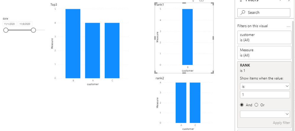
I would like to know if it is possible to have the top 3 or 4 of the top ten in separate visuals so you can see trending from month to month. Basically I would have a top ten chart and beside that 3 or 4 column charts showing usage from one month to the next. I would need it to change dynamically as the top ten chart changes. I can do this now with filters manually but would like for it to be automatic as the date range changes. I tried Rankx but cannot use that as a filter in the visuals for some reason.
Whatever is number 1 in the top ten chart for a given time period would be number one in the first trending chart. Number 2 would be in the second trending chart and so on.
- Mark as New
- Bookmark
- Subscribe
- Mute
- Subscribe to RSS Feed
- Permalink
- Report Inappropriate Content
Hi @Tcurtis ,
Create a rank measure and apply it to visual level filter for each separate visuals.
RANK = RANKX(ALLSELECTED('Table'[customer]),CALCULATE(COUNT('Table'[customer])),,DESC,Skip)
Best Regards,
Liang
If this post helps, then please consider Accept it as the solution to help the other members find it more quickly.
- Mark as New
- Bookmark
- Subscribe
- Mute
- Subscribe to RSS Feed
- Permalink
- Report Inappropriate Content
I an use Rankx and get the ranking but it does not work like I want it to. I want to look at trending in each of the other charts. One big chart with my top ten occurances and three charts with the Top 1, Top 2 and Top three with trending month over month. The ranking gets messed up when I do month over month and tries to re-rank the occurances to the month they occured.
- Mark as New
- Bookmark
- Subscribe
- Mute
- Subscribe to RSS Feed
- Permalink
- Report Inappropriate Content
Hi @Tcurtis ,
It is very difficult to analyze without looking at the data and just by imagining. See if you can paste the images of the chart representing any sample data and expected result.
Best Regards,
Liang
If this post helps, then please consider Accept it as the solution to help the other members find it more quickly.
- Mark as New
- Bookmark
- Subscribe
- Mute
- Subscribe to RSS Feed
- Permalink
- Report Inappropriate Content
I will work on getting some data for you to look at.
- Mark as New
- Bookmark
- Subscribe
- Mute
- Subscribe to RSS Feed
- Permalink
- Report Inappropriate Content
Can you please provide a depiction (Excel mockup for example) of what you are trying to achieve?
A sample dataset would also be helpful.
Thanks
Did I answer your question? Mark my post as a solution!
In doing so, you are also helping me. Thank you!
Proud to be a Super User!
Paul on Linkedin.
Helpful resources

Microsoft Fabric Learn Together
Covering the world! 9:00-10:30 AM Sydney, 4:00-5:30 PM CET (Paris/Berlin), 7:00-8:30 PM Mexico City

Power BI Monthly Update - April 2024
Check out the April 2024 Power BI update to learn about new features.

| User | Count |
|---|---|
| 114 | |
| 99 | |
| 75 | |
| 73 | |
| 49 |
| User | Count |
|---|---|
| 145 | |
| 109 | |
| 109 | |
| 90 | |
| 64 |

