- Power BI forums
- Updates
- News & Announcements
- Get Help with Power BI
- Desktop
- Service
- Report Server
- Power Query
- Mobile Apps
- Developer
- DAX Commands and Tips
- Custom Visuals Development Discussion
- Health and Life Sciences
- Power BI Spanish forums
- Translated Spanish Desktop
- Power Platform Integration - Better Together!
- Power Platform Integrations (Read-only)
- Power Platform and Dynamics 365 Integrations (Read-only)
- Training and Consulting
- Instructor Led Training
- Dashboard in a Day for Women, by Women
- Galleries
- Community Connections & How-To Videos
- COVID-19 Data Stories Gallery
- Themes Gallery
- Data Stories Gallery
- R Script Showcase
- Webinars and Video Gallery
- Quick Measures Gallery
- 2021 MSBizAppsSummit Gallery
- 2020 MSBizAppsSummit Gallery
- 2019 MSBizAppsSummit Gallery
- Events
- Ideas
- Custom Visuals Ideas
- Issues
- Issues
- Events
- Upcoming Events
- Community Blog
- Power BI Community Blog
- Custom Visuals Community Blog
- Community Support
- Community Accounts & Registration
- Using the Community
- Community Feedback
Register now to learn Fabric in free live sessions led by the best Microsoft experts. From Apr 16 to May 9, in English and Spanish.
- Power BI forums
- Forums
- Get Help with Power BI
- Desktop
- Top N per date in a chart
- Subscribe to RSS Feed
- Mark Topic as New
- Mark Topic as Read
- Float this Topic for Current User
- Bookmark
- Subscribe
- Printer Friendly Page
- Mark as New
- Bookmark
- Subscribe
- Mute
- Subscribe to RSS Feed
- Permalink
- Report Inappropriate Content
Top N per date in a chart
Hello PBI community!
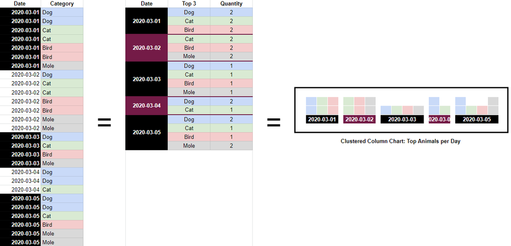
I'm trying to show the most common categories based on a charts drilled down selection. So if it's drilled all the way down to individual dates, then the chart displays the top 5 categories per date. But if it's higher, on say week or month, then it shows the top 5 for each week or month instead.
Date/Week/Month 1 has a different top 5 from Date/Week/Month 2. But the problem I'm encountering is in filtering by Top N which filters to only show me the Top 5 for the entire range, so only 5 categories show in total, even though they are not the top 5 for those specific ranges.
To give an idea of what I'm aiming for here, here's an image of an example table showing off the raw data (left) to the final table (right) using some common sense working out.

In actuality, there are potentially 100s of Categories and the list is ever-growing. So it needs to be something dynamic. I've been wrecking my head on this for a few days and can't figure it out.
Any wizards out there who can help?
Solved! Go to Solution.
- Mark as New
- Bookmark
- Subscribe
- Mute
- Subscribe to RSS Feed
- Permalink
- Report Inappropriate Content
I think you are looking for this:
Calculated column:
- Mark as New
- Bookmark
- Subscribe
- Mute
- Subscribe to RSS Feed
- Permalink
- Report Inappropriate Content
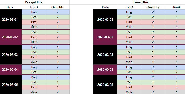
I've made the middle table in the image, now I just need to rank them to prevent the items beyond the top 3 from appearing.
How can I go about that? I've tried so many measures, but nothing is working.
Image below for example:
- Mark as New
- Bookmark
- Subscribe
- Mute
- Subscribe to RSS Feed
- Permalink
- Report Inappropriate Content
I think you are looking for this:
Calculated column:
- Mark as New
- Bookmark
- Subscribe
- Mute
- Subscribe to RSS Feed
- Permalink
- Report Inappropriate Content
Ohh, this is nice! Works very well. Every category available on each date is now ranked.
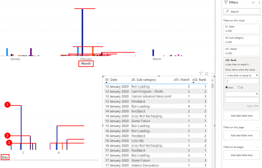
Now I've a new problem, the ranking doesn't stay true to the date selection on the chart.
As seen in the above image, the bottom left chart is filtered down to Day, in which the top 3 is shown as expected. But in the top chart that's drilled up to Monthly Data, the top 3 for each day is shown on that month, rather than the top 3 per month...
I'm thinking that I'm perhaps going about this wrong S: any ideas?
- Mark as New
- Bookmark
- Subscribe
- Mute
- Subscribe to RSS Feed
- Permalink
- Report Inappropriate Content
Hey Stefan,
I think you'll end up with something along these lines:
MEASURE, not a column this time 🙂
You basically add an if statement for every level of granularity you need (year, month, quarter, date).
This article is a great help, rankX is a really hard to understand DAX function! https://radacad.com/how-to-use-rankx-in-dax-part-2-of-3-calculated-measures
Helpful resources

Microsoft Fabric Learn Together
Covering the world! 9:00-10:30 AM Sydney, 4:00-5:30 PM CET (Paris/Berlin), 7:00-8:30 PM Mexico City

Power BI Monthly Update - April 2024
Check out the April 2024 Power BI update to learn about new features.

| User | Count |
|---|---|
| 109 | |
| 96 | |
| 77 | |
| 66 | |
| 53 |
| User | Count |
|---|---|
| 144 | |
| 105 | |
| 102 | |
| 89 | |
| 63 |


