- Power BI forums
- Updates
- News & Announcements
- Get Help with Power BI
- Desktop
- Service
- Report Server
- Power Query
- Mobile Apps
- Developer
- DAX Commands and Tips
- Custom Visuals Development Discussion
- Health and Life Sciences
- Power BI Spanish forums
- Translated Spanish Desktop
- Power Platform Integration - Better Together!
- Power Platform Integrations (Read-only)
- Power Platform and Dynamics 365 Integrations (Read-only)
- Training and Consulting
- Instructor Led Training
- Dashboard in a Day for Women, by Women
- Galleries
- Community Connections & How-To Videos
- COVID-19 Data Stories Gallery
- Themes Gallery
- Data Stories Gallery
- R Script Showcase
- Webinars and Video Gallery
- Quick Measures Gallery
- 2021 MSBizAppsSummit Gallery
- 2020 MSBizAppsSummit Gallery
- 2019 MSBizAppsSummit Gallery
- Events
- Ideas
- Custom Visuals Ideas
- Issues
- Issues
- Events
- Upcoming Events
- Community Blog
- Power BI Community Blog
- Custom Visuals Community Blog
- Community Support
- Community Accounts & Registration
- Using the Community
- Community Feedback
Register now to learn Fabric in free live sessions led by the best Microsoft experts. From Apr 16 to May 9, in English and Spanish.
- Power BI forums
- Forums
- Get Help with Power BI
- Desktop
- Tooltip view different after adding legend
- Subscribe to RSS Feed
- Mark Topic as New
- Mark Topic as Read
- Float this Topic for Current User
- Bookmark
- Subscribe
- Printer Friendly Page
- Mark as New
- Bookmark
- Subscribe
- Mute
- Subscribe to RSS Feed
- Permalink
- Report Inappropriate Content
Tooltip view different after adding legend
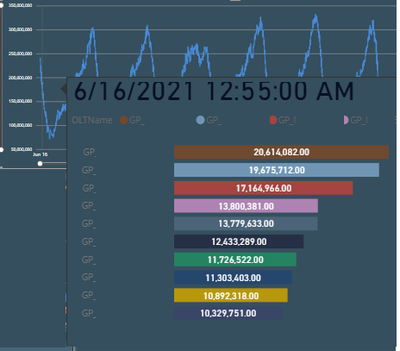
I have a chart where i am able to see the following tooltip (GP1 and its sum on that date,GP2 and its sum on that date, when i hover on a particular date).
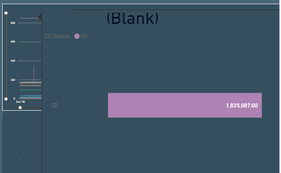
But when i add a legend field in this chart the tooltip doesn't show me the desired view ( I am supposed to see GP,GP1,GP2,GP3... But i am only seeing GP when i hover on GP line and GP1 when i hover on GP1. while i want to hover on x axis and see all the values of (aggregated Y axis) i.e GP on that particular date)
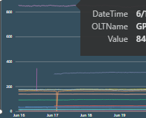
Tried removing the Tooltip but when i hover on the date axis instead of seeing all the GP values i can only see the GP that i point to :
When I use date field instead of datetime in this particular chart then i am able to see the tooltip with different GP values. I am not sure where am I doing wrong.
@amitchandak @parry2k @Fowmy @@please guide me throu
PS: Can't share the pbix due to its large size
- Mark as New
- Bookmark
- Subscribe
- Mute
- Subscribe to RSS Feed
- Permalink
- Report Inappropriate Content
@Anonymous whatever DateTime field you are using x-axis that will in drill thru section of the tooltip page. It should work.
Check my latest blog post Comparing Selected Client With Other Top N Clients | PeryTUS I would ❤ Kudos if my solution helped. 👉 If you can spend time posting the question, you can also make efforts to give Kudos to whoever helped to solve your problem. It is a token of appreciation!
⚡Visit us at https://perytus.com, your one-stop-shop for Power BI-related projects/training/consultancy.⚡
Subscribe to the @PowerBIHowTo YT channel for an upcoming video on List and Record functions in Power Query!!
Learn Power BI and Fabric - subscribe to our YT channel - Click here: @PowerBIHowTo
If my solution proved useful, I'd be delighted to receive Kudos. When you put effort into asking a question, it's equally thoughtful to acknowledge and give Kudos to the individual who helped you solve the problem. It's a small gesture that shows appreciation and encouragement! ❤
Did I answer your question? Mark my post as a solution. Proud to be a Super User! Appreciate your Kudos 🙂
Feel free to email me with any of your BI needs.
- Mark as New
- Bookmark
- Subscribe
- Mute
- Subscribe to RSS Feed
- Permalink
- Report Inappropriate Content
sorry @parry2k i am not able to resolve it but i found what's the issue and i am not able to resolve it
- Mark as New
- Bookmark
- Subscribe
- Mute
- Subscribe to RSS Feed
- Permalink
- Report Inappropriate Content
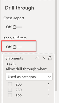
@Anonymous on the tooltip page, turn off, Keep All filters and add the column date that you used on x-axis under the drill thru section (in following screenshot I have shipment column, you will have date there) and that will do it,
Check my latest blog post Comparing Selected Client With Other Top N Clients | PeryTUS I would ❤ Kudos if my solution helped. 👉 If you can spend time posting the question, you can also make efforts to give Kudos to whoever helped to solve your problem. It is a token of appreciation!
⚡Visit us at https://perytus.com, your one-stop-shop for Power BI-related projects/training/consultancy.⚡
Subscribe to the @PowerBIHowTo YT channel for an upcoming video on List and Record functions in Power Query!!
Learn Power BI and Fabric - subscribe to our YT channel - Click here: @PowerBIHowTo
If my solution proved useful, I'd be delighted to receive Kudos. When you put effort into asking a question, it's equally thoughtful to acknowledge and give Kudos to the individual who helped you solve the problem. It's a small gesture that shows appreciation and encouragement! ❤
Did I answer your question? Mark my post as a solution. Proud to be a Super User! Appreciate your Kudos 🙂
Feel free to email me with any of your BI needs.
- Mark as New
- Bookmark
- Subscribe
- Mute
- Subscribe to RSS Feed
- Permalink
- Report Inappropriate Content
@parry2k it didn't worked. However if i change my datetime field with only date field i able to see the tooltip with different GP. but i need the datetime value as i need the time interval as well. I checked the format of datetime it's correct as it is working in the first chart however when i add the legend field it fails to show me the y axis value when i hover on a date field.
Helpful resources

Microsoft Fabric Learn Together
Covering the world! 9:00-10:30 AM Sydney, 4:00-5:30 PM CET (Paris/Berlin), 7:00-8:30 PM Mexico City

Power BI Monthly Update - April 2024
Check out the April 2024 Power BI update to learn about new features.

| User | Count |
|---|---|
| 112 | |
| 100 | |
| 76 | |
| 74 | |
| 49 |
| User | Count |
|---|---|
| 146 | |
| 108 | |
| 106 | |
| 90 | |
| 62 |


