- Power BI forums
- Updates
- News & Announcements
- Get Help with Power BI
- Desktop
- Service
- Report Server
- Power Query
- Mobile Apps
- Developer
- DAX Commands and Tips
- Custom Visuals Development Discussion
- Health and Life Sciences
- Power BI Spanish forums
- Translated Spanish Desktop
- Power Platform Integration - Better Together!
- Power Platform Integrations (Read-only)
- Power Platform and Dynamics 365 Integrations (Read-only)
- Training and Consulting
- Instructor Led Training
- Dashboard in a Day for Women, by Women
- Galleries
- Community Connections & How-To Videos
- COVID-19 Data Stories Gallery
- Themes Gallery
- Data Stories Gallery
- R Script Showcase
- Webinars and Video Gallery
- Quick Measures Gallery
- 2021 MSBizAppsSummit Gallery
- 2020 MSBizAppsSummit Gallery
- 2019 MSBizAppsSummit Gallery
- Events
- Ideas
- Custom Visuals Ideas
- Issues
- Issues
- Events
- Upcoming Events
- Community Blog
- Power BI Community Blog
- Custom Visuals Community Blog
- Community Support
- Community Accounts & Registration
- Using the Community
- Community Feedback
Register now to learn Fabric in free live sessions led by the best Microsoft experts. From Apr 16 to May 9, in English and Spanish.
- Power BI forums
- Forums
- Get Help with Power BI
- Desktop
- Tooltip is separating the data on hover
- Subscribe to RSS Feed
- Mark Topic as New
- Mark Topic as Read
- Float this Topic for Current User
- Bookmark
- Subscribe
- Printer Friendly Page
- Mark as New
- Bookmark
- Subscribe
- Mute
- Subscribe to RSS Feed
- Permalink
- Report Inappropriate Content
Tooltip is separating the data on hover
Greetings,
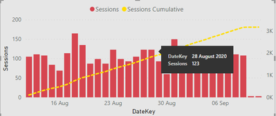
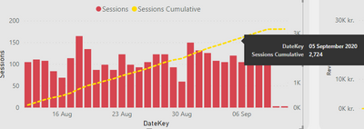
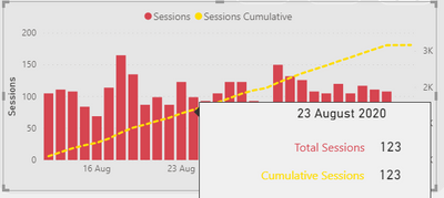
Another problem encoutnered, this time it's a tooltip one. As you can see below, the tooltip is separating the data on hover. In other words, takes the line chart as a different data type, whereas it's just a cumulative measure. Any ideas how to merge the two?
This is what is shown when I hover over the Session columns:
This is what is shown when I hover over Sessions Cumulative:
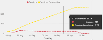
I would like it to be merged just like here:
Looking forward to your ideas!
Solved! Go to Solution.
- Mark as New
- Bookmark
- Subscribe
- Mute
- Subscribe to RSS Feed
- Permalink
- Report Inappropriate Content
Hi @Anonymous ,
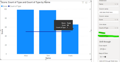
Tooltips are based on the data point you are presenting so in your case when you click on the column you get the value of the column and on the line the respective value. Altough you can add other values to the tooltip allowing to have more fields visible in this type of chart it's only valid for the columns:
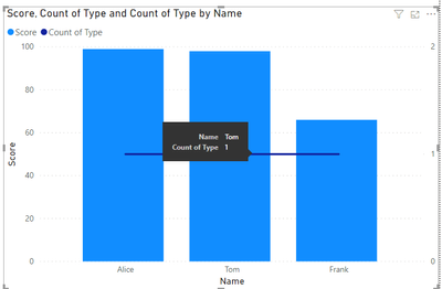
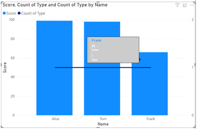
the option is to add a custom tooltip with both values:
I added a multirow card to the tooltip but is just depending on your imagination.
https://docs.microsoft.com/en-us/power-bi/create-reports/desktop-tooltips
Regards
Miguel Félix
Did I answer your question? Mark my post as a solution!
Proud to be a Super User!
Check out my blog: Power BI em Português- Mark as New
- Bookmark
- Subscribe
- Mute
- Subscribe to RSS Feed
- Permalink
- Report Inappropriate Content
@Anonymous I think you can include both the data values in both charts in the tooltip box. This way both tooltip appear whichiver chart is selected or you move mouse over.
Did I answer your question? Mark my post as a solution!
Appreciate your Kudos
Proud to be a Super User!
Follow me on linkedin
- Mark as New
- Bookmark
- Subscribe
- Mute
- Subscribe to RSS Feed
- Permalink
- Report Inappropriate Content
Many thanks for your answers! Since all you power users have flocked here, I have got one more question related to custom tooltips. I tried using it for the Sessions and Cumulative Sessions metrics. However the Sessions Cumulative always showed me the same value as Total Session.
My assumption is, the tooltip is filtered by a specific date, is there any way to overcome this issue?
This is the formula I use for Cumulative Sessions:
Total Sessions cumulative =
    CALCULATE(SUM([Sessions]),
    FILTER(ALLSELECTED('Calendar'),
    'Calendar'[DateKey]<= MAX('Calendar'[DateKey])))
Looking forward to your answers!
@amitchandak @MFelix @Tahreem24 @negi007
- Mark as New
- Bookmark
- Subscribe
- Mute
- Subscribe to RSS Feed
- Permalink
- Report Inappropriate Content
@Anonymous,
Could you please share the sample data that you are using for Cumulative Total?
Please take a quick glance at newly created dashboards : Restaurant Management Dashboard , HR Analytics Report , Hotel Management Report, Sales Analysis Report , Fortune 500 Companies Analysis , Revenue Tracking Dashboard
- Mark as New
- Bookmark
- Subscribe
- Mute
- Subscribe to RSS Feed
- Permalink
- Report Inappropriate Content
@Tahreem24 unfortunately, I can't share the file, as it's confidential.
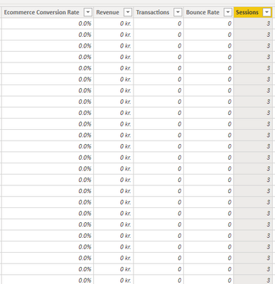
Here are some screenshots of the data columns used:
1. DataKey- Dates Table created through Power Query
2. Sessions extracted from Google Analytics connector (the original one)
- Mark as New
- Bookmark
- Subscribe
- Mute
- Subscribe to RSS Feed
- Permalink
- Report Inappropriate Content
I asked for sample data not the actual data.
Well, in order to calculate cummulative total try the below DAX:
Column Cumuative Total =
CALCULATE (
    SUM ( 'Table'[Sales] ),
    ALL ( 'DateTable' ),
    'DateTable'[Date] <= EARLIER ( 'DateTable'[Date] )
)
Measure:
Running Total MEASURE =
CALCULATE (
    SUM ( 'All Web Site Data (2)'[UniquePageviews] ),
    FILTER (
        ALL ( 'All Web Site Data (2)' ),
        'All Web Site Data (2)'[Date] <= MAX ( 'All Web Site Data (2)'[Date] )
    )
)
Please take a quick glance at newly created dashboards : Restaurant Management Dashboard , HR Analytics Report , Hotel Management Report, Sales Analysis Report , Fortune 500 Companies Analysis , Revenue Tracking Dashboard
- Mark as New
- Bookmark
- Subscribe
- Mute
- Subscribe to RSS Feed
- Permalink
- Report Inappropriate Content
Hi @Anonymous,
In theory using the same measure has you use on your visualization the filter context should be kept.
This is related with context, since you are using the allselected the information is getting filtered by the selected value, you need to add the date context to your tooltip page, or using a new measure to chan ge the ALLSELECTED.
Regards
Miguel Félix
Did I answer your question? Mark my post as a solution!
Proud to be a Super User!
Check out my blog: Power BI em Português- Mark as New
- Bookmark
- Subscribe
- Mute
- Subscribe to RSS Feed
- Permalink
- Report Inappropriate Content
@Anonymous ,
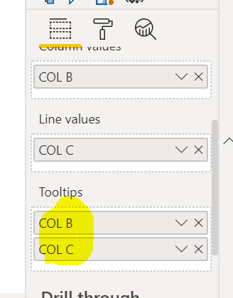
Try to add that measures which you want at same glance under tooltip option.
Please take a quick glance at newly created dashboards : Restaurant Management Dashboard , HR Analytics Report , Hotel Management Report, Sales Analysis Report , Fortune 500 Companies Analysis , Revenue Tracking Dashboard
- Mark as New
- Bookmark
- Subscribe
- Mute
- Subscribe to RSS Feed
- Permalink
- Report Inappropriate Content
Hi @Anonymous ,
Tooltips are based on the data point you are presenting so in your case when you click on the column you get the value of the column and on the line the respective value. Altough you can add other values to the tooltip allowing to have more fields visible in this type of chart it's only valid for the columns:
the option is to add a custom tooltip with both values:
I added a multirow card to the tooltip but is just depending on your imagination.
https://docs.microsoft.com/en-us/power-bi/create-reports/desktop-tooltips
Regards
Miguel Félix
Did I answer your question? Mark my post as a solution!
Proud to be a Super User!
Check out my blog: Power BI em Português- Mark as New
- Bookmark
- Subscribe
- Mute
- Subscribe to RSS Feed
- Permalink
- Report Inappropriate Content
@Anonymous , Not very clear. Hope both are different measure you can correct formatting in measure/column tool.
In case it not showing combined tooltip and you want one you have tooltip pages
https://docs.microsoft.com/en-us/power-bi/desktop-tooltips
Microsoft Power BI Learning Resources, 2023 !!
Learn Power BI - Full Course with Dec-2022, with Window, Index, Offset, 100+ Topics !!
Did I answer your question? Mark my post as a solution! Appreciate your Kudos !! Proud to be a Super User! !!
Helpful resources

Microsoft Fabric Learn Together
Covering the world! 9:00-10:30 AM Sydney, 4:00-5:30 PM CET (Paris/Berlin), 7:00-8:30 PM Mexico City

Power BI Monthly Update - April 2024
Check out the April 2024 Power BI update to learn about new features.

| User | Count |
|---|---|
| 115 | |
| 99 | |
| 86 | |
| 70 | |
| 62 |
| User | Count |
|---|---|
| 151 | |
| 120 | |
| 103 | |
| 87 | |
| 68 |
