- Power BI forums
- Updates
- News & Announcements
- Get Help with Power BI
- Desktop
- Service
- Report Server
- Power Query
- Mobile Apps
- Developer
- DAX Commands and Tips
- Custom Visuals Development Discussion
- Health and Life Sciences
- Power BI Spanish forums
- Translated Spanish Desktop
- Power Platform Integration - Better Together!
- Power Platform Integrations (Read-only)
- Power Platform and Dynamics 365 Integrations (Read-only)
- Training and Consulting
- Instructor Led Training
- Dashboard in a Day for Women, by Women
- Galleries
- Community Connections & How-To Videos
- COVID-19 Data Stories Gallery
- Themes Gallery
- Data Stories Gallery
- R Script Showcase
- Webinars and Video Gallery
- Quick Measures Gallery
- 2021 MSBizAppsSummit Gallery
- 2020 MSBizAppsSummit Gallery
- 2019 MSBizAppsSummit Gallery
- Events
- Ideas
- Custom Visuals Ideas
- Issues
- Issues
- Events
- Upcoming Events
- Community Blog
- Power BI Community Blog
- Custom Visuals Community Blog
- Community Support
- Community Accounts & Registration
- Using the Community
- Community Feedback
Register now to learn Fabric in free live sessions led by the best Microsoft experts. From Apr 16 to May 9, in English and Spanish.
- Power BI forums
- Forums
- Get Help with Power BI
- Desktop
- Re: Time Aggregates. Elegant Visual Design / Alter...
- Subscribe to RSS Feed
- Mark Topic as New
- Mark Topic as Read
- Float this Topic for Current User
- Bookmark
- Subscribe
- Printer Friendly Page
- Mark as New
- Bookmark
- Subscribe
- Mute
- Subscribe to RSS Feed
- Permalink
- Report Inappropriate Content
Time Aggregates. Elegant Visual Design / Alternative to Drill Downs and Drill Ups
In the dashboards we create, there is a need for visualizing the data in different time intervals. (Not a unique need.) I find that the drill up and drill downs suitable for an experienced PowerBI user, but for a novice it is not ideal and too indescript.
Has anyone created a well-received "control" that can govern all the visuals on a page allowing users to more elegantly change time intervals on a dashboard?
Thanks in advance...
- Mark as New
- Bookmark
- Subscribe
- Mute
- Subscribe to RSS Feed
- Permalink
- Report Inappropriate Content
@irnm8dn , The information you have provided is not making the problem clear to me. Can you please explain with an example.
You can explore a time table and bucket as a column in that
https://kohera.be/blog/power-bi/how-to-create-a-time-table-in-power-bi-in-a-few-simple-steps/
Appreciate your Kudos.
Microsoft Power BI Learning Resources, 2023 !!
Learn Power BI - Full Course with Dec-2022, with Window, Index, Offset, 100+ Topics !!
Did I answer your question? Mark my post as a solution! Appreciate your Kudos !! Proud to be a Super User! !!
- Mark as New
- Bookmark
- Subscribe
- Mute
- Subscribe to RSS Feed
- Permalink
- Report Inappropriate Content
I am looking for a more visual way to change all of the time dimensions on a single page for the user. For instance a visual cue or icon of some sort, that allows the user to move from Weekly to Monthly to Quarterly to Annually with a single click, and not use the drill up/down functionality. Ideally, I can change all of the visualizations on the page with a single click.
This a UX question, not how to create/model a time dimension.
- Mark as New
- Bookmark
- Subscribe
- Mute
- Subscribe to RSS Feed
- Permalink
- Report Inappropriate Content
Sounds to me like a good use case for "Bookmarks".
You can create a separate Bookmark for each Timescale. Then use images or icons as your navigation to access each bookmark.
There a multitude of videos on this subject...I just don't have any links handy.
Good Luck and Best Regards,
- Mark as New
- Bookmark
- Subscribe
- Mute
- Subscribe to RSS Feed
- Permalink
- Report Inappropriate Content
I think that's a great idea. I was in a similar headspace.
I will loop up some videos, but if anyone has a visual sample or link it'd be much appreciated.
- Mark as New
- Bookmark
- Subscribe
- Mute
- Subscribe to RSS Feed
- Permalink
- Report Inappropriate Content
Hi @irnm8dn ,
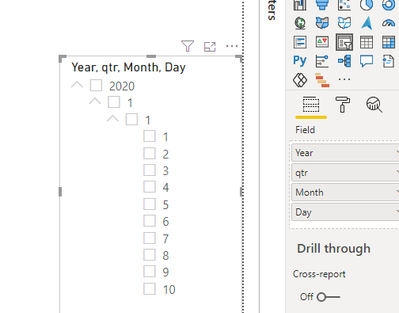
Or use a hierarchical slicer?
Best regards,
Lionel Chen
If this post helps, then please consider Accept it as the solution to help the other members find it more quickly.
- Mark as New
- Bookmark
- Subscribe
- Mute
- Subscribe to RSS Feed
- Permalink
- Report Inappropriate Content
I created an image of a "24 hour clock" for myself. Can't recall if I did it in Visio or Powerpoint, but you can use whatever is handy. This links to a page that reports activity in 6 hour segments for each of my facilities.
You can search the net for various "calendar" icons to give you something that would represent week / month / year. Hope this helps!
Helpful resources

Microsoft Fabric Learn Together
Covering the world! 9:00-10:30 AM Sydney, 4:00-5:30 PM CET (Paris/Berlin), 7:00-8:30 PM Mexico City

Power BI Monthly Update - April 2024
Check out the April 2024 Power BI update to learn about new features.

| User | Count |
|---|---|
| 109 | |
| 98 | |
| 77 | |
| 66 | |
| 54 |
| User | Count |
|---|---|
| 144 | |
| 104 | |
| 100 | |
| 86 | |
| 64 |


