- Power BI forums
- Updates
- News & Announcements
- Get Help with Power BI
- Desktop
- Service
- Report Server
- Power Query
- Mobile Apps
- Developer
- DAX Commands and Tips
- Custom Visuals Development Discussion
- Health and Life Sciences
- Power BI Spanish forums
- Translated Spanish Desktop
- Power Platform Integration - Better Together!
- Power Platform Integrations (Read-only)
- Power Platform and Dynamics 365 Integrations (Read-only)
- Training and Consulting
- Instructor Led Training
- Dashboard in a Day for Women, by Women
- Galleries
- Community Connections & How-To Videos
- COVID-19 Data Stories Gallery
- Themes Gallery
- Data Stories Gallery
- R Script Showcase
- Webinars and Video Gallery
- Quick Measures Gallery
- 2021 MSBizAppsSummit Gallery
- 2020 MSBizAppsSummit Gallery
- 2019 MSBizAppsSummit Gallery
- Events
- Ideas
- Custom Visuals Ideas
- Issues
- Issues
- Events
- Upcoming Events
- Community Blog
- Power BI Community Blog
- Custom Visuals Community Blog
- Community Support
- Community Accounts & Registration
- Using the Community
- Community Feedback
Register now to learn Fabric in free live sessions led by the best Microsoft experts. From Apr 16 to May 9, in English and Spanish.
- Power BI forums
- Forums
- Get Help with Power BI
- Desktop
- Re: This Should be Simple - Line Graph
- Subscribe to RSS Feed
- Mark Topic as New
- Mark Topic as Read
- Float this Topic for Current User
- Bookmark
- Subscribe
- Printer Friendly Page
- Mark as New
- Bookmark
- Subscribe
- Mute
- Subscribe to RSS Feed
- Permalink
- Report Inappropriate Content
This Should be Simple - Line Graph
I'm not sure why this is not working, hopinh someone here will be able to assist.
I am attempting to create a graph that will show 'Stock Levels' for certain products by date within a Line Graph.
I have created a "Stock Level" for each SKU and have assigned those values with a scale 0-3 - 'Stock Level Value'.
- Out of Stock = 0
- Low Stock = 1
- Nearing Low Stock = 2
- Stocked = 3
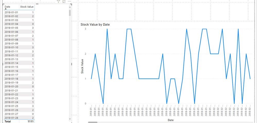
Everyday, as stock levels chance their stock level values ,ay change as well. I want to review this data within a line graph and then hopefully compliment a sales report. However, even though I have the table with accurate data, the line graph is not calculating the values as I would like. See the Below -
In the 'Value' field I have entered a measure that I created which is simply SUM (Stock Value).
I would expect to see a line graph that displays Out of Stock (Value 0) from 12/09/2019 - 12/10/2019, then 3 days of Low Stock indicated by a Value 1.
Why is this not working? 😥
Please help!
Solved! Go to Solution.
- Mark as New
- Bookmark
- Subscribe
- Mute
- Subscribe to RSS Feed
- Permalink
- Report Inappropriate Content
Hi @AlexAlberga727 ,
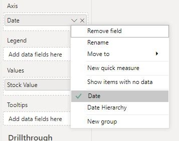
If the Stock Value is a calculated column, we can just use it in the value field as following to meet your requirement:
Best regards,
If this post helps, then please consider Accept it as the solution to help the other members find it more quickly.
- Mark as New
- Bookmark
- Subscribe
- Mute
- Subscribe to RSS Feed
- Permalink
- Report Inappropriate Content
Try this, select "stock value" on your "fields" ( all the way to the right). and go to modeling tab, then select "don't summarize". Hope that will solve your issue. If it does, please give me a kudos!!
- Mark as New
- Bookmark
- Subscribe
- Mute
- Subscribe to RSS Feed
- Permalink
- Report Inappropriate Content
@Anonymous Thanks for replying.
This was initially what I thought the issue was. However, the option to not summerize wasn't available. The only options were to SUM, MIN/MAX, AVG - but no option to not summerize. I then created a measure that was simply =SUM(Stock Value). Thinking this would SUM the date's stock value for the selected SKU, and not ask for a type of summerization.
- Mark as New
- Bookmark
- Subscribe
- Mute
- Subscribe to RSS Feed
- Permalink
- Report Inappropriate Content
Hi @AlexAlberga727 ,
If the Stock Value is a calculated column, we can just use it in the value field as following to meet your requirement:
Best regards,
If this post helps, then please consider Accept it as the solution to help the other members find it more quickly.
- Mark as New
- Bookmark
- Subscribe
- Mute
- Subscribe to RSS Feed
- Permalink
- Report Inappropriate Content
@v-lid-msft Thanks for helping. This solution worked. Implemented a calculated column utilizing the =RELATED DAX. Same values are being populated, but now the visualization works as expected.
Thanks again!
- Mark as New
- Bookmark
- Subscribe
- Mute
- Subscribe to RSS Feed
- Permalink
- Report Inappropriate Content
This is something I did toggle, and saw no impact. I just attempted again to confirm, and no - unfortunately this doesn't solve the issue.
I'm not sure why I am seeing a value of 6 across all dates, when the table on the left indicates all the dates I have within my table, and the associated stock level.
I also have created a date table and have marked it as the 'Date table'. I would expect to only see results for the data that has been populated which is only from 12/9/2019 - present. Values range from 0-3, for this particular SKU only 2 values - 0 and 1. Yet the graph shows 6... for all dates. Fairly frustrating. I feel like this should be very simple.
- Mark as New
- Bookmark
- Subscribe
- Mute
- Subscribe to RSS Feed
- Permalink
- Report Inappropriate Content
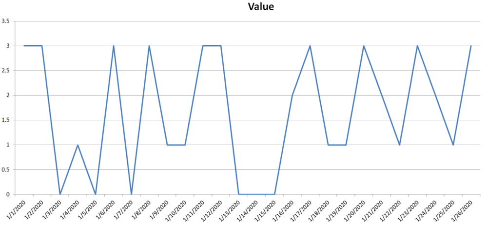
I simply need a graph that looks like the following - Plotting values 0-3.
- Mark as New
- Bookmark
- Subscribe
- Mute
- Subscribe to RSS Feed
- Permalink
- Report Inappropriate Content
Perhaps try changing your x-axis to be categorical instead of continuous.
@ me in replies or I'll lose your thread!!!
Instead of a Kudo, please vote for this idea
Become an expert!: Enterprise DNA
External Tools: MSHGQM
YouTube Channel!: Microsoft Hates Greg
Latest book!: The Definitive Guide to Power Query (M)
DAX is easy, CALCULATE makes DAX hard...
Helpful resources

Microsoft Fabric Learn Together
Covering the world! 9:00-10:30 AM Sydney, 4:00-5:30 PM CET (Paris/Berlin), 7:00-8:30 PM Mexico City

Power BI Monthly Update - April 2024
Check out the April 2024 Power BI update to learn about new features.

| User | Count |
|---|---|
| 110 | |
| 99 | |
| 80 | |
| 64 | |
| 58 |
| User | Count |
|---|---|
| 148 | |
| 111 | |
| 93 | |
| 84 | |
| 66 |


