- Power BI forums
- Updates
- News & Announcements
- Get Help with Power BI
- Desktop
- Service
- Report Server
- Power Query
- Mobile Apps
- Developer
- DAX Commands and Tips
- Custom Visuals Development Discussion
- Health and Life Sciences
- Power BI Spanish forums
- Translated Spanish Desktop
- Power Platform Integration - Better Together!
- Power Platform Integrations (Read-only)
- Power Platform and Dynamics 365 Integrations (Read-only)
- Training and Consulting
- Instructor Led Training
- Dashboard in a Day for Women, by Women
- Galleries
- Community Connections & How-To Videos
- COVID-19 Data Stories Gallery
- Themes Gallery
- Data Stories Gallery
- R Script Showcase
- Webinars and Video Gallery
- Quick Measures Gallery
- 2021 MSBizAppsSummit Gallery
- 2020 MSBizAppsSummit Gallery
- 2019 MSBizAppsSummit Gallery
- Events
- Ideas
- Custom Visuals Ideas
- Issues
- Issues
- Events
- Upcoming Events
- Community Blog
- Power BI Community Blog
- Custom Visuals Community Blog
- Community Support
- Community Accounts & Registration
- Using the Community
- Community Feedback
Register now to learn Fabric in free live sessions led by the best Microsoft experts. From Apr 16 to May 9, in English and Spanish.
- Power BI forums
- Forums
- Get Help with Power BI
- Desktop
- Teacher Enrollment counts over time report
- Subscribe to RSS Feed
- Mark Topic as New
- Mark Topic as Read
- Float this Topic for Current User
- Bookmark
- Subscribe
- Printer Friendly Page
- Mark as New
- Bookmark
- Subscribe
- Mute
- Subscribe to RSS Feed
- Permalink
- Report Inappropriate Content
Teacher Enrollment counts over time report
Hello:
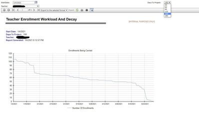
I'm hoping that somebody can fill in a couple of gaps for me and get me moving in the right direction. We have a report that was created in-house that we want to have recreated in Power BI. Essentially, this report is a snapshot of a teacher enrollment count over time that is a snapshot into the future. We want to be able to see that teacher A has 100 enrollments today but some of their enrollments will be completed and the date two weeks in the future will show enrollments as (for example) 80. This allows administrators to have projection of workload for a teacher to see what their current and future enrollment workload is to be to allow them to determine if the teacher will be able to take on additional enrolllments. From what I understand we will need to graph the end dates, not the start dates, in order to get this projection. I'm a bit confused as to how to start this computation structure to get the enrollment count tied to the teacher at X points of time, over time, over the course of an amount of time.
Here is a snapshot of the current report structure that we have and that we want recreated in Power BI:
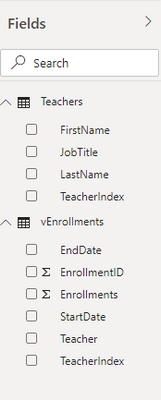
Here are the tables and fields that we have for this that I have loaded in to Power BI:
I believe that I'm going to need to implement a slicer in order to get the drop down to select a specific teacher to display the data for. I figured that I could worry about that after I got the structure down to get the enrollment counts over time tied to a teach and get the line graph visual put in place. Unless that should be planned while putting together the query. Any and all help is appreciated. Thank you.
Solved! Go to Solution.
- Mark as New
- Bookmark
- Subscribe
- Mute
- Subscribe to RSS Feed
- Permalink
- Report Inappropriate Content
Hi @RyanLMoran,
You can create a calendar table and use its date field as the axis of the line chart. Then you can write measure expressions to calculate the count of teachers based on current date and teacher table 'end date'.
Measure =
VAR currDate =
    MAX ( 'Calendar'[Date] )
RETURN
    CALCULATE (
        COUNT ( Table[Teacher] ),
        FILTER ( ALLSELECTED ( Table ), [End Date] >= currDate )
    )
Regards,
Xiaoxin Sheng
If this post helps, please consider accept as solution to help other members find it more quickly.
- Mark as New
- Bookmark
- Subscribe
- Mute
- Subscribe to RSS Feed
- Permalink
- Report Inappropriate Content
@RyanLMoran ,Can you share sample data and sample output in table format? Or a sample pbix after removing sensitive data.
Microsoft Power BI Learning Resources, 2023 !!
Learn Power BI - Full Course with Dec-2022, with Window, Index, Offset, 100+ Topics !!
Did I answer your question? Mark my post as a solution! Appreciate your Kudos !! Proud to be a Super User! !!
- Mark as New
- Bookmark
- Subscribe
- Mute
- Subscribe to RSS Feed
- Permalink
- Report Inappropriate Content
Hi,
I'm happy to provide any and all that I can to help you help me. Is this what you are looking for?
- Mark as New
- Bookmark
- Subscribe
- Mute
- Subscribe to RSS Feed
- Permalink
- Report Inappropriate Content
Hi @RyanLMoran,
You can create a calendar table and use its date field as the axis of the line chart. Then you can write measure expressions to calculate the count of teachers based on current date and teacher table 'end date'.
Measure =
VAR currDate =
    MAX ( 'Calendar'[Date] )
RETURN
    CALCULATE (
        COUNT ( Table[Teacher] ),
        FILTER ( ALLSELECTED ( Table ), [End Date] >= currDate )
    )
Regards,
Xiaoxin Sheng
If this post helps, please consider accept as solution to help other members find it more quickly.
Helpful resources

Microsoft Fabric Learn Together
Covering the world! 9:00-10:30 AM Sydney, 4:00-5:30 PM CET (Paris/Berlin), 7:00-8:30 PM Mexico City

Power BI Monthly Update - April 2024
Check out the April 2024 Power BI update to learn about new features.

| User | Count |
|---|---|
| 112 | |
| 100 | |
| 80 | |
| 64 | |
| 57 |
| User | Count |
|---|---|
| 146 | |
| 110 | |
| 93 | |
| 84 | |
| 67 |


