- Power BI forums
- Updates
- News & Announcements
- Get Help with Power BI
- Desktop
- Service
- Report Server
- Power Query
- Mobile Apps
- Developer
- DAX Commands and Tips
- Custom Visuals Development Discussion
- Health and Life Sciences
- Power BI Spanish forums
- Translated Spanish Desktop
- Power Platform Integration - Better Together!
- Power Platform Integrations (Read-only)
- Power Platform and Dynamics 365 Integrations (Read-only)
- Training and Consulting
- Instructor Led Training
- Dashboard in a Day for Women, by Women
- Galleries
- Community Connections & How-To Videos
- COVID-19 Data Stories Gallery
- Themes Gallery
- Data Stories Gallery
- R Script Showcase
- Webinars and Video Gallery
- Quick Measures Gallery
- 2021 MSBizAppsSummit Gallery
- 2020 MSBizAppsSummit Gallery
- 2019 MSBizAppsSummit Gallery
- Events
- Ideas
- Custom Visuals Ideas
- Issues
- Issues
- Events
- Upcoming Events
- Community Blog
- Power BI Community Blog
- Custom Visuals Community Blog
- Community Support
- Community Accounts & Registration
- Using the Community
- Community Feedback
Register now to learn Fabric in free live sessions led by the best Microsoft experts. From Apr 16 to May 9, in English and Spanish.
- Power BI forums
- Forums
- Get Help with Power BI
- Desktop
- Re: Table visual - Is it possible to dynamically a...
- Subscribe to RSS Feed
- Mark Topic as New
- Mark Topic as Read
- Float this Topic for Current User
- Bookmark
- Subscribe
- Printer Friendly Page
- Mark as New
- Bookmark
- Subscribe
- Mute
- Subscribe to RSS Feed
- Permalink
- Report Inappropriate Content
Table visual - Is it possible to dynamically add/remove columns?
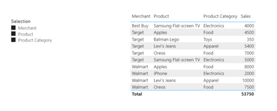
I have seen a lot of tutorials on how to dynamically change column selection in table visuals and matrices but none of them have quite fit my use case. Basically, I'm wondering if it is possible to allow a user to use a table visual or a matrix to display a custom cross-section of different segments, without the use of a unique record identifier. For example the whole cross-section would look like this:
But I would need the slicer to dynamically change what the user sees; e.g. if the user only chooses "Merchant" then I only want to see the following:
So I'm less interested in a specific solution to my problem, more just wondering if what I'm attempting to do is even possible, and also if it is possible to do without unpivoting my data. My actual data file has nearly 10 million records and about 9 different categories so I am not looking to impede performance.
Thank you for any help
Solved! Go to Solution.
- Mark as New
- Bookmark
- Subscribe
- Mute
- Subscribe to RSS Feed
- Permalink
- Report Inappropriate Content
While this is somewhat along the lines of what I am looking for, I do need the ability to see more than the MAX() value which would mean that the table expands horizontally and vertically when more categories are added, and contracts when they are removed. There appears to be no native functionality in PowerBI to allow what I am looking for, so I am going to have to use bookmarks to achieve it. Thank you though.
- Mark as New
- Bookmark
- Subscribe
- Mute
- Subscribe to RSS Feed
- Permalink
- Report Inappropriate Content
Hi @Anonymous ,
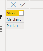
First create a slicer table as below:
Then create a measure as below:
Measure = SWITCH(
    SELECTEDVALUE('Slicer table'[Slicers]),
    "Merchant",MAX('Table'[Merchant]),
    "Product",MAX('Table'[Product]),BLANK())
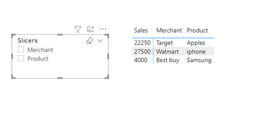
And you will see:
I also added another option of unpivoting the table to realize it in my sample .pbix file,you could turn to it to check which one is better.Pls check attachment for details.
Best Regards,
Kelly
Did I answer your question? Mark my post as a solution!
- Mark as New
- Bookmark
- Subscribe
- Mute
- Subscribe to RSS Feed
- Permalink
- Report Inappropriate Content
While this is somewhat along the lines of what I am looking for, I do need the ability to see more than the MAX() value which would mean that the table expands horizontally and vertically when more categories are added, and contracts when they are removed. There appears to be no native functionality in PowerBI to allow what I am looking for, so I am going to have to use bookmarks to achieve it. Thank you though.
- Mark as New
- Bookmark
- Subscribe
- Mute
- Subscribe to RSS Feed
- Permalink
- Report Inappropriate Content
Hi @Anonymous ,
Sorry for not being able to help on this issue,since you have a good idea of using bookmarks to address it,could you pls mark the reply as answered to let more people find the solution.
Much appreciated.
Best Regards,
Kelly
Did I answer your question? Mark my post as a solution!
- Mark as New
- Bookmark
- Subscribe
- Mute
- Subscribe to RSS Feed
- Permalink
- Report Inappropriate Content
@Anonymous , You can replace measure values. Or you can make it blank. Using the meausre slicer.
measure slicer
https://radacad.com/change-the-column-or-measure-value-in-a-power-bi-visual-by-selection-of-the-slicer-parameter-table-pattern
https://community.powerbi.com/t5/Desktop/Slicer-MTD-QTD-YTD-to-filter-dates-using-the-slicer/td-p/500115
// With external tools you have some more flexibility
https://www.youtube.com/watch?v=vlnx7QUVYME
But to hide show, you need bookmarks
https://radacad.com/bookmarks-and-buttons-making-power-bi-charts-even-more-interactive
Microsoft Power BI Learning Resources, 2023 !!
Learn Power BI - Full Course with Dec-2022, with Window, Index, Offset, 100+ Topics !!
Did I answer your question? Mark my post as a solution! Appreciate your Kudos !! Proud to be a Super User! !!
Helpful resources

Microsoft Fabric Learn Together
Covering the world! 9:00-10:30 AM Sydney, 4:00-5:30 PM CET (Paris/Berlin), 7:00-8:30 PM Mexico City

Power BI Monthly Update - April 2024
Check out the April 2024 Power BI update to learn about new features.

| User | Count |
|---|---|
| 110 | |
| 95 | |
| 76 | |
| 65 | |
| 51 |
| User | Count |
|---|---|
| 146 | |
| 109 | |
| 106 | |
| 88 | |
| 61 |


