- Power BI forums
- Updates
- News & Announcements
- Get Help with Power BI
- Desktop
- Service
- Report Server
- Power Query
- Mobile Apps
- Developer
- DAX Commands and Tips
- Custom Visuals Development Discussion
- Health and Life Sciences
- Power BI Spanish forums
- Translated Spanish Desktop
- Power Platform Integration - Better Together!
- Power Platform Integrations (Read-only)
- Power Platform and Dynamics 365 Integrations (Read-only)
- Training and Consulting
- Instructor Led Training
- Dashboard in a Day for Women, by Women
- Galleries
- Community Connections & How-To Videos
- COVID-19 Data Stories Gallery
- Themes Gallery
- Data Stories Gallery
- R Script Showcase
- Webinars and Video Gallery
- Quick Measures Gallery
- 2021 MSBizAppsSummit Gallery
- 2020 MSBizAppsSummit Gallery
- 2019 MSBizAppsSummit Gallery
- Events
- Ideas
- Custom Visuals Ideas
- Issues
- Issues
- Events
- Upcoming Events
- Community Blog
- Power BI Community Blog
- Custom Visuals Community Blog
- Community Support
- Community Accounts & Registration
- Using the Community
- Community Feedback
Register now to learn Fabric in free live sessions led by the best Microsoft experts. From Apr 16 to May 9, in English and Spanish.
- Power BI forums
- Forums
- Get Help with Power BI
- Desktop
- Table Visualization - Group By Field?
- Subscribe to RSS Feed
- Mark Topic as New
- Mark Topic as Read
- Float this Topic for Current User
- Bookmark
- Subscribe
- Printer Friendly Page
- Mark as New
- Bookmark
- Subscribe
- Mute
- Subscribe to RSS Feed
- Permalink
- Report Inappropriate Content
Table Visualization - Group By Field?
My goal is to create a Table Visualization with a Group By structure, similar to how you can create a "Group By" in a SharePoint list.
Let's say I have a table of data as follow:
Make | Model | Color
Honda | Pilot | White
BMW | X5 | Black
Jeep | Cherokee | White
Toyota | Highlander | White
Volvo | XC90 | Black
The Make and Model columns are unique values, but the Color column is only White or Black. I want the table to appear as follows:
Black
BMW | X5
Volvo | XC90
White
Honda | Pilot
Jeep | Cherokee
Toyota | Highlander
I can't seem to find a solution that does this.
Solved! Go to Solution.
- Mark as New
- Bookmark
- Subscribe
- Mute
- Subscribe to RSS Feed
- Permalink
- Report Inappropriate Content
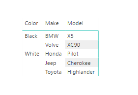
Try turning off "Stepped Layout" under "Row Headers" in your Matrix Visualization settings. Gets you pretty close to what you are looking for I think.
- Mark as New
- Bookmark
- Subscribe
- Mute
- Subscribe to RSS Feed
- Permalink
- Report Inappropriate Content
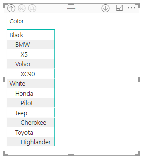
Use the matrix visual and drop Color, Make and Model into the row bucket. Expand the visualization using the buttons in the top left of the visual. You will get this:
If you really want the "Toyota | Highlander" rather than the per row format you would need to create a calculated column in your data table that combines Make and Model.
- Mark as New
- Bookmark
- Subscribe
- Mute
- Subscribe to RSS Feed
- Permalink
- Report Inappropriate Content
I suspected you could only create the view I need with a calculated field. I played with the Matrix view prior to posting my question, and ended up with the cascading rows as you demonstrated.
Right now I have two seperate tables creating the view I want, and I just have them sitting next to each other. Was hoping to join them as one continuous table, but for what I need, I may just have to keep them as seperate visualizations.
- Mark as New
- Bookmark
- Subscribe
- Mute
- Subscribe to RSS Feed
- Permalink
- Report Inappropriate Content
Try turning off "Stepped Layout" under "Row Headers" in your Matrix Visualization settings. Gets you pretty close to what you are looking for I think.
- Mark as New
- Bookmark
- Subscribe
- Mute
- Subscribe to RSS Feed
- Permalink
- Report Inappropriate Content
Out of my understanding you need black and white colors to be sorted.
Just drop the color column into a slicer and remaining two columns into a table. Select a value in the slicer then it will give you the res make and model.
- Mark as New
- Bookmark
- Subscribe
- Mute
- Subscribe to RSS Feed
- Permalink
- Report Inappropriate Content
The slicer option unfortunately will not work for me because I want to see all the tabulated data at once. Right now, I have two adjacent tables filtered to create the view I need, but I was hoping to create one table.
Helpful resources

Microsoft Fabric Learn Together
Covering the world! 9:00-10:30 AM Sydney, 4:00-5:30 PM CET (Paris/Berlin), 7:00-8:30 PM Mexico City

Power BI Monthly Update - April 2024
Check out the April 2024 Power BI update to learn about new features.

| User | Count |
|---|---|
| 109 | |
| 99 | |
| 77 | |
| 66 | |
| 54 |
| User | Count |
|---|---|
| 144 | |
| 104 | |
| 102 | |
| 87 | |
| 64 |


