- Power BI forums
- Updates
- News & Announcements
- Get Help with Power BI
- Desktop
- Service
- Report Server
- Power Query
- Mobile Apps
- Developer
- DAX Commands and Tips
- Custom Visuals Development Discussion
- Health and Life Sciences
- Power BI Spanish forums
- Translated Spanish Desktop
- Power Platform Integration - Better Together!
- Power Platform Integrations (Read-only)
- Power Platform and Dynamics 365 Integrations (Read-only)
- Training and Consulting
- Instructor Led Training
- Dashboard in a Day for Women, by Women
- Galleries
- Community Connections & How-To Videos
- COVID-19 Data Stories Gallery
- Themes Gallery
- Data Stories Gallery
- R Script Showcase
- Webinars and Video Gallery
- Quick Measures Gallery
- 2021 MSBizAppsSummit Gallery
- 2020 MSBizAppsSummit Gallery
- 2019 MSBizAppsSummit Gallery
- Events
- Ideas
- Custom Visuals Ideas
- Issues
- Issues
- Events
- Upcoming Events
- Community Blog
- Power BI Community Blog
- Custom Visuals Community Blog
- Community Support
- Community Accounts & Registration
- Using the Community
- Community Feedback
Register now to learn Fabric in free live sessions led by the best Microsoft experts. From Apr 16 to May 9, in English and Spanish.
- Power BI forums
- Forums
- Get Help with Power BI
- Desktop
- Table Field Icons in the model screen
- Subscribe to RSS Feed
- Mark Topic as New
- Mark Topic as Read
- Float this Topic for Current User
- Bookmark
- Subscribe
- Printer Friendly Page
- Mark as New
- Bookmark
- Subscribe
- Mute
- Subscribe to RSS Feed
- Permalink
- Report Inappropriate Content
Table Field Icons in the model screen
Hi all
I am new to PBI and working my way thourgh the sample files. Currently checking the sample file supplier quality which i got from this link.
When you open the desktop PBIX file you will see Metric table under which few fields are listed. I understand different calculations has different field icons
calculator is Measure,
FX is calcualted column and
Table icon is Calcualted Table.
But in this metric table there is one named Total Defect Qty with traffic light underwhich there are more columns. what type of calcualtion is this ? I can see the dax for Value field but not Goal and Status? How can i replicate this ?
Many thanks in advance
- Mark as New
- Bookmark
- Subscribe
- Mute
- Subscribe to RSS Feed
- Permalink
- Report Inappropriate Content
Hi,
I had just the same doubt, but digging through the IT Spend Analysis Sample PBIX file which can be downloaded from here.
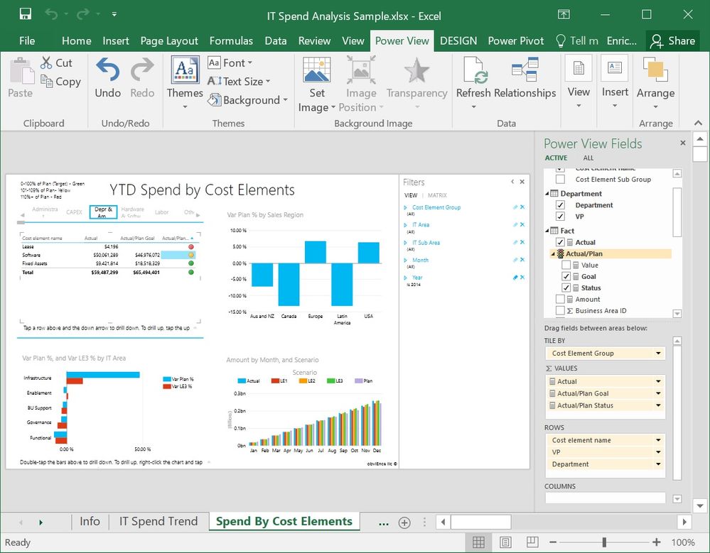
In this case, you can find that traffic light icon in the fact table for the field "Actual/Plan":
It has three "child" fields within itself: Value, Goal and Status. None of them are measures or fields that can be found in the Fact table.
It is used in the page "Spend By Cost Elements", on the top left matrix, and Status is used to show a green, yellow or red spot depending on the relationship between the amount spent and the goal.
After messing around with almost every menu option on sight, not finding anything that was defining that particular part of the matrix, the fields, etc. within Power BI, i recalled that an excel file with a powerpivot data model and powerview tabs can be imported directly to power BI and converted to a pbix file.
I went to check the excel counterpart for "IT Spend Analysis Sample" and there it was:

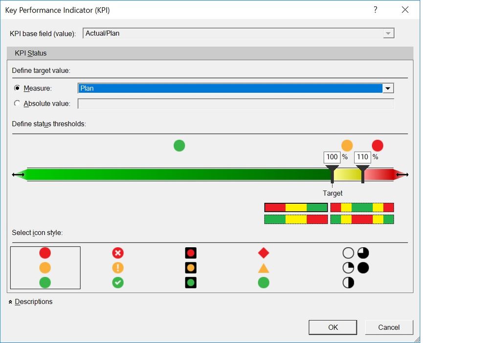
Going to the powerpivot tab, expanding the KPI menu and selecting manage KPI, i was able to see where those fields i was seeing in powerBI (most probably) had been defined:
I hope this helps someone else with a similar doubt.
There might be other ways within power BI to deal with this, but honestly i wasn't able to find it!
Cheers.
- Mark as New
- Bookmark
- Subscribe
- Mute
- Subscribe to RSS Feed
- Permalink
- Report Inappropriate Content
Hi @charitydatasol,
Per my understanding this is additional visual created by someone, so to use it you need to download it and use in your model.
I found this topic about such visual: http://community.powerbi.com/t5/Desktop/Where-to-get-these-visuals-controls/td-p/132766
Hope it will help you.
- Mark as New
- Bookmark
- Subscribe
- Mute
- Subscribe to RSS Feed
- Permalink
- Report Inappropriate Content
Pretty sure that's a hierarchy 🙂
More info on them here:
Power BI Hierarchy
Have fun learning 🙂
- Mark as New
- Bookmark
- Subscribe
- Mute
- Subscribe to RSS Feed
- Permalink
- Report Inappropriate Content
Thanks for your quick reply. Much Appreciated.
I don think it is a hierarchy. the icon for hierarchy is different and it doesn't make any sense to have it on Numeric field which is summarized.
If you have a look at the file here , you will understand why i say that.
Many thanks
Helpful resources

Microsoft Fabric Learn Together
Covering the world! 9:00-10:30 AM Sydney, 4:00-5:30 PM CET (Paris/Berlin), 7:00-8:30 PM Mexico City

Power BI Monthly Update - April 2024
Check out the April 2024 Power BI update to learn about new features.

| User | Count |
|---|---|
| 109 | |
| 98 | |
| 77 | |
| 66 | |
| 54 |
| User | Count |
|---|---|
| 144 | |
| 104 | |
| 102 | |
| 88 | |
| 63 |


