- Power BI forums
- Updates
- News & Announcements
- Get Help with Power BI
- Desktop
- Service
- Report Server
- Power Query
- Mobile Apps
- Developer
- DAX Commands and Tips
- Custom Visuals Development Discussion
- Health and Life Sciences
- Power BI Spanish forums
- Translated Spanish Desktop
- Power Platform Integration - Better Together!
- Power Platform Integrations (Read-only)
- Power Platform and Dynamics 365 Integrations (Read-only)
- Training and Consulting
- Instructor Led Training
- Dashboard in a Day for Women, by Women
- Galleries
- Community Connections & How-To Videos
- COVID-19 Data Stories Gallery
- Themes Gallery
- Data Stories Gallery
- R Script Showcase
- Webinars and Video Gallery
- Quick Measures Gallery
- 2021 MSBizAppsSummit Gallery
- 2020 MSBizAppsSummit Gallery
- 2019 MSBizAppsSummit Gallery
- Events
- Ideas
- Custom Visuals Ideas
- Issues
- Issues
- Events
- Upcoming Events
- Community Blog
- Power BI Community Blog
- Custom Visuals Community Blog
- Community Support
- Community Accounts & Registration
- Using the Community
- Community Feedback
Register now to learn Fabric in free live sessions led by the best Microsoft experts. From Apr 16 to May 9, in English and Spanish.
- Power BI forums
- Forums
- Get Help with Power BI
- Desktop
- Re: Synoptic Panel by OKviz question
- Subscribe to RSS Feed
- Mark Topic as New
- Mark Topic as Read
- Float this Topic for Current User
- Bookmark
- Subscribe
- Printer Friendly Page
- Mark as New
- Bookmark
- Subscribe
- Mute
- Subscribe to RSS Feed
- Permalink
- Report Inappropriate Content
Synoptic Panel by OKviz question
Hello there,
Quick question using this visualization tool.
I have a custom calendar, I would like to link that calendar with my excel file file as follow:
In my excel file I have two columns
Day = All the days in a month 1-31
Status = could be 1,2,3,4,5
Depends on the day the user choose from 1-5
Being 1= Green, 2= Yellow, 3=Red, etc.
What I have so far is every single day I am getting a different color.
How can I change to reflect my color scale from 1 to 5?

Thank in advance
Solved! Go to Solution.
- Mark as New
- Bookmark
- Subscribe
- Mute
- Subscribe to RSS Feed
- Permalink
- Report Inappropriate Content
Hi @sajarac
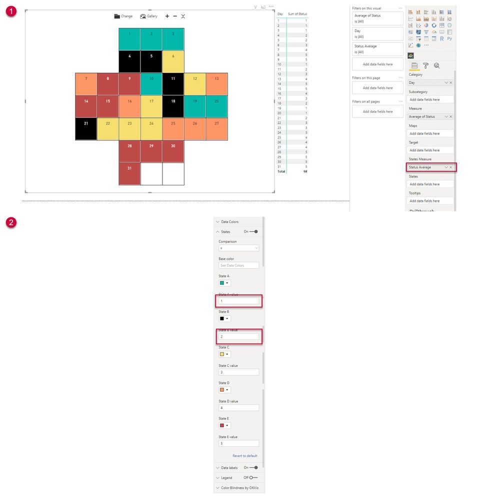
I think I solved it. The documentation on the Okviz site is a little dated but it is to do with the states field.
Here is what I came up with using your file. I will repost this to you in IM and you can see if this helps.
Cheers
Manfred
- Mark as New
- Bookmark
- Subscribe
- Mute
- Subscribe to RSS Feed
- Permalink
- Report Inappropriate Content
Hi @sajarac
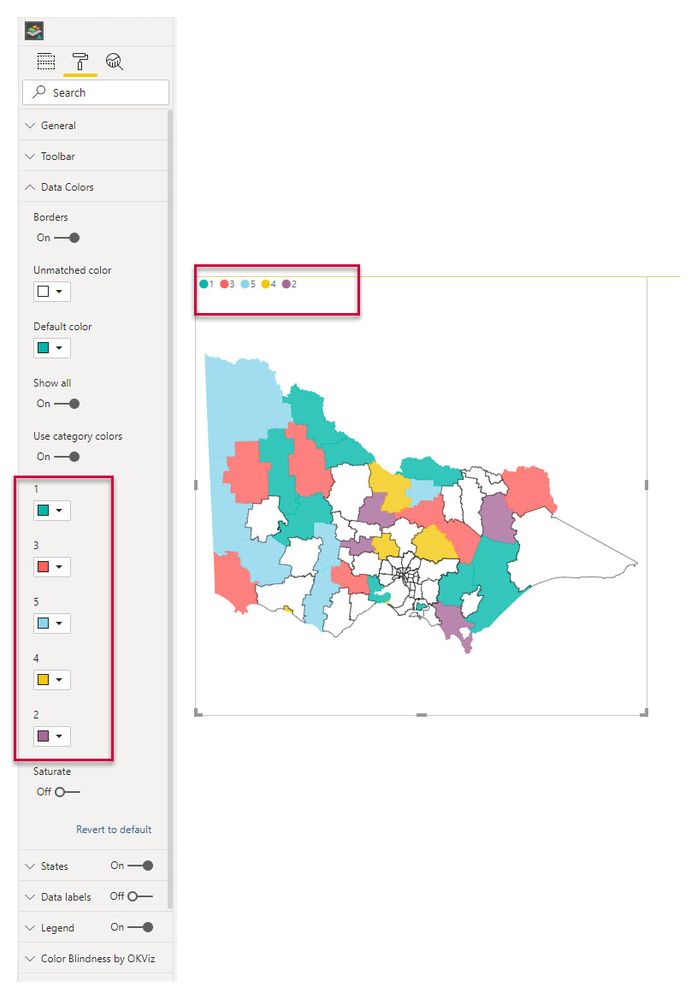
I've used this visual a little before and the legend colour is based on the category. In the Format tab of this visual, you can select this under Data Colors, if you have the Status ( 1-5) under Category.
I've just used a map visual ( completely wrong for the example I know ) but hopefully it illustrates the solution.
- Mark as New
- Bookmark
- Subscribe
- Mute
- Subscribe to RSS Feed
- Permalink
- Report Inappropriate Content
Hello, and thank you very much for your prompt response.
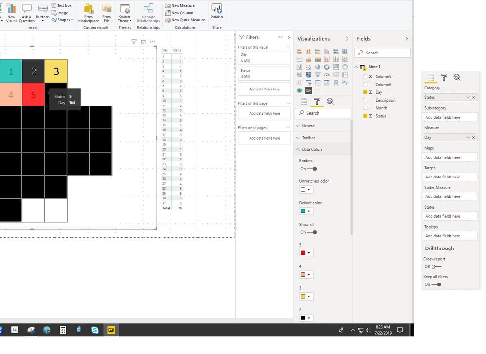
The problem that I have is, I guess the visual is using the column day and "Summing" or Counting"
As you can see the square for day 5 is showing Day = 164, which is basically summing the "Status" column where is equal to 5.
- Mark as New
- Bookmark
- Subscribe
- Mute
- Subscribe to RSS Feed
- Permalink
- Report Inappropriate Content
Hi @sajarac
Ah, ok, so to correct that you need to set the day to not autosum. The clue that that is happening, is the sigma (Σ) sign next to "day". To get rid of this , go to the modelling tab of the Desktop, and choose don't summarise. You could choose minimum or better yet, define a measure for this.
- Mark as New
- Bookmark
- Subscribe
- Mute
- Subscribe to RSS Feed
- Permalink
- Report Inappropriate Content
Hi there,
I am doing something wrong, for some reason I am not getting the full chart with the colors.
The first snapshot is Category = Status, Measure = Count of Day "I have changed to Don't sumarize"
The second screenshot is the opposite.
The first one seems like is writh but is only showing up to day 6.
Sorry 😞
- Mark as New
- Bookmark
- Subscribe
- Mute
- Subscribe to RSS Feed
- Permalink
- Report Inappropriate Content
Hi @sajarac
Are you using a custom made .SVG for the visual? If so could you share that with me please.
- Mark as New
- Bookmark
- Subscribe
- Mute
- Subscribe to RSS Feed
- Permalink
- Report Inappropriate Content
Sure,
I will send you a PM.
Thank again for your help.
- Mark as New
- Bookmark
- Subscribe
- Mute
- Subscribe to RSS Feed
- Permalink
- Report Inappropriate Content
Hi @sajarac
I think I solved it. The documentation on the Okviz site is a little dated but it is to do with the states field.
Here is what I came up with using your file. I will repost this to you in IM and you can see if this helps.
Cheers
Manfred
- Mark as New
- Bookmark
- Subscribe
- Mute
- Subscribe to RSS Feed
- Permalink
- Report Inappropriate Content
Hi there, sorry to bother you again. This is justa a quick question:
Is possible to add a label with the day name?
Thanks in advance.
Regards,
- Mark as New
- Bookmark
- Subscribe
- Mute
- Subscribe to RSS Feed
- Permalink
- Report Inappropriate Content
Hi @sajarac
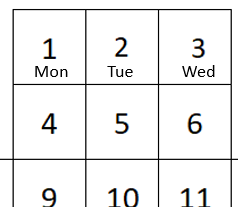
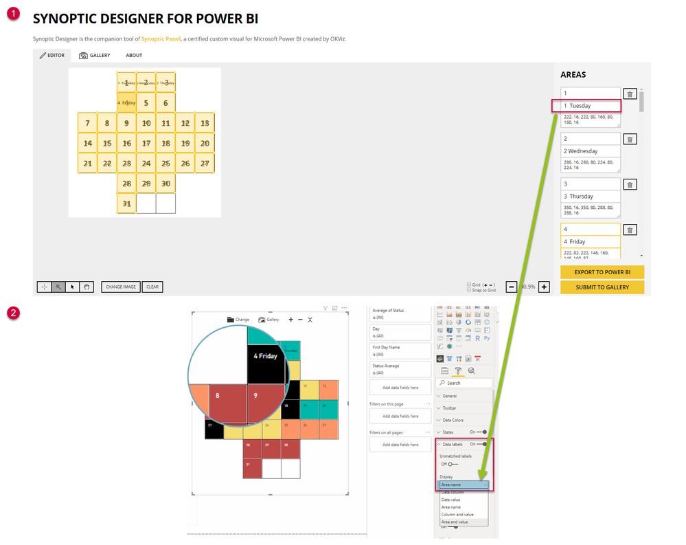
Interesting question. I did a bit of playing around...... So the visual offers a couple of options for the labels - however, the Data Column specified in the SVG ties up with the day number. If this was changed to be day number and day name joined ( in the SVG and the Dataset) it could work. But you would have to have a different visual for every month combination going forward I think. Another alternative is to modify the SVG to have the area name specified, and choose to display this. I have done this as in the example below and added a day number identifier in front of this. ( 1 Tuesday 2 Wednesday etc) I used January 2019 as an example.
In a production environment I would think you would need a tab for every month, filter the data for that particular month and have an SVG for each particular day one starting on a Monday or a Tuesday or a Wednesday, etc ( 7 in total) - every year then the day changes by one - and beware 2020 is a leap year.
The reason for the workaround is the visual only allows labels to be the 1)data column, 2)data value, 3)area name, 4)Column and value, and 5)Area and Value. Would have been awesome if it allowed Data Column and Area name together. Maybe you can ask OKviz on their support site?
Hope this helps.
Cheers
Manfred
- Mark as New
- Bookmark
- Subscribe
- Mute
- Subscribe to RSS Feed
- Permalink
- Report Inappropriate Content
Again, thank you very much for your prompt response and advise.
I was thinking of place the data required in the data source and leave the visual to pick whatever I need.
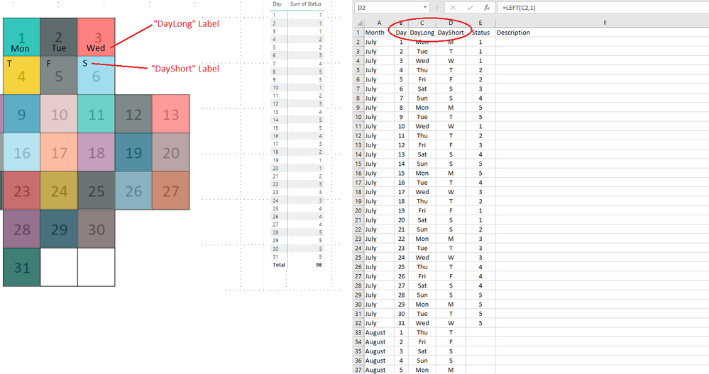
I think that having the choice of add multimple labels coud be a good stuff, like in my case for a custom made calendar but for every floor plan laytout etc.
I will try to submit this to the OKviz guys.
Here is an example:
Thanks again
- Mark as New
- Bookmark
- Subscribe
- Mute
- Subscribe to RSS Feed
- Permalink
- Report Inappropriate Content
Thank you, thank you, thank you!!!!!
I would not have guessed....
I really appreciate all the help.
Regards.
Helpful resources

Microsoft Fabric Learn Together
Covering the world! 9:00-10:30 AM Sydney, 4:00-5:30 PM CET (Paris/Berlin), 7:00-8:30 PM Mexico City

Power BI Monthly Update - April 2024
Check out the April 2024 Power BI update to learn about new features.

| User | Count |
|---|---|
| 109 | |
| 99 | |
| 77 | |
| 66 | |
| 54 |
| User | Count |
|---|---|
| 144 | |
| 104 | |
| 102 | |
| 87 | |
| 64 |
