- Power BI forums
- Updates
- News & Announcements
- Get Help with Power BI
- Desktop
- Service
- Report Server
- Power Query
- Mobile Apps
- Developer
- DAX Commands and Tips
- Custom Visuals Development Discussion
- Health and Life Sciences
- Power BI Spanish forums
- Translated Spanish Desktop
- Power Platform Integration - Better Together!
- Power Platform Integrations (Read-only)
- Power Platform and Dynamics 365 Integrations (Read-only)
- Training and Consulting
- Instructor Led Training
- Dashboard in a Day for Women, by Women
- Galleries
- Community Connections & How-To Videos
- COVID-19 Data Stories Gallery
- Themes Gallery
- Data Stories Gallery
- R Script Showcase
- Webinars and Video Gallery
- Quick Measures Gallery
- 2021 MSBizAppsSummit Gallery
- 2020 MSBizAppsSummit Gallery
- 2019 MSBizAppsSummit Gallery
- Events
- Ideas
- Custom Visuals Ideas
- Issues
- Issues
- Events
- Upcoming Events
- Community Blog
- Power BI Community Blog
- Custom Visuals Community Blog
- Community Support
- Community Accounts & Registration
- Using the Community
- Community Feedback
Register now to learn Fabric in free live sessions led by the best Microsoft experts. From Apr 16 to May 9, in English and Spanish.
- Power BI forums
- Forums
- Get Help with Power BI
- Desktop
- Synoptic Panel: Issue with States Measuers
- Subscribe to RSS Feed
- Mark Topic as New
- Mark Topic as Read
- Float this Topic for Current User
- Bookmark
- Subscribe
- Printer Friendly Page
- Mark as New
- Bookmark
- Subscribe
- Mute
- Subscribe to RSS Feed
- Permalink
- Report Inappropriate Content
Synoptic Panel: Issue with States Measuers
Hello everyone,
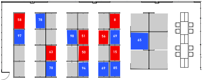
I am experiencing a very frustrating issue with Synoptic Panel. I have created a map of my company's call center that displays the employee's ID (hidden for this post) and the number of calls they took for the selected day. I want to use Synoptic Panel's states feature to color code the employee's area based on the number of calls they took and how that number compares to the mean, lower and upper standard deviations. The mean, 1-below-STDEV, and 1-above-STDEV values are measures.
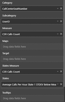
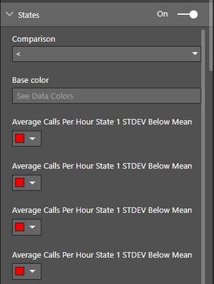
Below are images of how my data and visual fields are configured.
Below is a table of the values of these measures for the selected data range.
Ideally what should occurr is that any CSR who took less than 40 calls will display with the color red. However, it appears Synoptic Panel is coloring everyone who took less than 65 calls (the mean) with red. What's strange is that when I bind a measure with a hardcoded value of 40 in the "States" field, it works. This led me to believe that my measure is somehow calculating incorrectly, but based on the table that does not appear to be the case.
Has anyone ever experienced this issue? I've been trying to fix it for a few days but nothing comes to mind. I'm hoping I'm missing something incredibly obvious.
Any and all help is greatly appreciated. Thank you!
- Mark as New
- Bookmark
- Subscribe
- Mute
- Subscribe to RSS Feed
- Permalink
- Report Inappropriate Content
You may check Data colors in the Format section.
If this post helps, then please consider Accept it as the solution to help the other members find it more quickly.
- Mark as New
- Bookmark
- Subscribe
- Mute
- Subscribe to RSS Feed
- Permalink
- Report Inappropriate Content
Hi v-chuncz-msft
Thank you for your reply! I'm not sure what options under the Data Colors section I should be looking at. Enabling the Saturate feature sort of helps, as the lowest values are much less saturated than the higher values; however the main issue that the comparison is based off the mean rather than the defined measure is still ocurring.
Thank you!
- Mark as New
- Bookmark
- Subscribe
- Mute
- Subscribe to RSS Feed
- Permalink
- Report Inappropriate Content
In the format panel, if you choose as comparison operator > or >= the states are sorted by descending order and if the operator is < or <= the states are sorted by their values in ascending order. If you pur =, the measures will not be sorted. I recommend you treat the data in power query in order to obtain a range 1-5, then you can attribute a state to each one of them.
In this article, it is better explained:
https://okviz.com/blog/states-in-custom-visuals/
I hope it helps.
Helpful resources

Microsoft Fabric Learn Together
Covering the world! 9:00-10:30 AM Sydney, 4:00-5:30 PM CET (Paris/Berlin), 7:00-8:30 PM Mexico City

Power BI Monthly Update - April 2024
Check out the April 2024 Power BI update to learn about new features.

| User | Count |
|---|---|
| 112 | |
| 100 | |
| 76 | |
| 74 | |
| 49 |
| User | Count |
|---|---|
| 145 | |
| 108 | |
| 107 | |
| 89 | |
| 61 |


